How to Add a classname/id to React-Bootstrap Component ?
Last Updated :
01 Nov, 2023
In this article, we will learn how we can add a class name and ID to a React-Bootstrap component. ClassName and ID can be used to target elements while styling and scripting (which means writing logic) the application.
Prerequisites:
Steps to create React app and install bootstrap
- Create a React application using the following command:
npx create-react-app class-id
- After creating your project folder(i.e. class-id), move to it by using the following command:
cd class-id
- Now install react-bootstrap in your working directory i.e. class-id by executing the below command in the VScode terminal:
npm install react-bootstrap bootstrap
- Now we need to Add Bootstrap CSS to the index.js file:
import 'bootstrap/dist/css/bootstrap.min.css';
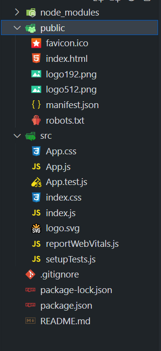
Project Structure
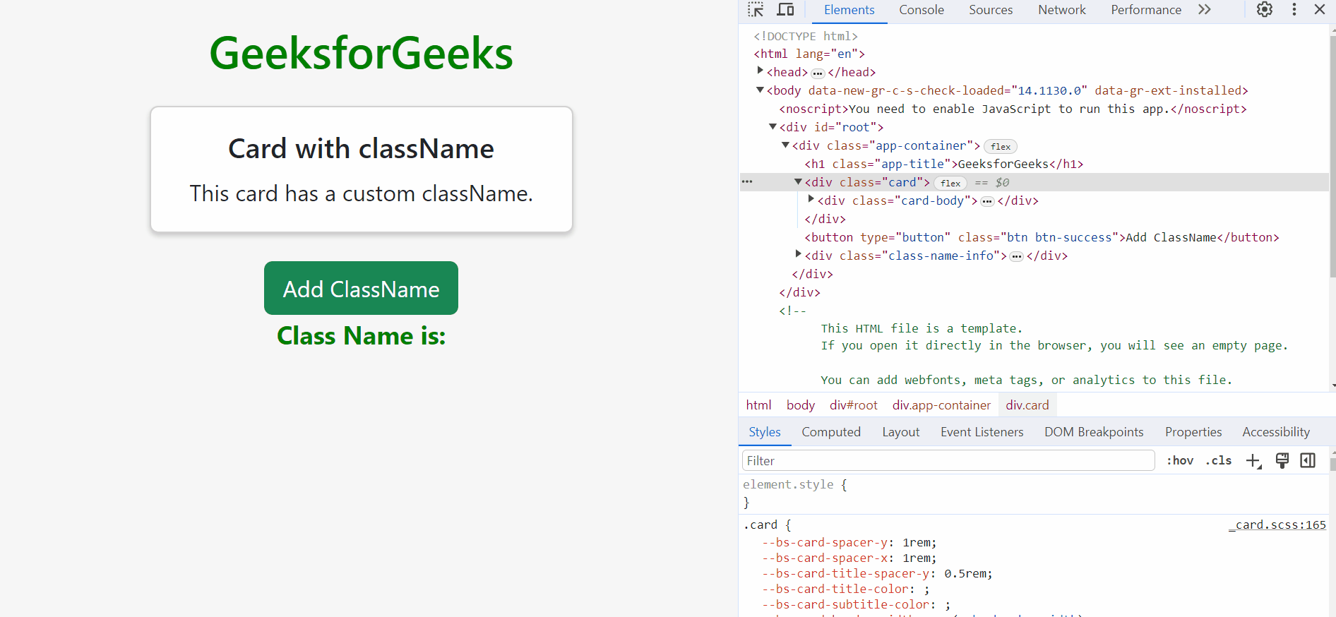
Example 1: In this example, we have used the card component of the bootstrap and also the button component. Here, when the button is clicked, the class “gfg-card-class” is assigned to the Bootstrap Card component. This class name is controlled by the ‘useState’ hook and also shown below the card. There is a ‘className’ prop to dynamically apply the class to the card component of the Bootstrap.
Javascript
import React, { useState } from "react";
import Button from "react-bootstrap/Button";
import Card from "react-bootstrap/Card";
import "./App.css";
function App() {
const [className, setClassName] = useState("");
const handleSetClassName = () => {
setClassName("gfg-card-class")};
return (
<div className="app-container">
<h1 className="app-title">
GeeksforGeeks
</h1>
<Card className={className}>
<Card.Body>
<Card.Title>
Card with className
</Card.Title>
<Card.Text>
This card has a custom className.
</Card.Text>
</Card.Body>
</Card>
<Button variant="success"
onClick={handleSetClassName}>
Add ClassName
</Button>
<div className="class-name-info">
<p>
Class Name is:{" "} {className}
</p>
</div>
</div>
)}
export default App;
|
Javascript
import React from "react";
import ReactDOM from "react-dom/client";
import "./index.css";
import App from "./App";
import reportWebVitals from "./reportWebVitals";
import "bootstrap/dist/css/bootstrap.min.css";
const root = ReactDOM.createRoot(
document.getElementById("root"));
root.render(
<React.StrictMode>
<App />
</React.StrictMode>);
reportWebVitals();
|
CSS
.app-container {
text-align: center;
padding: 20px;
background-color: #f7f7f7;
min-height: 100vh;
display: flex;
flex-direction: column;
align-items: center;
}
.app-title {
color: green;
font-size: 32px;
margin-bottom: 20px;
}
.card {
width: 300px;
border: 1px solid #ccc;
box-shadow: 0 2px 4px
rgba(0, 0, 0, 0.2);
margin-bottom: 20px;
}
.btn-success {
background-color: green;
border: none;
padding: 10px 20px;
font-size: 16px;
}
.class-name-info {
font-size: 18px;
font-weight: bold;
color: green;
}
|
Output:
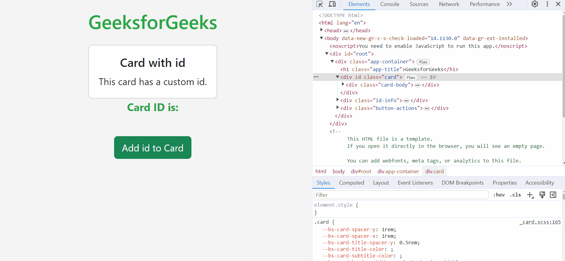
Example 2: In this example, we have used the card and button components from react-bootstrap. We are assigning or adding the ID to the card component by clicking the button. Also, we are showing the ID name on screen. There is a useState hook to mainly manage the ID state and an ID prop to dynamically set the ID for the Card component. We can see that in the component Inspect, when the button is clicked, the ID “gfg-id-card” is automatically added to the card component.
Javascript
import React, { useState } from "react";
import Button from "react-bootstrap/Button";
import Card from "react-bootstrap/Card";
import "./App.css";
function App() {
const [id, setId] = useState("");
const addID = () => {setId("gfg-id-card")};
return (
<div className="app-container">
<h1 className="app-title">
GeeksforGeeks
</h1>
<Card id={id}>
<Card.Body>
<Card.Title>
Card with id
</Card.Title>
<Card.Text>
This card has a custom id.
</Card.Text>
</Card.Body>
</Card>
<div className="id-info">
<p>Card ID is: {id}</p>
</div>
<div className="button-actions">
<Button variant="success"
onClick={addID}>
Add id to Card
</Button>
</div>
</div>
)}
export default App;
|
Javascript
import React from "react";
import ReactDOM from "react-dom/client";
import "./index.css";
import App from "./App";
import reportWebVitals from "./reportWebVitals";
import "bootstrap/dist/css/bootstrap.min.css";
const root = ReactDOM.createRoot(
document.getElementById("root"));
root.render(
<React.StrictMode>
<App />
</React.StrictMode>);
reportWebVitals();
|
CSS
.app-container {
text-align: center;
padding: 20px;
background-color: #f5f5f5;
min-height: 100vh;
display: flex;
flex-direction: column;
align-items: center;
}
.app-title {
color: #28a745;
font-size: 32px;
margin-bottom: 20px;
}
.custom-card {
width: 300px;
background-color: #ffffff;
border: 1px solid #ced4da;
border-radius: 5px;
box-shadow: 0 2px 4px
rgba(0, 0, 0, 0.2);
margin-bottom: 20px;
}
.custom-card .card-body {
padding: 20px;
}
.custom-card .card-title {
color: #28a745;
font-size: 24px;
font-weight: bold;
margin-bottom: 10px;
}
.custom-card .card-text {
font-size: 18px;
}
.button-actions {
margin-top: 20px;
}
.btn-success {
background-color: #28a745;
border: none;
padding: 10px 20px;
font-size: 16px;
}
.id-info {
font-size: 18px;
font-weight: bold;
color: #28a745;
}
|
Output:
Share your thoughts in the comments
Please Login to comment...