Histogram-Definition, Types, Graph, and Examples: A histogram is a graphical representation used in statistics to show the distribution of numerical data. It looks somewhat like a bar chart, but with key differences that make it suitable for showing how data is distributed across continuous intervals or specific categories that are considered “bins”.
A histogram is similar to a bar graph. The basic difference between the two is that bar charts correlate a value with a single category or discrete variable, whereas histograms visualize frequencies for continuous variables.
In this article, we have provided every detail about Histograms, their definition, types, examples, how the histogram looks, etc.
Histogram
What is Histogram?
Histogram is a graphical representation that condenses data series into easy-to-understand numerical data by grouping them into logical ranges of varying heights, often known as bins. Essentially, it summarises discrete or continuous data. Histogram is a tool for visualising the distribution of data across a continuous interval or period.
In a histogram data is grouped into continuous number ranges and each range corresponds to a vertical bar.
- Horizontal axis displays the number range.
- Vertical axis (frequency) represents the amount of data present in each range.
It allows us to assess where the values are concentrated, what the extremes are, and whether there are any gaps or anomalous values. A Histogram is similar to a vertical bar graph, however, the distinction is that the Histogram has no space between the bars, but a bar graph has.
Histogram Meaning
A histogram is a graph that shows the distribution of data. It resembles a sequence of interconnected bars. Each bar represents a range of values, and its height indicates how many data points are inside that range.
Parts of a Histogram
A histogram is a graph that represents the distribution of data. Here are the essential components, presented in simple terms:
Title: This is similar to the name of the histogram. It explains what the histogram is about and what data it displays.
X-axis: Visualize the X-axis as a horizontal line at the bottom of the histogram. It displays the many categories or groups that the data is sorted into. For example, if you’re measuring people’s heights, the X-axis may indicate several height ranges such as “5-6 feet” or “6-7 feet.”
Y-axis: The Y-axis appears as a vertical line on the side of the histogram. It displays the number of times something occurs in each category or group shown on the X-axis. So, if you’re measuring heights, the Y-axis may display how many individuals are in each height range.
Bars: Bars are like the histogram’s building blocks. They are the vertical rectangles you see on the chart. Each bar on the X-axis represents a category or group, and its height indicates how many times something occurs inside that category. So, higher bars indicate more occurrences, whereas shorter bars indicate fewer occurrences. The bar’s width remains constant, but it indicates the range covered by each category on the X-axis. If all of the bars have the same width, it indicates that the categories are all the same size.
Types of Histogram
The following are some typical forms of histograms and their characteristics:
Uniform Histogram
A uniform distribution means that the data is uniformly distributed among the classes, with each having a same number of elements. It may display many peaks, suggesting varying degrees of incidence.
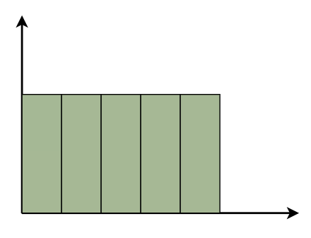
Uniform Histogram
Bimodal Histogram
A histogram is called bimodal if it has two distinct peaks. This implies that the data consists of observations from two distinct groups or categories, with notable variations between them.
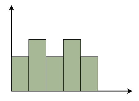
Bimodal Histogram
Symmetric Histogram
Symmetric Histogram is also known as a bell-shaped histogram, it has perfect symmetry when divided vertically down the centre, with both sides matching each other in size and shape. The balance reflects a steady distribution pattern.
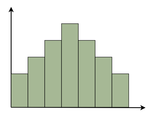
Symmetric Histogram
Right-Skewed Histogram
A right-skewed histogram shows bars leaning towards the right side. This signifies that the majority of the data points are on the left side, with a few outliers reaching to the right. Consider a histogram showing the distribution of family earnings. A right-skewed histogram occurs when the majority of families are in lower income groups, but a small number of highly rich households skew the average income.
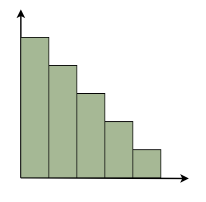
Right-Skewed Histogram
Left-Skewed Histogram
A left-skewed histogram shows bars that lean towards the left side. This means that the majority of the data points are on the right side, with a few exceptionally low values extending to the left. Consider a histogram reflecting the distribution of test scores in a classroom. A left-skewed histogram occurs when the majority of students receive excellent grades but a few do badly, resulting in an average that is dragged to the left.
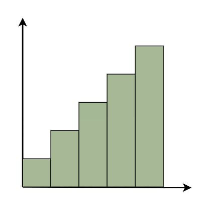
Left-Skewed Histogram
Frequency Histogram
A frequency histogram visually displays how often specific values appear in data. Each bar represents a range of values, with its height indicating the frequency of occurrences. For instance, if we’re tracking study hours, the histogram shows how many students fall into each study time range, offering insights into study habits across the student population.
Relative Frequency Histogram
Relative Frequency Histogram displays proportions instead of exact counts for each interval. For example, in a class of 20 students, it might show that 25% scored between 70 and 80%. Relative frequency histograms offer insights into the occurrence of distinct values and distribution patterns within a dataset.
Cumulative Frequency Histogram
A cumulative frequency histogram is a graph that depicts the total number of values up to a specific point. Instead of displaying the frequency of each individual number, it shows the cumulative frequency, which increases as you walk down the graph.
For example, if you’re graphing test scores, the height of each bar shows the total number of points received to that moment. So, if the first bar displays a frequency of 10 for scores 0-10 and the second bar shows a frequency of 20 for scores 0-20, it indicates that 20 students scored 20 or below.
Cumulative Relative Frequency Histogram
A Cumulative Relative Frequency Histogram is a histogram that depicts the percentage of data points in a dataset that fall below a specific number. Each bar indicates the sum of relative frequencies up to a certain point.
For example, if we have test results ranging from 0 to 100, the histogram will show the percentage of students that scored below each level. If 30% of students scored less than 70, the bar for 70 would be 30% higher.
Histogram Examples
1. Normal Distribution Histogram
- The histogram will likely be bell-shaped, indicating a normal distribution.
- The highest bar (or bars) will be around the middle score range, with the height of bars decreasing symmetrically as you move away from the middle.
2. Skewed Distribution Histogram
- The histogram will have a long tail to the right, indicating a right-skewed distribution.
- Most of the bars will be taller on the left side of the histogram (representing younger employees), with the height of bars decreasing as you move to the right (older age groups).
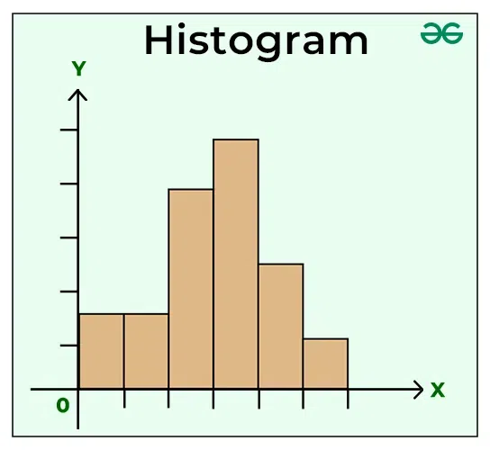
Histogram Graph
A histogram is like a bar graph that shows data in columns along the x-axis. Each column represents a range of outcomes, and the height of the column on the y-axis shows how many times that outcome occurred in the data. It’s a simple and effective way to see how data is spread out or distributed. A histogram chart is added below,

How to Draw Histogram?
Histogram is the basic toll of representing data and we can easily draw histogram by following the steps added below:
Step 1: Collect the data you wish to display in the histogram. This might range from test results to population distribution. For example: Assume you get the following test scores: 14, 20, 12, 26, 8, 7, 2, 28, 30, 16, 18, 23. First arrange it in ascending order. Exam results: 2, 7, 8, 12, 14, 16, 18, 19, 23, 26, 28 and 30.
Step 2: Determine the number of intervals, or “bins,” you wish to split your data into. This is determined by the scope and distribution of your data, as well as the amount of information you choose to display. Assume we wish to divide the scores into 5 bins.
Step 3: Determine the limits of each bin. These bounds should encompass the complete range of your data and be regularly spaced. 0-5 – 10 – 15 – 20 – 25 – 30.
Step 4: Count the number of data points that belong in each bin.
|
Class Interval
|
Frequency
|
|
0-5
|
1
|
|
5-10
|
2
|
|
10-15
|
2
|
|
15-20
|
3
|
|
20-25
|
1
|
|
25-30
|
3
|
Step 5: On a graph, show the bin borders on the x-axis and the frequency of data points in each bin on the y-axis.
Create bars for each bin, with the height of each bar representing the frequency of data points in that bin.

In this histogram, the x-axis depicts the bins, while the y-axis indicates the frequency of data points falling within each bin. The bars represent the sample data’s distribution across the given bins.
How to Interpret a Histogram?
A histogram is a type of bar graph that displays the distribution of data. Assume you have a collection of numbers, such as test results or people’s heights. A histogram divides these numbers into ranges known as “bins,” and then illustrates how many data points fall into each bin by creating bars. The higher the bar, the more data points are contained inside that range.
So, when you look at a histogram, you can immediately observe where the majority of the data is, whether it is grouped in one location or spread out, and whether there are any strange patterns, such as gaps or outliers.
When to Use Histogram?
Histogram graphs are utilised under various scenarios and some of them are,
- When you have numbers as data.
- To understand how your data is distributed, especially whether it follows a typical pattern.
- To determine if a process satisfies consumer needs.
- Analyse the results of a supplier’s procedure.
- Compare changes in a process over time.
- To compare the results of several processes.
- When you want to quickly and clearly show people how your data is distributed.
Advantages of Histogram
Histograms provide various advantages for data analysis and visualization:
- Histograms provide an easy-to-understand visual representation, allowing for fast estimate of key statistical measures such as the mean and median based solely on the shape and central tendency of the graph.
- Histograms can give insights into probable future data events by highlighting patterns and trends in the current dataset, which can help with forecasting and decision-making.
- Histograms are a simple way to exhibit data of variable frequencies and kinds, allowing for clear communication and analysis across several domains and disciplines.
- Statisticians respect histograms for their consistency since they organise data into intervals with uniform distribution, guaranteeing precision and dependability when showing data distributions.
Disadvantages of Histogram
Histograms has advantages as well as disadvantages for data analysis and visualization:
- While histograms provide a simple visual representation, they might oversimplify complicated data patterns, potentially leading to misconceptions or missing subtleties in the information.
- Histogram interpretation can be subjective since people perceive patterns differently, resulting in various judgements regarding the data.
- The bin sizes and intervals used in a histogram can influence the visual look and perception of the data. Poorly designed bins might hide key details or generate fake patterns.
- In rare situations, histograms can be visually deceiving, particularly if the scale or axes are modified to emphasise some traits or downplay others, resulting in inaccurate data interpretation.
- While histograms are useful for visualising a single dataset, they may not allow for straightforward comparison of many datasets, particularly those with differing sizes or distributions.
Applications of Histogram
- In the Classroom: Imagine a teacher curious about how well her students understood the latest math test. She plots their scores on a histogram, and it’s like seeing the class’s academic portrait. She can quickly spot if most kids nailed it (scores clustered in the high end), if it was a mixed bag, or if she needs to revisit some topics (scores spread out or leaning towards the lower end).
- Health Checks: Think of a doctor looking over the ages of patients getting flu shots. A histogram helps the doc see at a glance which age groups are rolling up their sleeves the most and which might need a nudge. It’s like getting a health pulse on the community with just a peek.
- Nature’s Patterns: A biologist tracking the growth of plants in different environments uses a histogram to visualize growth patterns. It’s as if the plants are telling their stories, showing which conditions make them thrive or barely hang on, all through the height and spread of those bars.
- Market Trends: Imagine a business owner gauging when their store is busiest by plotting customer visits across the day. The histogram becomes a daily schedule, highlighting rush hours when the store should be fully staffed and quiet times perfect for restocking.
Difference between Bar Graph And Histogram
A histogram is one of the most frequent graphs used to represent frequency distribution. The histogram appears more like a bar graph, but there is a distinction between the two. The differences between the bar graph and the histogram are as follows:
| Feature |
Bar Graph |
Histogram |
| Purpose |
Used to show comparisons among discrete categories. |
Used to show the distribution of continuous data over intervals. |
| Data Type |
Categorical or discrete. |
Continuous, but binned into discrete intervals. |
| Orientation |
Bars can be oriented horizontally or vertically. |
Bars are typically vertical. |
| Spacing Between Bars |
Spaces between bars to indicate that categories are distinct. |
No space between bars (except for gaps indicating no data for a bin) to signify continuous data range. |
| Order of Bars |
Can be arranged in any order, often sorted by frequency. |
Arranged in ascending order of the variable. |
| X-axis |
Represents different categories. |
Represents the intervals or “bins” of the continuous data. |
| Y-axis |
Represents the value (count, percentage, etc.) for each category. |
Represents the frequency or count of data points within each bin. |
| Use Cases |
Comparing population sizes in different cities, showing sales by product category. |
Showing the distribution of exam scores, ages of participants in a study. |
People Also View:
Histogram Solved Examples
Example 1: Present the following information as a histogram:
|
Marks
|
0-10
|
10-20
|
20-30
|
30-40
|
40-50
|
|
No. of students
|
30
|
70
|
40
|
28
|
55
|
Solution:
We take the Marks on the graph’s horizontal axis and, based on the first column of the data, set the scale to 1 unit = 10. We pick number of students on the vertical axis of the graph and use the second column of the table to determine the scale: 1 unit = 10. Now we’ll create the relevant histogram.

Example 2: Present the following information as a histogram:
|
Marks
|
5-10
|
10-15
|
15-20
|
20-25
|
25-30
|
30-35
|
35-40
|
40-45
|
|
No. of students
|
10
|
15
|
18
|
26
|
35
|
42
|
54
|
62
|
Solution:
We take the Marks on the graph’s horizontal axis and, based on the first column of the data, set the scale to 1 unit = 10. We pick number of students on the vertical axis of the graph and use the second column of the table to determine the scale: 1 unit = 5. Now we’ll create the relevant histogram.

Practice Problems of Histogram
1) Present the following information as a histogram:
|
Marks
|
0-15
|
15-30
|
30-45
|
45-60
|
60-75
|
75-90
|
|
No. of students
|
35
|
69
|
42
|
58
|
25
|
50
|
2) Present the following information as a histogram:
|
Marks
|
0-10
|
10-20
|
20-30
|
30-40
|
40-50
|
50-60
|
|
No. of students
|
31
|
78
|
35
|
41
|
63
|
55
|
FAQs of Histogram – Definition, Types, Graph, and Examples
What is histogram and how is it different from a bar graph?
A histogram is a graphical depiction of frequency distributions in continuous data, whereas a bar chart is used in categorical data. A histogram, unlike a bar chart, depicts frequencies for continuous variables with no gaps between the bars.
What are key elements of a histogram?
A histogram is made up of a title, an X-axis (which represents categories or groups), a Y-axis (which shows frequency), and bars (which show frequency distribution).
What are many forms of histograms and what do they represent?
Histograms can be uniform, bimodal, symmetric (bell-shaped), right-skewed, or left-skewed. Each class represents distinct patterns in data distribution.
When should you use a histogram?
Histograms are important for analysing numerical data distributions, evaluating process changes over time, determining if data meets customer demands, and visualising data distribution patterns quickly and effectively.
What are advantage of utilising histograms?
Histograms simplify complicated data representation, make statistical measurements easier to read, provide insights into future data patterns, improve data communication, and assure consistent and trustworthy data visualization.
What is a right-skewed histogram, and when does it appear?
A right-skewed histogram means that the majority of data points are on the left side, with outliers stretching to the right. It happens when a dataset has a small number of high-value outliers.
What is a left-skewed histogram, and when does it appear?
A left-skewed histogram depicts the majority of data points on the right side, with outliers to the left. It happens when there are just a few low-value outliers in a dataset.
What is difference between a bar graph and a histogram?
Bar graphs show categorical data, whereas histograms display numerical data. Furthermore, bar graphs depict independent variables on the x-axis, whereas histograms show a continuous scale on the x-axis that represents ranges of data values.
Share your thoughts in the comments
Please Login to comment...