Handling Categorical Data with Bokeh – Python
Last Updated :
30 Dec, 2022
As a data scientist, you will often come across datasets with categorical data. Categorical data is a type of data that can be divided into distinct categories or groups. For example, a dataset might have a column with the categories “red”, “green”, and “blue”. Handling categorical data can be challenging because it cannot be processed in the same way as numerical data.
One way to visualize and analyze categorical data is through the use of Bokeh, a powerful Python library for creating interactive visualizations. In this blog, we will explore how to handle categorical data with Bokeh and provide some examples to illustrate the concepts.
Concepts:
Before diving into the specifics of handling categorical data with Bokeh, it is important to understand a few key concepts.
- Categorical data: As mentioned above, categorical data is a type of data that can be divided into distinct categories or groups. It can be either nominal (no inherent order) or ordinal (has an inherent order).
- Categorical axis: In Bokeh, a categorical axis is used to represent categorical data on a plot. The categories are plotted along the axis, with each category represented by a tick mark.
- Categorical color mapping: Categorical color mapping is a way to assign different colors to different categories on a plot. This can be useful for visually distinguishing between different categories.
Steps:
Now that we have a basic understanding of the concepts, let’s go through the steps for handling categorical data with Bokeh.
- Import the necessary libraries (Bokeh and any others you might need)
- Create a toy dataset with your categorical data
- Create a figure object and set the x_range or y_range to the categories you want to plot
- Use the vbar() or hbar() glyph methods to plot the data, specifying the categories as the x or y coordinates and the values as the top or right coordinates
- Optional: customize the appearance of the plot by setting the width, adding grid lines, and setting the range start values
- Display the plot using the show() function
Example
Now that we have gone through the steps for handling categorical data with Bokeh, let’s look at some examples to further illustrate the concepts.
Example :1 Simple Bar chart
Python3
from bokeh.io import output_file, show
from bokeh.plotting import figure
from sklearn.datasets import load_breast_cancer
data = load_breast_cancer(as_frame=True)
output_file("Breast Cancer.html")
color = ["orange","green"]
p = figure(x_range=data.target_names, height=350, title="breast cancer",toolbar_location=None, tools="")
p.vbar(x=data.target_names, top=data['target'].value_counts(), color=color, width=0.9)
show(p)
|
Outputs:
The above code generates a bar chart as shown using the Bokeh library in Python.
Code explanations:
The output_file function specifies the name and location of the HTML file where the chart will be saved.
- Here we have used Breast cancer dataset from scikit-learn library
- The figure function creates a new chart figure with the specified options:
- x_range: the labels for the x-axis, in this case, the breast cancer ‘malignant’ or ‘benign’.
- height: the height of the chart in pixels
- title: the title of the chart
- The p.vbar function adds vertical bars to the chart, with the x parameter specifying the labels for the bars (Breast cancer status) and the top parameter specifying the heights of the bars (value_count). The width parameter sets the width of the bars.
- Finally, the show function displays the chart. When the script is run, an HTML file named “bar_sorted.html” will be created containing the chart.
Example: 2 Nested Bar chart
In this example, we will use a toy dataset with six categories of fruits: Carrots’, ‘Peas’, ‘Broccoli’, ‘Cauliflower’, ‘Beans’, ‘Peppers’.
Python3
from bokeh.io import output_file, show
from bokeh.models import ColumnDataSource, FactorRange
from bokeh.plotting import figure
from bokeh.transform import factor_cmap
from sklearn.datasets import load_iris
data = load_iris(as_frame=True)
data= data.frame
data.target.replace({0: load_iris().target_names[0],
1:load_iris().target_names[1],
2:load_iris().target_names[2]},
inplace = True)
df = data.groupby('target').agg('mean')
x = [ (cls, col) for cls in data.target.unique() for col in data.columns[:-1] ]
mean = sum(zip(df['sepal length (cm)'],
df['sepal width (cm)'],
df['petal length (cm)'],
df['petal width (cm)']), ())
source= ColumnDataSource(data=dict(x=x, Average = mean))
output_file("Bokeh Nested Bar chart.html")
p = figure(x_range=FactorRange(*x),
height=350,
title="Iris Flower Average length",
)
color = ['orange','#FF0000','green','#00FF00',]
p.vbar(x='x',
top='Average',
width=0.9,
source=source,
line_color="white",
fill_color=factor_cmap('x', palette=color, factors=data.columns[:-1], start=1, end=2)
)
p.xaxis.major_label_orientation = 1
p.xgrid.grid_line_color = None
show(p)
|
Output:
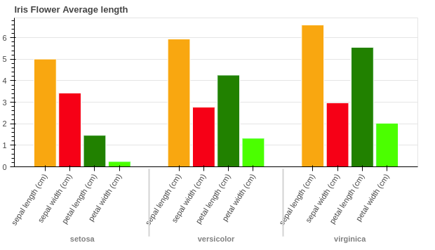
Bokeh Nested Bar chart
Code Explanations:
- Here we have used the iris flower dataset from scikit-learn library.
- Then group the data according to iris flower names and calculate mean length for sepal and petal, length and width.
- Then we create a list to store each variable and their respective value with names ‘x’ and ‘mean’.
- The figure function creates a new chart figure.
- x_range: the labels for the x-axis, in this case, the name of iris flower.
- height: the height of the chart in pixels
- title: the title of the chart
- The p.vbar function adds vertical bars to the chart, with the x parameter specifying the labels for the bars and the top parameter specifying the heights of the bars (mean). The width parameter sets the width of the bars.
- Finally, the show function displays the chart. When the script is run, an HTML file named “bar_sorted.html” will be created containing the chart.
Conclusion:
In this blog, we explored how to handle categorical data with Bokeh and provided some examples to illustrate the concepts. By using Bokeh, you can easily visualize and analyze categorical data, making it a valuable tool for data science.
Share your thoughts in the comments
Please Login to comment...