Grouping of Data: Data Handling or Handling of data is not just a mathematical term but is used in everyday life. When there is a requirement to record, gather, and present any type of information or data, data handling is preferably used. Statistics is a word we often hear, is not but another term for data handling. From making a bar chart of favorite candies of different students to representing a large survey done on COVID-19 cases, data handling is used and preferred.
This information in such cases is called Data. Data can be represented in both statistical ways and graphical ways. Graphical ways usually visually appealing are also easier to understand by a common person. There are many ways to represent data graphically:
- Pictograph
- Bar Graph
- Double Bar Graph
What is Data Handling?
Data Handling is the process of gathering, recording, or presenting information in such a way that is helpful to others in instances like graphs or charts.
Data Handling Definition
Data handling refers to the process of managing, organizing, analyzing, and interpreting data to extract useful information and insights. It involves various activities such as data collection, storage, retrieval, cleaning, transformation, visualization, and presentation.
Usually, the data that we receive is not organized. This kind of data is called raw data. To present it in a meaningful way or to draw good conclusions out of it we need to organize it systematically. For example, consider the following data,
Students of Literature were asked to name their favorite existentialist author. The results are listed below:
Camus, Kafka, Nietzsche, Camus, Camus, Nietzsche, Kafka, Camus, Camus, Kafka, Kafka, Kafka, Kafka, Camus, Camus, Nietzsche, Kafka, Camus, Kafka, Kafka
Now the question we need to answer is which was the least liked author?
It’s not easy to count like this if this data had been huge. It would have been impossible to count like this. That’s why we need to organize the data.
What is Data Grouping of Grouping of Data?
The previous example can be solved by grouping data properly. It can be easier to count if these values were grouped with their type. Let’s do that for the previous example only,
We have the following data:
Camus, Kafka, Nietzsche, Camus, Camus, Nietzsche, Kafka, Camus, Camus, Kafka, Kafka, Kafka, Kafka, Camus, Camus, Nietzsche, Kafka, Camus, Kafka, Kafka
We see that there are three entities here: Camus, Kafka, and Nietzsche. Let’s count their occurrences and group them by their occurrences in a table.
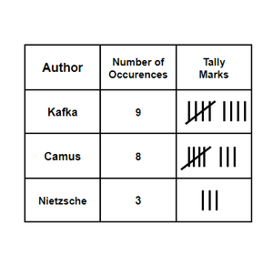
The lines and crosses on them are called tally marks. They sometimes make it easier for us to count the number of objects. Now we can see that the least liked author is Nietzsche. The value in the “Number of Occurrences” column is called the frequency of that entity and this table is called frequency distribution.
Grouped Frequency Distribution
Sometimes it can happen that, there too many values in a particular range. So, it can be really difficult to make a frequency table for each entity. Instead, we make a frequency table for a range and count the number of entities lying in that range.
For example,
Let’s say we have data that shows the runs made by a particular batsman in 60 matches.
21, 10, 30, 22, 33, 5, 37, 12, 25, 42, 15, 39, 26, 32, 26 27, 28, 19, 29, 35, 31, 24, 36, 18, 20, 38, 22, 44, 16, 24, 10, 27, 39, 28, 49, 29, 32, 23, 31, 21, 34, 22, 23, 36, 24, 36, 33, 47, 48, 50, 39, 20, 7, 16, 36, 45, 47, 30, 22, 17
Now we cannot make a frequency table for each value, thus we use the grouped frequency distribution concept discussed above.
Let’s make a range like 0-10, 10-20, 20-30, and so on.
| Groups |
Frequency |
| 0-10 |
2 |
| 10-20 |
9 |
| 20-30 |
22 |
| 30-40 |
15 |
| 40-50 |
8 |
| 50-60 |
2 |
Note: Notice that in the interval 0-10, 10-20. 10 is common, but a value cannot belong to two intervals simultaneously. Thus, a convention is assumed that the common observation will belong to higher class. So 10 will belong to the interval 10-20.
In a group 50-60, 50 is called the lower class limit and 60 is called the upper-class limit. The difference between the upper-class limit and the lower class limit is called the width or size of the interval.
Histograms
It is similar to a bar graph but a histogram groups the numbers into ranges and then plot the occurrences of values in the given ranges on the graph.
Let’s consider the previous example,
| Groups |
Frequency |
| 0-10 |
2 |
| 10-20 |
9 |
| 20-30 |
22 |
| 30-40 |
15 |
| 40-50 |
8 |
| 50-60 |
2 |
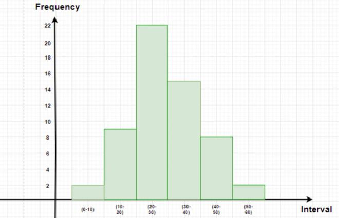
The figure below represents this data in graphical format. The height of the bars represents the frequency of the class-interval. Notice that there is no gap between the bars. This kind of graph is called a histogram.
Sample Problems on Grouping of Data
Question 1: A die was thrown 25 times and the following scores were obtained:
2, 5, 2, 4, 3, 6, 1, 4, 2, 5, 1, 6, 2, 6, 3, 5, 4, 1, 3, 2, 3, 6, 1, 5, 2
Create a frequency table of the scores.
Solution:
The frequency table of the scores obtained when a die is thrown can be shown as –
| Die |
Tally marks |
Scores
(frequency)
|
| 1 |
|||| |
4 |
| 2 |
|||| | |
6 |
| 3 |
|||| |
4 |
| 4 |
||| |
3 |
| 5 |
|||| |
4 |
| 6 |
|||| |
4 |
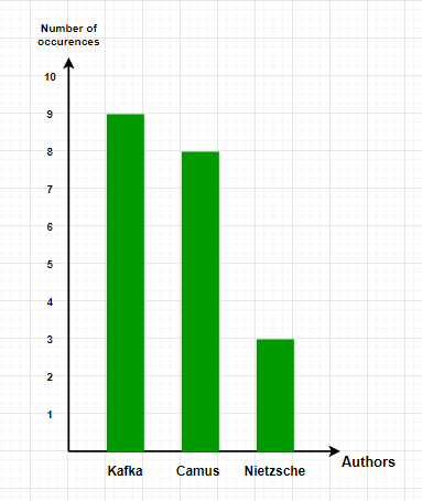
Question 2: Make the bar graph for the data given in the literature example in the beginning.
Solution:
Let’s make the table for the given data
| Author |
Number of Occurrences |
| Kafka |
9 |
| Camus |
8 |
| Nietzsche |
3 |
Let’s put the names of authors on the x-axis and number of occurrences on the y-axis.
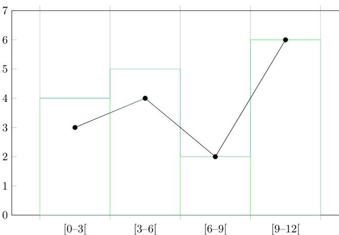
Question 3: Make histogram for the data given below:
1, 2, 2, 1, 5, 5, 4, 10, 4, 5, 7, 10, 9, 8, 9, 9, 11
Solution:
Let’s assume an interval size of 3 and make a frequency table.
| Groups |
Frequency |
| 0-3 |
3 |
| 3-6 |
4 |
| 6-9 |
2 |
| 9-12 |
6 |
Let’s plot these intervals on graph.
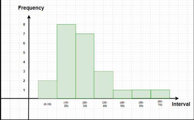
Question 4: The data given below represents the usage per day in minutes for Spotify for a particular person.
5, 10, 12, 7, 20, 13, 30, 25, 20, 50, 30, 24, 17, 63, 24, 30, 15, 10, 40, 24, 15, 18, 20, 11.
Make a frequency table and a histogram for this data.
Solution:
Before making a histogram, we need to group the data and make a frequency distribution for it.
Let’s assume the interval size to be 10.
| Interval |
Frequency |
| 0-10 |
2 |
| 10-20 |
8 |
| 20-30 |
7 |
| 30-40 |
3 |
| 40-50 |
1 |
| 50-60 |
1 |
| 60-70 |
1 |
Question 5: Answer the following questions by observing the given histogram.
- What is the information given by the histogram
- Which group contains the maximum girls.
- How many girls have marks more than 145.
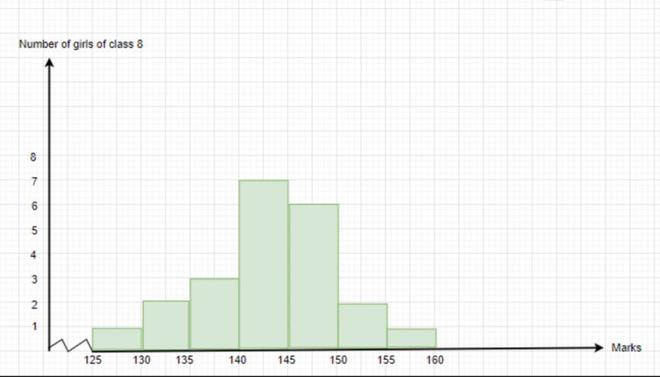
Solution:
- The histogram represents the total marks obtained the girls in the class.
- The group 140-150 contains the maximum number of girls.
- 9 girls have marks more than 145.
People Also Read:
Summary – Grouping of Data
Grouping of data is a statistical technique used to organize and summarize large sets of data into smaller, more manageable groups or intervals. This process involves categorizing raw data into classes or intervals based on their values, with each group representing a range of values. Grouping facilitates easier interpretation and analysis of data by reducing complexity and highlighting important patterns or trends. Common methods of grouping include equal width intervals, equal frequency intervals, and percentile groups. Grouping of data is essential in descriptive statistics for constructing frequency distributions, histograms, and cumulative frequency curves, enabling researchers and analysts to draw meaningful insights and conclusions from the data.
FAQs on Grouping of Data
What is grouping of data, and why is it important?
Grouping of data is a statistical technique where raw data is organized into intervals or groups based on their values. It is important because it simplifies large datasets, making them easier to analyze and interpret. Grouping highlights trends and patterns in the data, facilitating effective decision-making and inference.
How do you determine the number of groups or intervals for data grouping?
The number of groups or intervals for data grouping depends on factors such as the size of the dataset, the range of values, and the purpose of analysis. Common methods for determining the number of groups include Sturges’ rule, Scott’s normal reference rule, and Freedman-Diaconis’ rule, which are based on the number of data points or the data’s distribution.
What are the different methods of grouping data?
There are several methods of grouping data, including equal width intervals, equal frequency intervals, and percentile groups. Equal width intervals divide the range of data into equal-sized intervals, while equal frequency intervals ensure each interval contains the same number of data points. Percentile groups categorize data based on percentiles, such as quartiles or deciles.
What are the advantages and disadvantages of data grouping?
The advantages of data grouping include simplifying complex datasets, highlighting patterns, and facilitating analysis. However, grouping may also lead to loss of information and precision, especially if the intervals are too broad or if important details are obscured. Additionally, the choice of grouping method can affect the interpretation of results.
How does grouping of data affect statistical measures such as mean and standard deviation?
Grouping of data can affect statistical measures such as the mean and standard deviation by changing the precision and accuracy of calculations. When data is grouped, the mean and standard deviation are typically calculated using interval midpoints or class marks, which may introduce approximation errors.
Share your thoughts in the comments
Please Login to comment...