GradientDrawable in Android
Last Updated :
20 Dec, 2021
The user interface (UI) of modern apps is improving all the time. Designers are experimenting with various styles and color combinations to see which ones work best with the Android App. GradientDrawable is a key component of Android that is commonly used these days.
What actually is a gradient drawable?
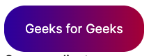
A GradientDrawable is drawable with a color gradient that can be used for buttons, backgrounds, and so on. Let’s begin with a simple example of creating a button in Android with an aqua colored background:

This can be achieved in the following way:
XML
<Button
android:layout_width="0dp"
android:layout_height="48dp"
android:layout_marginStart="24dp"
android:layout_marginEnd="24dp"
android:text="Geeks for Geeks"
android:background="#00FFFF"
app:layout_constraintStart_toStartOf="parent"
app:layout_constraintEnd_toEndOf="parent"
app:layout_constraintTop_toTopOf="parent"
app:layout_constraintBottom_toBottomOf="parent" />
|
What if you want something similar to this:

Gradients are required for this.
There are two approaches to this:
#1. Using an XML drawable resource
Create a new file gfg color drawable.xml in the drawable package and enter the following code:
XML
<?xml version="1.0" encoding="utf-8"?>
<gradient
android:angle="45"
android:startColor="#D98880"
android:centerColor="#F4D03F"
android:endColor="#48C9B0"/>
</shape>
|
We’ve used the <gradient /> tag and added three colour codes: startColor, centerColor, and endColor.
GeekTip: We’ve also set the angle to 45 to indicate a TOP-BOTTOM orientation.
Finally, start the app!
#2. Drawable Gradient
Using GradientDrawable, we can achieve the same functionality programmatically. Create the GradientDrawable in your activity.
Kotlin
val gfgGradient = GradientDrawable(GradientDrawable.Orientation.TOP_BOTTOM,
intArrayOf(
0XFFD98880.toInt(),
0XFFF4D03F.toInt(),
0XFF48C9B0.toInt()
))
|
In this case, the orientation is TOP BOTTOM (which corresponds to 45 we added in XML earlier). We’ve also used the same three colors as before. Then, make this gradientDrawable the button’s background:
Kotlin
val gfgButton: Button = findViewById(R.id.gfgButton)
gfgButton.background = gradientDrawable
|
Color 1 takes up half of the entire space (50 percent), while the other two colors cover the remaining space equally. (Each contributes 25%). This is not possible with XML. This is where GradientDrawable’s true power is revealed. To achieve the aforementioned result, we can do the following:
val gfgGradient = GradientDrawable(GradientDrawable.Orientation.TOP_BOTTOM,
    intArrayOf(
        0XFFD98880.toInt(),
        0XFFD98880.toInt(),
        0XFFF4D03F.toInt(),
        0XFF48C9B0.toInt()
    ))
This is also not possible with XML, but it is simple to do with GradientDrawable, as shown below:
Kotlin
val gfgGradient = GradientDrawable(GradientDrawable.Orientation.TOP_BOTTOM,
intArrayOf(
0XFFD98880.toInt(),
0XFFF4D03F.toInt(),
0XFF48C9B0.toInt(),
0XFF2C3E50.toInt(),
0XFFAF7AC5.toInt()
))
|
Things to Keep in Mind
1. Positioning:
- It can be any of the orientations defined in the GradientDrawable enum.
- Orientation. LEFT RIGHT has been used in our examples. TOP BOTTOM, TR BL, RIGHT LEFT, and other orientations are also possible. They’re pretty self-explanatory.
2. Color Palette:
- We must provide an array of hexadecimal color values here.
- For the value 0XFFD98880,
- 0X – Denotes a hexadecimal number
- FF – The alpha value that will be applied to the color. Alpha can range from 0 to 100. In this case, FF represents 100 percent alpha
- D98880 – The hexadecimal color code RRGGBB is represented by this value.
Share your thoughts in the comments
Please Login to comment...