Foundation CSS XY Grid Build Semantically
Last Updated :
01 Sep, 2023
Foundation CSS XY Grid utilizes Flexbox and CSS Grid under the hood providing a semantic grid structure that supports both row-based and column-based layouts. It enables developers to create complex grid patterns while maintaining semantic HTML markup improving accessibility and SEO.
Foundation CSS XY Grid Classes
- Grid Container: The grid container is the parent element that contains all the grid cells. It acts as the container for the entire grid layout.
- Grids: The Grids are the main building blocks of the XY Grid system. They help organize the layout of a webpage by dividing it into a series of rows and columns. A grid is created by defining the number of columns it should have and optionally specifying gutters between the columns.
- Gutters: The Gutters are the spaces between the columns in the grid. They provide padding and separation between the cells.
- Cells: The Cells are the individual units within the grid that hold the content. They are placed within the rows and columns defined by the grid and can span multiple columns.
- Responsive Grids: The Foundation CSS XY Grid system is fully responsive meaning it can adapt to different screen sizes and devices. It utilizes media queries to adjust the layout based on the screen width.
- Custom Block Grid: The custom block grid is a feature of the XY Grid system that allows you to create custom-sized blocks for specific elements. This feature is useful when you want to create a grid of elements with varying dimensions.
Syntax
<div class="container">
    <div class="row">
        <div class="col small-6 medium-4 large-3">Column 1</div>
        <div class="col small-6 medium-4 large-3">Column 2</div>
        <div class="col small-12 medium-4 large-6">Column 3</div>
    </div>
</div>
In the above syntax, we have a container with three columns. The small-6, medium-4 and large-3 classes define how many columns each element should occupy on different screen sizes.
Example 1: In this example, we will create a basic 3-Column Grid structure.
HTML
<!DOCTYPE html>
<html lang="en">
<head>
<meta charset="UTF-8">
<meta name="viewport" content=
"width=device-width, initial-scale=1.0">
<link rel="stylesheet"
href="path/to/foundation.min.css">
<style>
.box {
padding: 20px;
text-align: center;
margin-bottom: 10px;
}
.red-box {
background-color: yellow;
}
.green-box {
background-color: rgb(0, 128, 255);
}
.blue-box {
background-color: rgba(255, 0, 0, 0.5);
}
</style>
</head>
<body>
<div class="grid-container">
<div class="grid-x grid-margin-x">
<div class="cell small-12 medium-4">
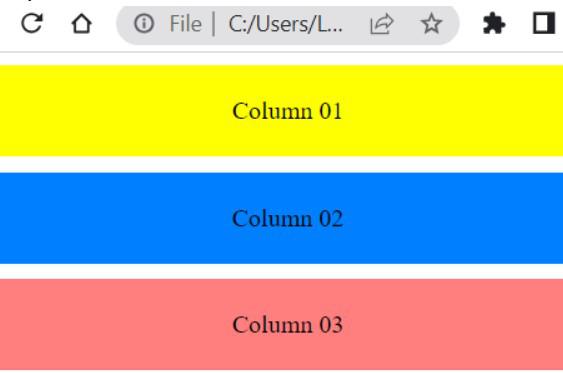
<div class="box red-box">Column 01</div>
</div>
<div class="cell small-12 medium-4">
<div class="box green-box">Column 02</div>
</div>
<div class="cell small-12 medium-4">
<div class="box blue-box">Column 03</div>
</div>
</div>
</div>
<script src="path/to/foundation.min.js"></script>
</body>
</html>
|
Output:
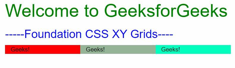
Example 2: In this example, we will create a 3 Cell grid structure.
HTML
<!DOCTYPE html>
<html lang="en">
<head>
<link rel="stylesheet" href=
<script src=
</script>
</head>
<body style="margin-inline: 10rem">
<h1 style="color: green">
Welcome to GeeksforGeeks
</h1>
<h3 style="color: blue">
-----Foundation CSS XY Grids----
</h3>
<div class="grid-x grid-padding-x
small-up-2 medium-up-4 large-up-6">
<div class="cell" style="background-color: red">
Geeks!
</div>
<div class="cell"
style="background-color: rgb(147, 180, 151)">
Geeks!
</div>
<div class="cell"
style="background-color: rgb(0, 355, 191)">
Geeks!
</div>
</div>
</body>
</html>
|
Output:
Reference: https://get.foundation/sites/docs/xy-grid.html#building-semantically
Share your thoughts in the comments
Please Login to comment...