CSS justify-items Property
Last Updated :
12 Apr, 2024
The `justify-items` property in CSS is important for aligning items within a grid container along the inline (row) axis. It allows you to control the alignment of grid items in a grid container when they do not explicitly position themselves using grid-area or similar properties.
Similar to `align-items` property for flex containers, justify-items enables you to align grid items horizontally within their grid areas.
Syntax:
justify-items: normal | stretch | <baseline-position> | <overflow-position>? [ <self-position> | left | right ] |
legacy | positional alignment | Initial | inherit | inherit
Now, let’s understand each of the property values:
1. Basic Keyword Values:
- stretch: Default value of the `justify-items`. The grid items are stretched to fit the grid area.
Syntax:
justify-items: stretch;
- normal: This property aligns grid items within a grid container based on their context. In grid layouts, it acts like
stretch (items fill their cell’s width); in other layouts, it often defaults to start alignment.
Syntax:
justify-items: normal;
Example:
HTML
<!DOCTYPE html>
<html>
<head>
    <title>
        CSS | justify-items Property
    </title>
    <style>

        #stretch {
            width: 320px;
            height: 200px;
            border: 2px solid black;
            display: grid;
            justify-items: stretch;
        }
    </style>
</head>

<body>
    <center>
        <h1 style="color:green;">GeeksforGeeks</h1>
        <div id="stretch">
            <div style="background-color:Yellow;">
            Yellow
            </div>
        </div>
    </center>
</body>
</html>
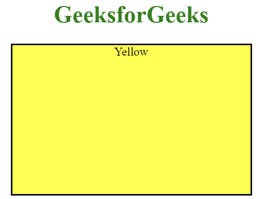
Output: The grid item is taking the whole width of the parent container.
2. Positional alignment Values:
- start: Grid items are aligned to the start of the grid area.
- left: Aligns grid items to the left within the grid area.
- self-start: Aligns the grid items to the start of their respective grid cells along the inline axis (row).
Syntax:
justify-items: start | left | self-start;
- end: Align items to the end of the container’s cross axis.
- right: Aligns grid items to the right within the grid area.
- self-end: Aligns items to the end of their individual flex container.
Syntax:
justify-items: end | right | self-end;
- center: Grid items are centered within the grid area.
Syntax:
justify-items: center;
Example:
HTML
<!DOCTYPE html>
<html>
    <head>
        <title>
            CSS | justify-items Property
        </title>
        <style>
            #container{
            display:flex;
            align-items:center;
            justify-content:center;
            }
            .child{
            width: 100px;
            height: 100px;
            margin-right:2rem;
            border: 2px solid black;
            display: grid;
            }
            #start {
            justify-items: start;
            }
            #end {
            justify-items: end;
            }
            #center {
            justify-items: center;
            }
        </style>
    </head>
    <body>
        <center>
            <h1 style="color:green;">GeeksforGeeks</h1>
            <div id="container">
                <!--justify-items: start | left | self-start -->
                <div class="child" id="start">
                    <div style="background-color:green;">
                        Start
                    </div>
                    <div style="background-color:Yellow;">
                        Left
                    </div>
                </div>
                <!--justify-items: center -->
                <div class="child" id="center">
                    <div style="background-color:green;">
                        Center
                    </div>
                    <div style="background-color:Yellow;">
                        Center
                    </div>
                </div>
                <!--justify-items: end | right | self-end; -->
                <div class="child" id="end">
                    <div style="background-color:green;">
                        End
                    </div>
                    <div style="background-color:Yellow;">
                        right
                    </div>
                </div>
            </div>
        </center>
    </body>
</html>
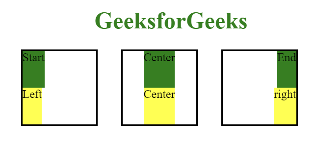
Output: The 3 contianers represent the different values of positional alignment.
3. Baseline alignment values:
- baseline: Aligns grid items along their baseline.
- first baseline: Aligns grid items along their first baseline.
- last baseline: Aligns grid items along their last baseline.
Syntax:
justify-items: first baseline | last baseline;
Example:
HTML
<!DOCTYPE html>
<html>
    <head>
        <title>
            CSS | justify-items Property
        </title>
        <style>
            #container{
            display:flex;
            align-items:center;
            justify-content:center;
            }
            .child{
            width: 150px;
            height: 150px;
            margin-right:2rem;
            border: 1px solid red;
            display: grid;
            }
            #first-baseline {
            justify-items: first baseline;
            }
            #last-baseline {
            justify-items: last baseline;
            }
        </style>
    </head>
    <body>
        <center>
            <h1 style="color:green;">GeeksforGeeks</h1>
            <div id="container">

                <!--justify-items: first baseline -->
                <div class="child" id="first-baseline">
                    <div> First Baseline </div>
                    <div> First Baseline  </div>
                </div>

                <!--justify-items:last baseline; -->
                <div class="child" id="last-baseline">
                    <div> Last Baseline </div>
                    <div> Last Baseline  </div>
                </div>
            </div>
        </center>
    </body>
</html>
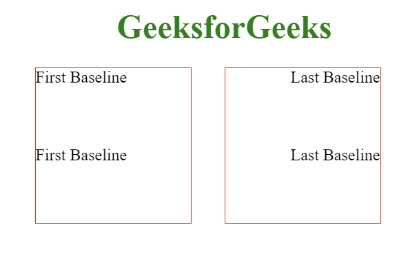
Output: The first container represent the `value: first baseline` and the second container represent `value: last baseline` alignment.
4. Overflow alignment Values:
Used with the optional positional alignment value.
safe <right | left | center >: If the item is too big for its container, the alignment will change to start to make sure you can still see all of the content.
Syntax:
justify-items: safe <right | left | center>;
unsafe <right | left | center>: The alignment you chose (right, left, center) stays the same, even if the item gets cut off because it overflows its container.
Syntax:
justify-items: unsafe <right | left | center>;
5. Legacy Values:
- legacy <left | center | right>: When paired with directional keywords,
justify-items is inherited by descendants but overridden by justify-self: auto; legacy behavior is ignored while the directional keyword persists, defaulting to normal if no keyword is provided.
Syntax:
justify-items: legacy <left | center | right>;
6. Global Values:
- Inherit: Inherit the value from the parent element.
- initial: Sets the property to its default value.
- unset: Resets it to inherit from its parent element or defaults to its initial value if not inherited.
Syntax:
justify-items: <inherit | initial | unset>;
Example:
HTML
<!DOCTYPE html>
<html>
    <head>
        <title>
            CSS | justify-items Property
        </title>
        <style>
            #initial {
            width: 320px;
            height: 200px;
            border: 2px solid black;
            display: grid;
            justify-items: initial;
            }
        </style>
    </head>
    <body>
        <center>
            <h1 style="color:green;">GeeksforGeeks</h1>
            <div id="initial">
                <div style="background-color:green;">
                    Green
                </div>
                <div style="background-color:Yellow;">
                    Yellow
                </div>
            </div>
        </center>
    </body>
</html>
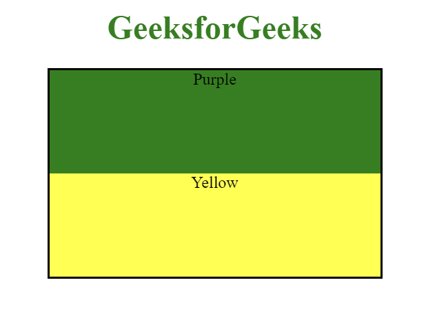
Output: It used the initial value which set it to the default value of element.
Supported Browsers: CSS justify-items property
- Google Chrome: 52.0 and above
- Edge: 12.0 and above
- Internet Explorer: 11.0 and above
- Firefox: 20.0 and above
- Opera: 12.1 and above
- Safari: 9.0 and above
Share your thoughts in the comments
Please Login to comment...