CSS Buttons
Last Updated :
17 Jan, 2024
The CSS Buttons are used to decorate the web pages by applying the various styling properties to the button. Buttons are used for event processing and interacting with the user. From submitting a form to getting to view some information, we have to click on buttons. A button tag is used to create buttons in HTML.
Example: The implementation of the many buttons functionality with its multiple attributes.
HTML
<!DOCTYPE html>
<html>
<head>
<title> HTML <button> tag</title>
<style>
body {
text-align: center;
}
h1 {
color: green;
text-align: center;
}
</style>
</head>
<body>
<h1>GeeksforGeeks</h1>
<h2><button> tag</h2>
<button>Button</button>
</body>
</html>
|
Output:

Basic Styling in button: There are many CSS properties used to style the button element which is discussed below:
background-color:
This property is used to set the background color of the button.
Syntax:
element {
     background-color: color_name;
}
Example: This example describes the Button with basic styling property where the background-color is applied to the button.
HTML
<!DOCTYPE html>
<html>
<head>
<title>HTML <button> tag </title>
<style>
body {
text-align: center;
}
h1 {
color: green;
text-align: center;
}
.b1 {
background-color: red;
}
.b2 {
background-color: blue;
}
.b3 {
background-color: green;
}
.b4 {
background-color: yellow;
}
</style>
</head>
<body>
<h1>GeeksforGeeks</h1>
<h2><button> tag</h2>
<div class="btn">
<button class="button b1">Red</button>
<button class="button b2">Blue</button>
<button class="button b3">Green</button>
<button class="button b4">Yellow</button>
</div>
</body>
</html>
|
Output:

border:
This property is used to set the border of the button.
Syntax:
element {
      border: style;
}
Example: This example describes the Button with the border property.
HTML
<!DOCTYPE html>
<html>
<head>
<title>HTML <button> tag</title>
<style>
body {
text-align: center;
}
h1 {
color: green;
text-align: center;
}
.b1 {
border: none;
}
.b2 {
border: 2px black solid;
}
.b3 {
border: 2px black dashed;
}
.b4 {
border: 2px black double;
}
</style>
</head>
<body>
<h1>GeeksforGeeks</h1>
<h2><button> tag</h2>
<div class="btn">
<button class="button b1">Red</button>
<button class="button b2">Blue</button>
<button class="button b3">Green</button>
<button class="button b4">Yellow</button>
</div>
</body>
</html>
|
Output:

color:
This property is used to set color of the text in the button. The color value can be set in terms of color name, color hex code, etc.
Syntax:
element {
     color: style;
}
Example: This example describes the Button with the color property.
HTML
<!DOCTYPE html>
<html>
<head>
<title>HTML <button> tag </title>
<style>
h1 {
color: green;
}
.button {
border: none;
color: white;
border-radius: 8px;
text-align: center;
padding: 20px;
cursor: pointer;
font-size: 20px;
}
.b1 {
color: white;
}
.b2 {
color: black;
}
.b3 {
color: blue;
}
.b4 {
color: crimson;
}
</style>
</head>
<body>
<h1>GeeksforGeeks</h1>
<h2>HTML <button> tag</h2>
<div class="btn">
<button class="button b1">Red</button>
<button class="button b2">Blue</button>
<button class="button b3">Green</button>
<button class="button b4">Yellow</button>
</div>
</body>
</html>
|
Output:
This property is used to set the padding in the button.
Syntax:
element {
     padding: style;
}
Example: This example describes the Button with the padding property.
HTML
<!DOCTYPE html>
<html>
<head>
<title>HTML button tag </title>
<style>
h1 {
color: green;
text-align: center;
}
.button {
border: none;
color: white;
border-radius: 8px;
text-align: center;
padding: 20px;
cursor: pointer;
font-size: 20px;
}
.b1 {
background-color: red;
padding: 15px 32px;
}
.b2 {
background-color: blue;
padding: 24px 50px;
}
.b3 {
background-color: green;
padding: 32px 32px;
}
.b4 {
background-color: yellow;
padding: 16px;
}
</style>
</head>
<body>
<h1>GeeksforGeeks</h1>
<h2>HTML <button> tag</h2>
<div class="btn">
<button class="button b1">Red</button>
<button class="button b2">Blue</button>
<button class="button b3">Green</button>
<button class="button b4">Yellow</button>
</div>
</body>
</html>
|
Output:

font-size:
This property is used to set the font size of the text in the button. Change the pixel value to get the desired size.
Syntax:
element {
     font-size: style;
}
Example: This example describes the Button with the font-size property to adjust the font of the button.
HTML
<!DOCTYPE html>
<html>
<head>
<title>HTML button tag </title>
<style>
h1 {
text-align: center;
}
.button {
border: none;
color: white;
border-radius: 8px;
text-align: center;
padding: 20px;
cursor: pointer;
font-size: 20px;
}
.b1 {
background-color: red;
font-size: 10px;
}
.b2 {
background-color: blue;
font-size: 15px;
}
.b3 {
background-color: green;
font-size: 20px;
}
.b4 {
background-color: yellow;
font-size: 30px;
}
</style>
</head>
<body>
<h1>GeeksforGeeks</h1>
<h2>HTML <button> tag</h2>
<div class="btn">
<button class="button b1">Red</button>
<button class="button b2">Blue</button>
<button class="button b3">Green</button>
<button class="button b4">Yellow</button>
</div>
</body>
</html>
|
Output:
border-radius:
This property is used to set the border-radius of the button. It sets the rounded corners of the border.
Syntax:
element {
     border-radius: property;
}
Example: This example describes the Button with the border-radius property.
HTML
<!DOCTYPE html>
<html>
<head>
<title>HTML button tag </title>
<style>
h1 {
color: green;
}
.button {
border: none;
color: white;
border-radius: 8px;
text-align: center;
padding: 20px;
cursor: pointer;
font-size: 20px;
}
.b1 {
background-color: red;
border-radius: 3px;
}
.b2 {
background-color: blue;
border-radius: 16px;
}
.b3 {
background-color: green;
border-radius: 30px;
}
.b4 {
background-color: yellow;
border-radius: 70px;
}
</style>
</head>
<body>
<h1>GeeksforGeeks</h1>
<h2>HTML <button> tag with border radius</h2>
<div class="btn">
<button class="button b1">Red</button>
<button class="button b2">Blue</button>
<button class="button b3">Green</button>
<button class="button b4">Yellow</button>
</div>
</body>
</html>
|
Output:

box-shadow:
This box-shadow property is used to create the shadow of the button box.
Syntax:
box-shadow: [horizontal offset] [vertical offset] [blur radius]
            [optional spread radius] [color];
Example: This example describes the Button with the box-shadow property.
HTML
<!DOCTYPE html>
<html>
<head>
<title>HTML button tag </title>
<style>
h1 {
color: green;
}
.button {
border: none;
color: white;
border-radius: 8px;
text-align: center;
padding: 20px;
cursor: pointer;
font-size: 20px;
}
.b1 {
padding: 15px 32px;
border: none;
font-size: 16px;
color: white;
}
.b2 {
background-color: green;
box-shadow: 0 8px 16px 0 rgba(0, 0, 0, 0.2),
0 6px 20px 0 rgba(0, 0, 0, 0.19);
}
</style>
</head>
<body>
<h1>GeeksforGeeks</h1>
<h2>HTML <button> tag with box shadow</h2>
<div class="btn">
<button class="button b1">Red</button>
<button class="button b2">Blue</button>
</div>
</body>
</html>
|
Output:

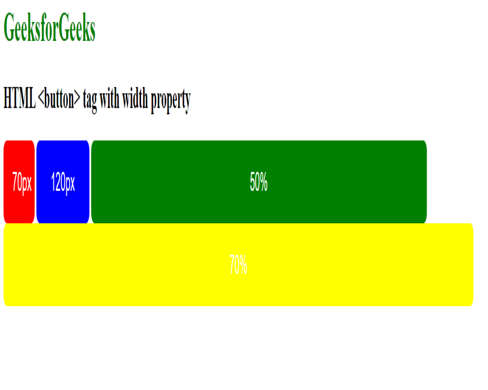
width:
This property is used to set the width of the button.
Syntax:
element {
     width: property;
}
Example: This example describes the Button with the width property to set the width of the button.
HTML
<!DOCTYPE html>
<html>
<head>
<title> button tag </title>
<style>
h1 {
color: green;
}
.button {
border: none;
color: white;
border-radius: 8px;
text-align: center;
padding: 20px;
cursor: pointer;
font-size: 20px;
}
/* adding width in buttons */
.b1 {
background-color: red;
width: 70px;
}
.b2 {
background-color: blue;
width: 120px;
}
.b3 {
background-color: green;
width: 50%;
}
.b4 {
background-color: yellow;
width: 70%;
}
</style>
</head>
<body>
<h1>GeeksforGeeks</h1>
<h2>HTML <button> tag with width property</h2>
<div class="btn">
<button class="button b1">Red</button>
<button class="button b2">Blue</button>
<button class="button b3">Green</button>
<button class="button b4">Yellow</button>
</div>
</body>
</html>
|
Output:
Hover Effects:
This hover property is used to change the button interface when the mouse moves over.
Syntax:
element:hover {
    // CSS property
}
Example: This example describes the Button with the hovering effect on the button.
HTML
<!DOCTYPE html>
<html>
<head>
<title>HTML button tag </title>
<style>
h1 {
color: green;
}
.button {
border: none;
color: white;
border-radius: 8px;
text-align: center;
padding: 20px;
cursor: pointer;
font-size: 20px;
}
.b1 {
background-color: green;
}
.b2 {
background-color: orange;
}
.b1:hover {
background-color: white;
color: orange;
}
.b2:hover {
background-color: white;
color: green;
}
</style>
</head>
<body>
<h1>GeeksforGeeks</h1>
<h2>HTML <button> tag with hover</h2>
<div class="btn">
<button class="button b1">Red</button>
<button class="button b2">Blue</button>
</div>
</body>
</html>
|
Output:

Animated , Disabled, Fade in effect
- Animated Button: Makes clicking a button more interesting by adding a gentle, animation.
- Disabled Button: Indicates a button that is temporarily inactive, or its action is not currently available.
- Fade-in Effect on Hover: The button changes colors smoothly when you hover over it, making it look polished and responsive.
Example: This example shows the implementation of above three effects with help of an example
HTML
<!DOCTYPE html>
<html>
<head>
<title>HTML button tag</title>
<style>
h1 {
color: green;
}
button {
margin-top: 15px;
padding: 10px;
display: block;
cursor: pointer;
transition: background-color 0.3s, color 0.3s;
}
/* Disabled button styling */
button:disabled {
opacity: 0.5;
cursor: not-allowed;
}
/* Animated button styling */
button.animated {
animation: pulse 1s infinite;
}
@keyframes pulse {
0% {
transform: scale(1);
}
50% {
transform: scale(1.1);
}
100% {
transform: scale(1);
}
}
/* Fade-in effect on hover */
button:hover {
background-color: #2ecc71;
color: #fff;
}
</style>
</head>
<body>
<h1>GeeksforGeeks</h1>
<h2>HTML <button> tag</h2>
<button>Button</button>
<button disabled>
Disabled Button
</button>
<button class="animated">
Animated Button
</button>
</body>
</html>
|
Output:

Supported Browsers:
- Google Chrome
- Firefox
- Microsoft Edge
- Opera
- Safari
Share your thoughts in the comments
Please Login to comment...