Circular Barplots and Customisation in R
Last Updated :
07 Mar, 2022
In this article, we are going to see how to create Circular Barplots and Customisation in R Programming Language.
A circular barplot is similar to a barplot, but instead of cartesian coordinates, it uses polar coordinates. A circular barplot is one in which the bars are presented in a circle rather than a line. This article will show you how to create such graphs using R and ggplot2. It contains reproducible code and explains how to use the coord_polar() method.
Define the data
To use dataset in barplot we need to create dataset so here we will create it.
R
library(tidyverse)
library(ggplot2)
data = data.frame(
index = seq(1,100),
label = paste( data ="Data ",
seq(1,100),
sep="= "),
values = sample( seq(10,100), 100, replace = T)
)
head(data)
|
Output:
  index   label  values
1     1 Data -1     28
2     2 Data -2     46
3     3 Data -3     54
4     4 Data -4     25
5     5 Data -5     43
6     6 Data -6     26
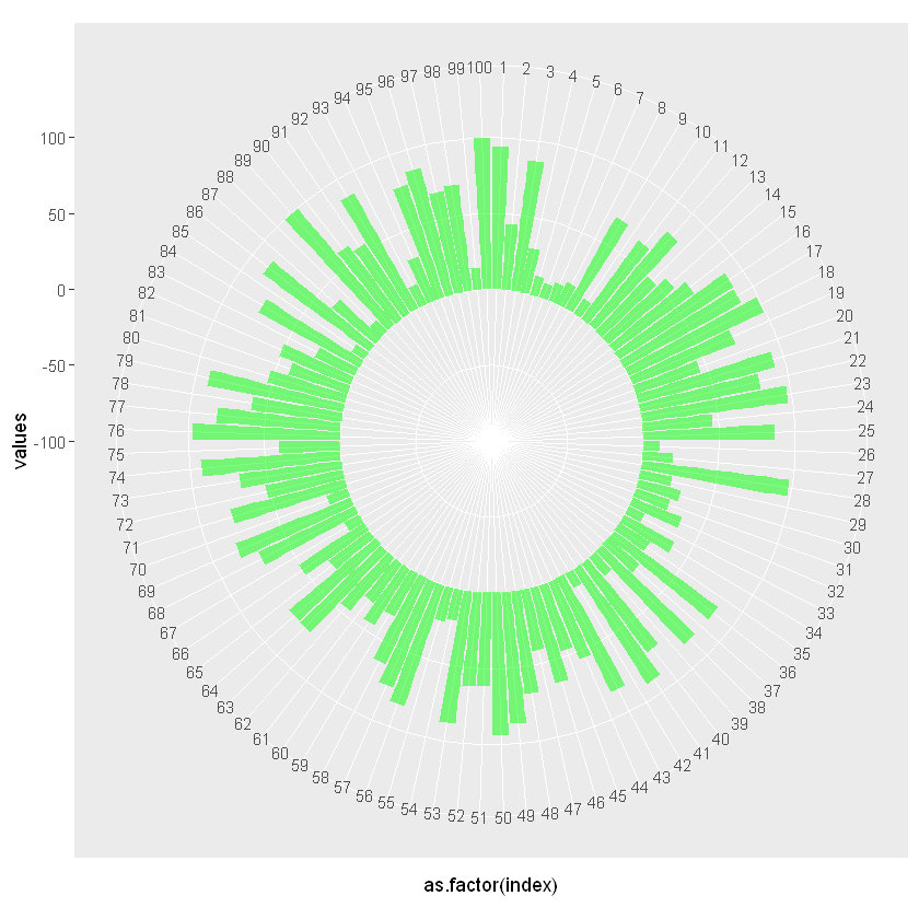
Example 1: Basic Circular BarPlot
coord_polar() methods used to create plot in specific coordinated.
Syntax: coord_polar(theta = “x”, start = 0, direction = 1, clip = “on”)
Parameters:
- theta: Variable to map angle to (x or y)
- start : Offset of starting point from 12 o’clock in radians. Offset is applied clockwise or anticlockwise depending on value of direction.
- direction : 1, clockwise; -1, anticlockwise
- clip : Should drawing be clipped to the extent of the plot panel? A setting of “on” (the default) means yes, and a setting of “off” means no. For details, please see coord_cartesian().
R
p <- ggplot(data, aes(x = as.factor(index),
y = values)) +
geom_bar(stat = "identity",
fill=alpha("green", 0.5)) +
ylim(-100,120) +
coord_polar(start = 0)
p
|
Output:
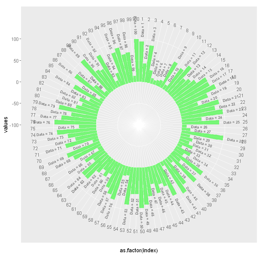
Example 2: Adding labels to the data
To add labels and data into it will use geom_text() methods.
R
data_with_labels = data
number_of_label <- nrow(data_with_labels)
angle <- 90 - 360 * (data_with_labels$index - 0.5) /number_of_label
data_with_labels$hjust<-ifelse( angle < -90, 1, 0)
data_with_labels$angle<-ifelse(angle < -90,
angle + 180, angle)
p <- ggplot(data, aes(x = as.factor(index),
y = values)) +
geom_bar(stat = "identity",
fill=alpha("green", 0.5)) +
ylim(-100,120) +
coord_polar(start = 0) +
geom_text(data = data_with_labels,
aes(x = index, y = values+10,
label = label, hjust=hjust),
color = "black", fontface="bold",
alpha = 0.6, size = 2.5,
angle = data_with_labels$angle,
inherit.aes = FALSE )
p
|
Output:
Share your thoughts in the comments
Please Login to comment...