Build a Random User Generator App Using ReactJS
Last Updated :
26 Oct, 2023
In this article, we will create a random user generator application using API and React JS. A Random User Generator App Using React Js is a web application built with the React.js library that generates random user profiles. It typically retrieves and displays details like names, photos, and contact information to simulate user data for testing and design purposes.
Preview Image:
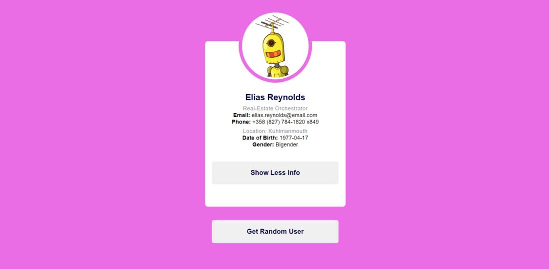
Preview
Steps to Create a React Application:
Step 1: Create a react application by using this command
npx create-react-app RandomUserApp
Step 2: After creating your project folder, i.e. RandomUserApp, use the following command to navigate to it:
cd RandomUserApp
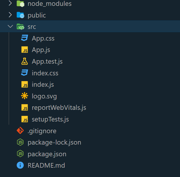
Project Structure:
The package.json file will look like:
{
  "name": "RandomUserApp",
  "version": "0.0.0",
  "private": true,
  "dependencies": {
    "react": "18.2.0",
    "react-dom": "18.2.0"
  },
  "scripts": {
    "start": "react-scripts start",
    "build": "react-scripts build",
    "test": "react-scripts test --env=jsdom",
    "eject": "react-scripts eject"
  },
  "devDependencies": {
    "react-scripts": "latest"
  }
}
Approach:
- The React component called “App” is responsible for creating an engaging Random User Generator application. It employs a well-defined set of instructions to execute
- The state variables are initialized by utilizing the useState function. This allows for the storage of user data (user) and toggling the display of additional information (showMoreInfo).
- The useEffect hook is employed to fetch user data from a random user API when the component mounts. This ensures that the data is retrieved when the app loads.
- The user data is retrieved through the getUser function from a designated API.
- The function changeThemeColor is responsible for generating a random color and applying it to the app’s theme through CSS custom properties.
- The function toggleMoreInfo is designed to alternate the state of showMoreInfo, enabling or disabling the visibility of additional user information.
- The JSX rendering of the component showcases various user details, such as their avatar, name, job title, email address, phone number, and location. In addition to this primary information, a convenient button enables users to toggle visibility for more comprehensive details.
- Event handlers, such as onClick for the “Get Random User” button and the “Show More Info” button, have been defined to activate specific actions.
Example : Write the below code in App.js file and style.css in the src directory
Javascript
import React, { useState, useEffect } from 'react';
import './style.css';
function App() {
const [user, setUser] = useState({
avatar: '',
first_name: '',
last_name: '',
employment: { title: '' },
address: { city: '' },
email: '',
dob: '',
gender: '',
});
const [showMoreInfo, setShowMoreInfo] = useState(false);
useEffect(() => {
getUser();
}, []);
const getUser = () => {
const url =
fetch(url)
.then((resp) => resp.json())
.then((data) => {
setUser(data);
changeThemeColor();
});
};
const changeThemeColor = () => {
const randomColor =
'#' + ((Math.random() * 0xffffff) << 0)
.toString(16).padStart(6, '0');
document.documentElement.style.setProperty(
'--theme-color', randomColor);
};
const toggleMoreInfo = () => {
setShowMoreInfo(!showMoreInfo);
};
return (
<div className="container">
<div className="card">
<div className="img-container">
<img src={user.avatar}
alt={`${user.first_name}
${user.last_name}`} />
</div>
<div className="details">
<h2>{`${user.first_name} ${user.last_name}`}</h2>
<h3>{user.employment.title}</h3>
<p>
<strong
>Email:
</strong>
{user.email}
</p>
<p>
<strong>
Phone:
</strong>
{user.phone_number}
</p>
<h4>Location:
{user.address.city}</h4>
{showMoreInfo && (
<div>
<p>
<strong>
Date of Birth:
</strong>
{user.date_of_birth}
</p>
<p>
<strong>
Gender:
</strong>
{user.gender}
</p>
</div>
)}
<button onClick={toggleMoreInfo}>
{showMoreInfo ?
'Show Less Info' : 'Show More Info'}
</button>
</div>
</div>
<button onClick={getUser}>
Get Random User
</button>
</div>
);
}
export default App;
|
CSS
* {
padding: 0;
margin: 0;
box-sizing: border-box;
font-family: "Poppins", sans-serif;
}
:root {
--theme-color: #5074f3;
}
body {
background-color: var(--theme-color);
}
.container {
width: 90%;
max-width: 25em;
position: absolute;
transform: translate(-50%, -50%);
top: 50%;
left: 50%;
}
.card {
width: 100%;
padding: 4em 0;
background-color: #ffffff;
text-align: center;
border-radius: 0.5em;
}
.card .img-container {
height: 11.25em;
width: 11.25em;
display: block;
margin: -8.75em auto 0 auto;
background-color: #ffffff;
box-shadow: 0 0 0 0.3em #ffffff, 0 0 0 0.9em var(--theme-color);
border-radius: 50%;
}
.img-container img {
width: 100%;
border-radius: 50%;
}
.container button {
display: block;
font-size: 1.2em;
width: 90%;
margin: 2em auto 0 auto;
padding: 1.1em 0;
border-radius: 0.3em;
border: none;
outline: none;
font-weight: 600;
color: #000341;
cursor: pointer;
}
.card h2 {
margin-top: 1.8em;
font-weight: 600;
color: #000341;
}
.card h3,
.card h4 {
font-size: 1em;
letter-spacing: 0.02em;
margin-top: 0.5em;
font-weight: 300;
color: #90919e;
}
.card i {
color: var(--theme-color);
margin-right: 0.3em;
}
.card h4 {
margin-top: 0.4em;
}
|
Steps to run the Application:
- Type the following command in the terminal:
npm start
- Type the following URL in the browser:
http://localhost:3000/
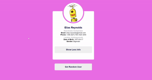
Output:
Share your thoughts in the comments
Please Login to comment...