Bootstrap 5 Select Sizing
Last Updated :
04 Apr, 2023
Bootstrap 5 Select Sizing is used to choose form’s select small and large custom selects to match your different-sized text inputs. The large-sized select element used the class form-select-lg and the small-sized select uses the form-select-sm class.
Bootstrap 5 Select Sizing Class: The default size is medium size so we don’t need to put any class for that.
- form-select-sm: This class is used to set the select input in small size.
- form-select-lg: This class is used to set the select input in large size.
Syntax: The * can be replaceable with sm and lg according to your text-inputs size.
<select class="form-select form-select-*">
    ...
</select>
Example 1: In this example, we show the default and the large-sized using the “form-select-lg” class.
HTML
<!DOCTYPE html>
<html lang="en">
<head>
<meta charset="UTF-8">
<meta http-equiv="X-UA-Compatible" content="IE=edge">
<meta name="viewport" content="width=device-width, initial-scale=1.0">
<script src=
</script>
<script src=
</script>
<link rel="stylesheet"
href=
</head>
<body>
<div class="m-3">
<div class="geeksforgeeks">
<h3 class="text-success">GeeksforGeeks</h3>
<h4>Bootstrap 5 Select Sizing</h4>
</div>
<h5>Default Sized Select Element</h5>
<select class="form-select">
<option value="dsa">C/C++</option>
<option value="dev">Java</option>
<option value="cp">Rust</option>
<option value="sd">Python</option>
</select>
<h5>Large Sized Select Element</h5>
<select class="form-select form-select-lg">
<option value="dsa">C/C++</option>
<option value="dev">Java</option>
<option value="cp">Rust</option>
<option value="sd">Python</option>
</select>
</div>
</body>
</html>
|
Output:

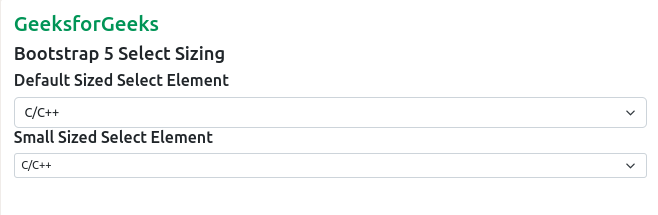
Example 2: In this example, the small-sized select element is shown using the class “form-control-sm”.
HTML
<!DOCTYPE html>
<html lang="en">
<head>
<meta charset="UTF-8">
<meta http-equiv="X-UA-Compatible" content="IE=edge">
<meta name="viewport" content="width=device-width, initial-scale=1.0">
<script src=
</script>
<script src=
</script>
<link rel="stylesheet"
href=
</head>
<body>
<div class="m-3">
<div class="geeksforgeeks">
<h3 class="text-success">GeeksforGeeks</h3>
<h4>Bootstrap 5 Select Sizing</h4>
</div>
<h5>Default Sized Select Element</h5>
<select class="form-select">
<option value="dsa">C/C++</option>
<option value="dev">Java</option>
<option value="cp">Rust</option>
<option value="sd">Python</option>
</select>
<h5>Small Sized Select Element</h5>
<select class="form-select form-select-sm">
<option value="dsa">C/C++</option>
<option value="dev">Java</option>
<option value="cp">Rust</option>
<option value="sd">Python</option>
</select>
</div>
</body>
</html>
|
Output:
Reference: https://getbootstrap.com/docs/5.2/forms/select/#sizing
Share your thoughts in the comments
Please Login to comment...