Bootstrap 5 Select SASS
Last Updated :
30 Jan, 2023
Bootstrap 5 Select SASS can be used to change the default values provided for the select menus by customizing scss file.
SASS variables of Select:
- $form-select-padding-y: This variable provides the top and bottom padding of the form select. By default, it is 0.375rem.
- $form-select-padding-x: This variable provides the left and right padding of the form select. By default, it is 0.75rem.
- $form-select-font-family: This variable provides the font family of the form select. By default, it is null.
- $form-select-font-size: This variable provides the font size of the form select. By default, it is 1rem.
- $form-select-indicator-padding: This variable provides the padding of the form select indicator.
- $form-select-font-weight: This variable provides the font weight of the form select. By default, it is 400.
- $form-select-line-height: This variable provides the line height of the form select. By default, it is 1.5.
- $form-select-color: This variable provides the text color on the form select menus. By default, it is gray color.
- $form-select-bg: This variable provides the background color of the form select menus. By default, it is white color.
- $form-select-disabled-color: This variable provides the text color of the disabled form select menus. By default, it is null.
- $form-select-disabled-bg: This variable provides the background color of the disabled form select menus. By default, it is gray color.
- $form-select-disabled-border-color: This variable provides the border color of the form select menu which is disabled. By default, it is null.
- $form-select-bg-position: This variable provides the position of the indicator of the form select menu. By default, it is right.
- $form-select-bg-size: This variable provides the dimension of the indicator of the form select menu. By default, it is 16px and 12px.
- $form-select-indicator-color: This variable provides the color of the indicator of the form select menu. By default, it is gray color.
- $form-select-indicator: This variable provides the url of the image of the indicator of form select menu. By default, it is expand icon.
- $form-select-feedback-icon-position: This variable provides the position of the feedback icon of the form select. By default, it is right to the center position.
- $form-select-feedback-icon-size: This variable provides the size of the feedback icon of the form select. By default, it is 0.5em.
- $form-select-border-width: This variable provides the width of the border of the form select. By default, it is 1px.
- $form-select-border-color: This variable provides the border color of the form select. By default, it is gray color.
- $form-select-border-radius: This variable provides the border radius of the form select. By default, it is 0.375rem.
- $form-select-box-shadow: This variable provides the box shadow of the form select. By default, the horizontal offset of shadow is 1px, the vertical offset of shadow is 2px, and the color of the shadow is black.
- $form-select-focus-border-color: This variable provides the border color of the form select on focus. By default, it is white.
- $form-select-focus-width: This variable provides the width of the form select on focus. By default, it is 0.25rem.
- $form-select-focus-box-shadow: This variable provides the box shadow of the form select on focus. By default, it is blue color with 0 h-offset and v-offset.
- $form-select-padding-y-sm: This variable provides the top and bottom padding of the form select in small size. By default, it is 0.25rem.
- $form-select-padding-x-sm: This variable provides the left and right padding of the form select in small size. By default, it is 0.5rem.
- $form-select-font-size-sm: This variable provides the font size of the form select in small size. By default, it is 0.875rem.
- $form-select-padding-y-lg: This variable provides the top and bottom padding of the form select in large size. By default, it is 0.5rem.
- $form-select-padding-x-lg: This variable provides the left and right padding of the form select in large size. By default, it is 1rem.
- $form-select-font-size-lg: This variable provides the font size of the form select in large size. By default, it is 1.25rem.
- $form-select-transition: This variable provides the transition of the form select. By default, the transition duration of the border color and box shadow is 0.15 seconds with ease-in-out as transition timing function.
Steps to override scss:
Step 1: Install bootstrap using following command:
npm i bootstrap
Step 2: Create your custom scss file and write the variable you want to override. Include the bootstrap scss file using import.
$SASS_variable: values;
@import "node_modules/bootstrap/scss/bootstrap"
Step 3: Convert the file to CSS using live server extension.
Step 4: Include the converted scss file to your HTML after the link tag of Bootstrap CSS.
Project Structure: The custom scss file name is “custom.scss” and “custom.css” is converted file
Syntax:
$variable: value
@import "./node_modules/bootstrap/scss/bootstrap"
Example 1: In this example, we make use of some of the above variables to change the default values of form select.
selectStyle.scss
CSS
$form-select-padding-y:0.8rem;
$form-select-padding-x:2.3rem;
$form-select-font-family:Lucida;
$form-select-font-size:22px;
$form-select-font-weight:600;
$form-select-line-height:3;
$form-select-color: white;
$form-select-bg:green;
$form-select-disabled-color:white;
$form-select-disabled-bg:black;
$form-select-disabled-border-color:black;
$form-select-bg-size:40px 30px;
$form-select-indicator-color:white;
@import "./node_modules/bootstrap/scss/bootstrap"
|
CSS file created after conversion
selectStyle.css
CSS
.form-select {
display: block;
width: 100%;
padding: 0.8rem 6.9rem 0.8rem 2.3rem;
-moz-padding-start: calc(2.3rem - 3px);
font-family: Lucida;
font-size: calc(1.2625rem + 0.15vw);
font-weight: 600;
line-height: 3;
color: white;
background-color: green;
background-image: url(
viewBox='0 0 16 16'%3e%3cpath
fill='none' stroke='white' stroke-linecap='round'
stroke-linejoin='round'
stroke-width='2'
d='m2 5 6 6 6-6'/%3e%3c/svg%3e");
background-repeat: no-repeat;
background-position: right 2.3rem center;
background-size: 40px 30px;
border: 1px solid #ced4da;
border-radius: 0.375rem;
transition: border-color 0.15s ease-in-out,
box-shadow 0.15s ease-in-out;
-webkit-appearance: none;
-moz-appearance: none;
appearance: none;
}
|
HTML Code:
HTML
<!DOCTYPE html>
<html lang="en">
<head>
<meta charset="UTF-8">
<meta name="viewport" content=
"width=device-width, initial-scale=1.0">
<title>Bootstrap 5 Select SASS</title>
<link href=
rel="stylesheet">
<link rel="stylesheet" href="selectStyle.css">
<script src=
</script>
</head>
<body class="text-center">
<div class="container">
<h1 class="text-success">GeeksforGeeks</h1>
<div class="container pt-3" style="width:700px;">
<select class="form-select">
<option selected>
Select the programming language
</option>
<option value="java">Java</option>
<option value="c++">C++</option>
<option value="python">Python</option>
<option value="c">C</option>
</select>
<br>
<p>Disabled Select</p>
<select class="form-select" disabled>
<option selected>
Select the programming language
</option>
<option value="java">Java</option>
<option value="c++">C++</option>
<option value="python">Python</option>
<option value="c">C</option>
</select>
</div>
</div>
</body>
</html>
|
Output:
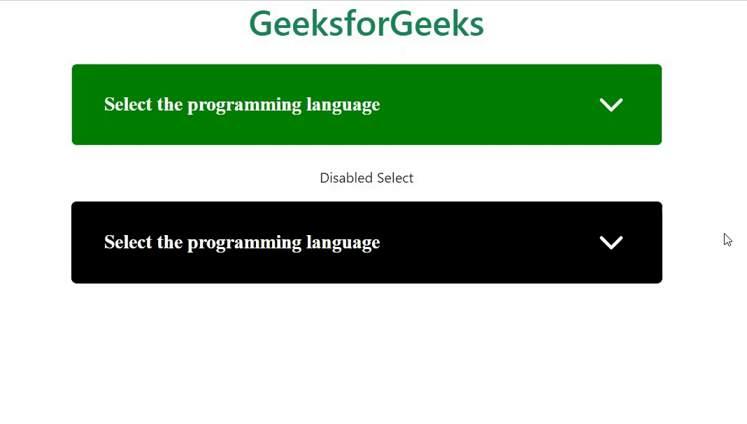
Output
Example 2: In this example, we make use of some of the above variables to change the default values of form select.
selectStyle2.scss
CSS
$form-select-feedback-icon-size:30px;
$form-select-feedback-icon-position:center;
$form-select-border-width:0.4rem;
$form-select-border-color:black;
$form-select-border-radius:2rem;
$form-select-focus-border-color:green;
$form-select-focus-width:1rem;
$form-select-focus-box-shadow:5px 10px rgb(117, 221, 117);
$form-select-transition:border-color 3.5s ease,box-shadow 2s ease-in-out;
@import "./node_modules/bootstrap/scss/bootstrap"
|
CSS file created after conversion
selectStyle2.css
CSS
.form-select {
display: block;
width: 100%;
padding: 0.375rem 2.25rem 0.375rem 0.75rem;
-moz-padding-start: calc(0.75rem - 3px);
font-size: 1rem;
font-weight: 400;
line-height: 1.5;
color: #212529;
background-color: #fff;
background-image: url(
viewBox='0 0 16 16'%3e%3cpath
fill='none' stroke='%23343a40'
stroke-linecap='round'
stroke-linejoin='round'
stroke-width='2'
d='m2 5 6 6 6-6'/%3e%3c/svg%3e");
background-repeat: no-repeat;
background-position: right 0.75rem center;
background-size: 16px 12px;
border: 0.4rem solid black;
border-radius: 2rem;
transition: border-color 3.5s ease, box-shadow 2s ease-in-out;
-webkit-appearance: none;
-moz-appearance: none;
appearance: none;
}
|
HTML Code:
HTML
<!DOCTYPE html>
<html lang="en">
<head>
<meta charset="UTF-8">
<meta name="viewport" content=
"width=device-width, initial-scale=1.0">
<title>Bootstrap 5 Select SASS</title>
<link href=
rel="stylesheet">
<link rel="stylesheet" href="selectStyle2.css">
<script src=
</script>
</head>
<body class="text-center">
<div class="container">
<h1 class="text-success">GeeksforGeeks</h1>
<div class="container pt-3" style="width:700px;">
<p>Form select with validation</p>
<form class="was-validated">
<select class="form-select">
<option selected>
Select the programming language
</option>
<option value="java">Java</option>
<option value="c++">C++</option>
<option value="python">Python</option>
<option value="c">C</option>
</select>
<div class="valid-feedback">
Please select any one
</div>
<button class="btn btn-success">
Submit form
</button>
</form><br>
<select class="form-select">
<option selected>
Select the programming language
</option>
<option value="java">Java</option>
<option value="c++">C++</option>
<option value="python">Python</option>
<option value="c">C</option>
</select>
</div>
</div>
</body>
</html>
|
Output:

Output
Example 3: In this example, we make use of some of the above variables of select sass to change the default values of form select.
selectStyle3.scss
CSS
$form-select-padding-y-sm:2rem;
$form-select-padding-x-sm:4rem;
$form-select-font-size-sm:18px;
$form-select-padding-y-lg:2.5rem;
$form-select-padding-x-lg:3rem;
$form-select-font-size-lg:22px;
@import "./node_modules/bootstrap/scss/bootstrap"
|
CSS file created after conversion
selectStyle3.css
CSS
.form-select {
display: block;
width: 100%;
padding: 0.375rem 2.25rem 0.375rem 0.75rem;
-moz-padding-start: calc(0.75rem - 3px);
font-size: 1rem;
font-weight: 400;
line-height: 1.5;
color: #212529;
background-color: #fff;
background-image: url(
viewBox=
'0 0 16 16'%3e%3cpath fill='none'
stroke='%23343a40' stroke-linecap='round'
stroke-linejoin='round' stroke-width='2'
d='m2 5 6 6 6-6'/%3e%3c/svg%3e");
background-repeat: no-repeat;
background-position: right 0.75rem center;
background-size: 16px 12px;
border: 1px solid #ced4da;
border-radius: 0.375rem;
transition: border-color 0.15s ease-in-out,
box-shadow 0.15s ease-in-out;
-webkit-appearance: none;
-moz-appearance: none;
appearance: none;
}
.form-select-sm {
padding-top: 2rem;
padding-bottom: 2rem;
padding-left: 4rem;
font-size: 1.125rem;
border-radius: 0.25rem;
}
.form-select-lg {
padding-top: 2.5rem;
padding-bottom: 2.5rem;
padding-left: 3rem;
font-size: calc(1.2625rem + 0.15vw);
border-radius: 0.5rem;
}
|
HTML Code:
HTML
<!DOCTYPE html>
<html lang="en">
<head>
<meta charset="UTF-8">
<meta name="viewport" content=
"width=device-width, initial-scale=1.0">
<title>Bootstrap 5 Select SASS</title>
<link href=
rel="stylesheet">
<link rel="stylesheet" href="selectStyle3.css">
<script src=
</script>
</head>
<body class="text-center">
<div class="container">
<h1 class="text-success">GeeksforGeeks</h1>
<div class="container pt-3" style="width: 700px;">
<h5>Small Form select</h5>
<select class="form-select form-select-sm">
<option selected>Select the programming language</option>
<option value="java">Java</option>
<option value="c++">C++</option>
<option value="python">Python</option>
<option value="c">C</option>
</select>
<h5 class="pt-4">Large Form select</h5>
<select class="form-select form-select-lg">
<option selected>Select the programming language</option>
<option value="java">Java</option>
<option value="c++">C++</option>
<option value="python">Python</option>
<option value="c">C</option>
</select>
</div>
</div>
</body>
</html>
|
Output:

Output
Reference: https://getbootstrap.com/docs/5.0/forms/select/#sass
Share your thoughts in the comments
Please Login to comment...