Bootstrap Flex Auto margins
Last Updated :
26 Apr, 2024
Bootstrap introduces the Flex property for the flexible arrangement of items within containers. This utility provides various properties, including auto-margin, enabling easy manipulation of layouts. With Flex, developers can efficiently modify and organize flex items within containers for enhanced design control.
Flex Auto margins used Classes:
| Class | Description |
|---|
| .ms-auto | Adds auto margin to the start (left) of flex items, pushing them towards the right side of the container. |
| .me-auto | Sets auto margin to the end (right) of flex items, pushing them towards the left side of the container. |
Syntax:
<div class="d-flex">
<div class="*-auto"> Content... </div>
...
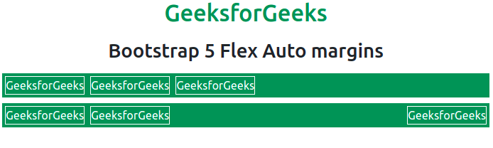
</div>Example 1: In this example, we will use .d-flex and .ms-auto classes to place the flex items.
HTML
<!DOCTYPE html>
<html lang="en">

<head>
    <title>Bootstrap 5 Flex Auto margins</title>
    <link href=
"https://cdn.jsdelivr.net/npm/bootstrap@5.0.2/dist/css/bootstrap.min.css"
          rel=
"stylesheet"
        integrity=
"sha384-EVSTQN3/azprG1Anm3QDgpJLIm9Nao0Yz1ztcQTwFspd3yD65VohhpuuCOmLASjC"
        crossorigin="anonymous">
    <script src=
"https://cdn.jsdelivr.net/npm/bootstrap@5.0.2/dist/js/bootstrap.bundle.min.js"
        integrity=
"sha384-MrcW6ZMFYlzcLA8Nl+NtUVF0sA7MsXsP1UyJoMp4YLEuNSfAP+JcXn/tWtIaxVXM"
        crossorigin="anonymous">
        </script>
</head>

<body>
    <h1 class="text-success text-center">
        GeeksforGeeks
    </h1>

    <h2 class="text-center m-3">
        Bootstrap 5 Flex Auto margins
    </h2>

    <div class="d-flex bg-success m-2 text-white">
        <div class="m-1 border border-white">
            GeeksforGeeks
        </div>

        <div class="m-1 border border-white">
            GeeksforGeeks
        </div>

        <div class="m-1 border border-white">
            GeeksforGeeks
        </div>
    </div>

    <div class="d-flex bg-success m-2 text-white">
        <div class="m-1 border border-white">
            GeeksforGeeks
        </div>

        <div class="m-1 border border-white">
            GeeksforGeeks
        </div>

        <div class="ms-auto m-1 border border-white">
            GeeksforGeeks
        </div>
    </div>
</body>

</html>
Output:
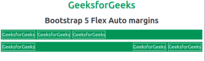
Example 2: In this example, we will use .d-flex and .me-auto classes to place the flex items.
HTML
<!DOCTYPE html>
<html lang="en">

<head>
    <link href=
"https://cdn.jsdelivr.net/npm/bootstrap@5.0.2/dist/css/bootstrap.min.css"
          rel="stylesheet"
        integrity=
"sha384-EVSTQN3/azprG1Anm3QDgpJLIm9Nao0Yz1ztcQTwFspd3yD65VohhpuuCOmLASjC"
        crossorigin="anonymous">
    <script src=
"https://cdn.jsdelivr.net/npm/bootstrap@5.0.2/dist/js/bootstrap.bundle.min.js"
        integrity=
"sha384-MrcW6ZMFYlzcLA8Nl+NtUVF0sA7MsXsP1UyJoMp4YLEuNSfAP+JcXn/tWtIaxVXM"
        crossorigin="anonymous">
        </script>
</head>

<body>
    <h1 class="text-success text-center">
        GeeksforGeeks
    </h1>

    <h2 class="text-center m-3">
        Bootstrap 5 Flex Auto margins
    </h2>

    <div class="d-flex bg-success m-2 text-white">
        <div class="m-1 border border-white">
            GeeksforGeeks
        </div>

        <div class="m-1 border border-white">
            GeeksforGeeks
        </div>

        <div class="m-1 border border-white">
            GeeksforGeeks
        </div>
    </div>

    <div class="d-flex bg-success m-2 text-white">
        <div class="me-auto m-1 border border-white">
            GeeksforGeeks
        </div>

        <div class="m-1 border border-white">
            GeeksforGeeks
        </div>

        <div class="m-1 border border-white">
            GeeksforGeeks
        </div>
    </div>
</body>

</html>
Output:
Auto Margins with align-items:
Auto Margin can also be used with the Align Items to vertically move items up or down. The .mb-auto class indicates that margin-bottom is set to auto, while .mt-auto class indicates margin-auto-top.
Example: In this example, we will use .d-flex, .align-items-start, and .align-items-end classes to place the flex items.
HTML
<!DOCTYPE html>
<html lang="en">

<head>
    <title>
        Bootstrap 5 Flex Auto Margin with Align Items
    </title>
    <link href=
"https://cdn.jsdelivr.net/npm/bootstrap@5.0.2/dist/css/bootstrap.min.css"
          rel="stylesheet"
        integrity=
"sha384-EVSTQN3/azprG1Anm3QDgpJLIm9Nao0Yz1ztcQTwFspd3yD65VohhpuuCOmLASjC"
        crossorigin="anonymous">
    <script src=
"https://cdn.jsdelivr.net/npm/bootstrap@5.0.2/dist/js/bootstrap.bundle.min.js"
        integrity=
"sha384-MrcW6ZMFYlzcLA8Nl+NtUVF0sA7MsXsP1UyJoMp4YLEuNSfAP+JcXn/tWtIaxVXM"
        crossorigin="anonymous">
        </script>
</head>

<body>
    <h1 class="text-success text-center">
        GeeksforGeeks
    </h1>

    <h2 class="text-center m-3">
        Bootstrap 5 Flex Auto Margin with Align Items
    </h2>

    <div class="d-flex align-items-start flex-column
        bg-success m-3 text-white" style="height: 200px;">
        <div class="mb-auto p-2 border border-white m-1">
            GeeksforGeeks
        </div>
        <div class="p-2 border border-white m-1">
            GeeksforGeeks
        </div>
        <div class="p-2 border border-white m-1">
            GeeksforGeeks
        </div>
    </div>

    <div class="d-flex align-items-end flex-column
        bg-success m-3 text-white" style="height: 200px;">
        <div class="p-2 border border-white m-1">
            GeeksforGeeks
        </div>

        <div class="p-2 border border-white m-1">
            GeeksforGeeks
        </div>

        <div class="mt-auto p-2 border border-white m-1">
            GeeksForGeeks
        </div>
    </div>
</body>

</html>
Output:

Share your thoughts in the comments
Please Login to comment...