Bootstrap 5 Dropdowns Usage
Last Updated :
30 Jan, 2023
Bootstrap 5 dropdowns allow users to display a list of options that can be selected by clicking on a button or link. They are often used in navigation menus, form selectors, and other user interfaces. To use a dropdown in Bootstrap 5, you will need to include the Bootstrap CSS and JavaScript files in your project.
Approach:
- To create a dropdown, you will need to use the “dropdown” class on a container element, such as a HTML div or nav element.
- Within the container, you will need to create a button or link with the “dropdown-toggle” class and the “data-toggle” attribute set to “dropdown”. This will create a clickable element that will toggle the dropdown menu when clicked.
- Create a list of items with the “dropdown-menu” class. Each item in the list should be a link or button with the “dropdown-item” class.
- You can also add a caret icon to the toggle element to indicate that it is a dropdown menu. To do this, you will need to include the “dropdown-caret” class on the toggle element.
Bootstrap 5 dropdown Usages: Bootstrap 5 also includes options for making the dropdown menu appear on the right side of the toggle element, as well as creating split dropdowns where the toggle element is split into two parts with one part functioning as the dropdown toggle and the other as a separate action.
- Via data attributes: To create a dropdown using data attributes, add the data-toggle=”dropdown” attribute to the toggle element and the .dropdown class to the container element. The .dropdown-menu and .dropdown-item classes are used for the menu and items, respectively, as before.
- Via JavaScript: To create a dropdown using JavaScript, add the .dropdown class to the container element, and use the dropdown constructor to create a new instance of the dropdown. This constructor takes two arguments: the toggle element and an options object.
- Options: When creating a new instance of a dropdown using JavaScript, you can pass an options object to customize the behavior of the dropdown.
- Using function with popperConfig: When creating a new instance of a dropdown using JavaScript, you can pass an options object with a function to the popperConfig property to customize the behavior of the dropdown.
- Methods: When using a dropdown with JavaScript, you can use several methods to control and manipulate the dropdown.
- Events: When using a dropdown with JavaScript, you can use events to listen for different actions that happen on the dropdown.
Syntax:
<div class="dropdown">
      <button class="btn btn-secondary dropdown-toggle"
              type="button" id="dropdownMenuButton"
              data-toggle="dropdown" aria-haspopup="true"
              aria-expanded="false">
        Dropdown button
      </button>
      <div class="dropdown-menu" aria-labelledby="dropdownMenuButton">
            <a class="dropdown-item" href="#">...</a>
         ...
      </div>
</div>
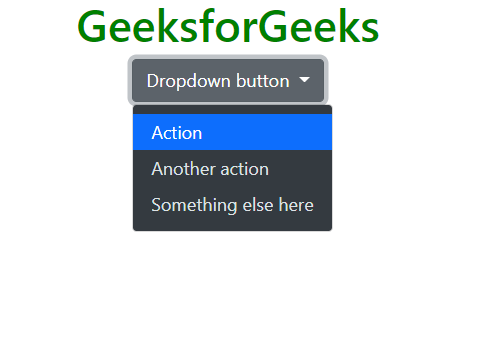
Example 1: This shows a basic dropdown. In this example, the toggle element is a button with the “dropdown-toggle” class and the “data-toggle” attribute set to “dropdown”. The dropdown menu is a div with the “dropdown-menu” class and the “aria-labelledby” attribute set to the ID of the toggle element. The dropdown items are a series of links with the “dropdown-item” class.
HTML
<!doctype html>
<html lang="en">
<head>
<meta charset="utf-8">
<meta name="viewport" content=
"width=device-width, initial-scale=1">
<link href=
rel="stylesheet" integrity=
"sha384-EVSTQN3/azprG1Anm3QDgpJLIm9Nao0Yz1ztcQTwFspd3yD65VohhpuuCOmLASjC"
crossorigin="anonymous">
<script src=
integrity=
"sha384-MrcW6ZMFYlzcLA8Nl+NtUVF0sA7MsXsP1UyJoMp4YLEuNSfAP+JcXn/tWtIaxVXM"
crossorigin="anonymous">
</script>
</head>
<body class="m-3">
<h1 class="text-success">
GeeksforGeeks
</h1>
<div class="dropdown" >
<button class="btn btn-secondary dropdown-toggle"
type="button" id="dropdownMenuButton2"
data-bs-toggle="dropdown" aria-expanded="false">
Dropdown button
</button>
<ul class="dropdown-menu dropdown-menu-dark"
aria-labelledby="dropdownMenuButton2">
<li><a class="dropdown-item active" href="#">
Action</a></li>
<li><a class="dropdown-item" href="#">
Another action</a></li>
<li><a class="dropdown-item" href="#">
Something else here</a></li>
</ul>
</div>
</body>
</html>
|
Output:
Bootstrap 5 Dropdowns Usage
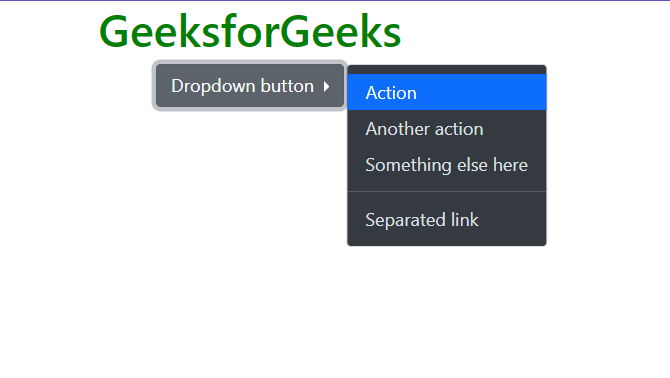
Example 2: This example shows a right-aligned dropdown. To display a dropdown menu to the right of an element, add the “dropend” class to the parent element.
HTML
<!doctype html>
<html lang="en">
<head>
<meta charset="utf-8">
<meta name="viewport" content=
"width=device-width, initial-scale=1">
<link href=
rel="stylesheet" integrity=
"sha384-EVSTQN3/azprG1Anm3QDgpJLIm9Nao0Yz1ztcQTwFspd3yD65VohhpuuCOmLASjC"
crossorigin="anonymous">
<script src=
integrity=
"sha384-MrcW6ZMFYlzcLA8Nl+NtUVF0sA7MsXsP1UyJoMp4YLEuNSfAP+JcXn/tWtIaxVXM"
crossorigin="anonymous">
</script>
</head>
<body class="m-3">
<h1 class="text-success">
GeeksforGeeks
</h1>
<div class="dropend">
<button class="btn btn-secondary dropdown-toggle"
type="button" id="dropdownMenuButton2"
data-bs-toggle="dropdown" aria-expanded="false">
Dropdown button
</button>
<ul class="dropdown-menu dropdown-menu-dark"
aria-labelledby="dropdownMenuButton2">
<li><a class="dropdown-item active" href="#">
Action</a></li>
<li><a class="dropdown-item" href="#">
Another action</a></li>
<li><a class="dropdown-item" href="#">
Something else here</a></li>
<li>
<hr class="dropdown-divider">
</li>
<li><a class="dropdown-item" href="#">
Separated link</a></li>
</ul>
</div>
</body>
</html>
|
Output:
Bootstrap 5 Dropdowns Usage
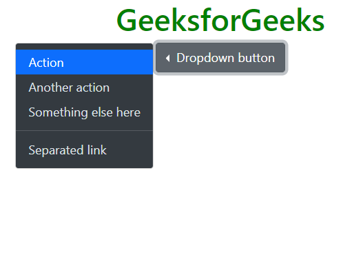
Example 3: This shows a left-aligned dropdown. To display a dropdown menu to the left of an element, add the “dropstart” class to the parent element.
HTML
<!doctype html>
<html lang="en">
<head>
<meta charset="utf-8">
<meta name="viewport" content=
"width=device-width, initial-scale=1">
<link href=
rel="stylesheet" integrity=
"sha384-EVSTQN3/azprG1Anm3QDgpJLIm9Nao0Yz1ztcQTwFspd3yD65VohhpuuCOmLASjC"
crossorigin="anonymous">
<script src=
integrity=
"sha384-MrcW6ZMFYlzcLA8Nl+NtUVF0sA7MsXsP1UyJoMp4YLEuNSfAP+JcXn/tWtIaxVXM"
crossorigin="anonymous">
</script>
</head>
<body class="m-2" style="text-align:center">
<h1 class="text-success">
GeeksforGeeks
</h1>
<div class="dropstart">
<button class="btn btn-secondary dropdown-toggle"
type="button" id="dropdownMenuButton2"
data-bs-toggle="dropdown" aria-expanded="false">
Dropdown button
</button>
<ul class="dropdown-menu dropdown-menu-dark"
aria-labelledby="dropdownMenuButton2">
<li><a class="dropdown-item active" href="#">
Action</a></li>
<li><a class="dropdown-item" href="#">
Another action</a></li>
<li><a class="dropdown-item" href="#">
Something else here</a></li>
<li>
<hr class="dropdown-divider">
</li>
<li><a class="dropdown-item" href="#">
Separated link</a></li>
</ul>
</div>
</body>
</html>
|
Output:
Bootstrap 5 Dropdowns Usage
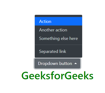
Example 4: To display a dropdown menu above an element, add the “dropup” class to the parent element.
HTML
<!doctype html>
<html lang="en">
<head>
<meta charset="utf-8">
<meta name="viewport" content=
"width=device-width, initial-scale=1">
<link href=
rel="stylesheet" integrity=
"sha384-EVSTQN3/azprG1Anm3QDgpJLIm9Nao0Yz1ztcQTwFspd3yD65VohhpuuCOmLASjC"
crossorigin="anonymous">
<script src=
integrity=
"sha384-MrcW6ZMFYlzcLA8Nl+NtUVF0sA7MsXsP1UyJoMp4YLEuNSfAP+JcXn/tWtIaxVXM"
crossorigin="anonymous">
</script>
</head>
<body class="m-2"
style="text-align:center;padding-top:120px;">
<h1 class="text-success">
GeeksforGeeks
</h1>
<div class="dropup">
<button class="btn btn-secondary dropdown-toggle"
type="button" id="dropdownMenuButton2"
data-bs-toggle="dropdown" aria-expanded="false">
Dropdown button
</button>
<ul class="dropdown-menu dropdown-menu-dark"
aria-labelledby="dropdownMenuButton2">
<li><a class="dropdown-item active" href="#">
Action</a></li>
<li><a class="dropdown-item" href="#">
Another action</a></li>
<li><a class="dropdown-item" href="#">
Something else here</a></li>
<li>
<hr class="dropdown-divider">
</li>
<li><a class="dropdown-item" href="#">
Separated link</a></li>
</ul>
</div>
</body>
</html>
|
Output:
Bootstrap 5 Dropdowns Usage
Example 5: This shows a Dropdown in Navbar. A navbar dropdown menu is displayed within a navigation bar. To create a dropdown menu in a navbar using Bootstrap, you can use the .nav-item and .dropdown classes.
HTML
<!doctype html>
<html lang="en">
<head>
<meta charset="utf-8">
<meta name="viewport" content=
"width=device-width, initial-scale=1">
<link href=
rel="stylesheet" integrity=
"sha384-EVSTQN3/azprG1Anm3QDgpJLIm9Nao0Yz1ztcQTwFspd3yD65VohhpuuCOmLASjC"
crossorigin="anonymous">
<script src=
integrity=
"sha384-MrcW6ZMFYlzcLA8Nl+NtUVF0sA7MsXsP1UyJoMp4YLEuNSfAP+JcXn/tWtIaxVXM"
crossorigin="anonymous">
</script>
</head>
<body class="m-2">
<nav class="navbar navbar-expand-lg navbar-dark
bg-dark">
<div class="container-fluid">
<a class="navbar-brand" href="#">
<h1 class="text-success">
GeeksforGeeks
</h1>
</a>
<button class="navbar-toggler" type="button"
data-bs-toggle="collapse"
data-bs-target="#navbarNavDarkDropdown"
aria-controls="navbarNavDarkDropdown"
aria-expanded="false"
aria-label="Toggle navigation">
<span class="navbar-toggler-icon"></span>
</button>
<div class="collapse navbar-collapse" id="navbarNavDarkDropdown">
<ul class="navbar-nav">
<li class="nav-item dropdown">
<a class="nav-link dropdown-toggle" href="#"
id="navbarDarkDropdownMenuLink" role="button"
data-bs-toggle="dropdown" aria-expanded="false">
Dropdown
</a>
<ul class="dropdown-menu dropdown-menu-dark"
aria-labelledby="navbarDarkDropdownMenuLink">
<li><a class="dropdown-item" href="#">
Action</a></li>
<li><a class="dropdown-item" href="#">
Another action</a></li>
<li><a class="dropdown-item" href="#">
Something else here</a></li>
</ul>
</li>
</ul>
</div>
</div>
</nav>
</body>
</html>
|
Output:

Bootstrap 5 Dropdowns Usage
Reference: https://getbootstrap.com/docs/5.0/components/dropdowns/
Share your thoughts in the comments
Please Login to comment...