Bootstrap 5 Approach z-index Scales Component Elements
Last Updated :
03 Jul, 2023
Bootstrap z-index allows providing different axis to the components on the screen. It helps in defining the order of the overlapping elements. It sets the position or order of the elements along the z-axis. An element with a greater z-index will appear before the others.
Component elements
Pre-built elements like button groups, input groups, and pagination are built with overlapping elements to prevent double borders without modifying the border property. In Bootstrap 5, component elements can be layered and controlled using the z-index property. By assigning different z-index values to components, you can control their stacking order. Higher z-index values bring components to the front, while lower values keep them at the back.
These elements share a range of 0-3 z-index. It helps in providing a good user experience because the one with the highest priority appears more prominently on the screen.
- 0 – It is the default value of the element
- 1 – The z-index is set at 1 when we hover over the element.
- 2 – The z-index is set at 2 when the element is in an active state.
- 3 – The z-index is set at 3 when the element is focused.
If the element is focused it gets the highest priority, whereas on active it gets a little lower priority, and on hover, it gets the lowest.
Syntax:
<div class="z-index-*">...</div>
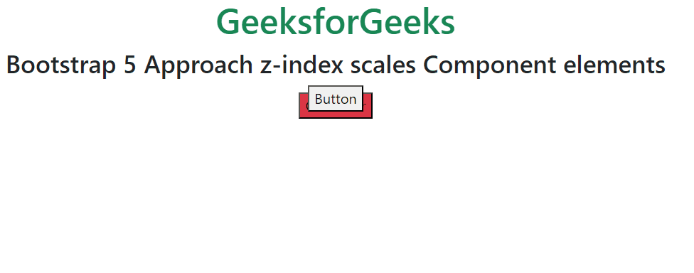
Example 1: In this example, we are demonstrating z-index-n1 which represents z-index:-1, and z-index-0 which represents z-index: 0, by adding two overlapping buttons.
HTML
<!DOCTYPE html>
<html lang="en">
<head>
<link href=
rel="stylesheet">
<style>
button:hover {
opacity: 0;
}
</style>
</head>
<body>
<div class="text-center">
<h1 class="text-success">
GeeksforGeeks
</h1>
<h3>
Bootstrap 5 Approach z-index
scales Component elements
</h3>
<div class="d-flex justify-content-center">
<button class="w-30 position-absolute end-30
mt-2 z-index-n1 bg-danger">
On Hover
</button>
<button class="w-30 position-absolute end-30
z-index-0">
Button
</button>
</div>
</div>
</body>
</html>
|
Output:
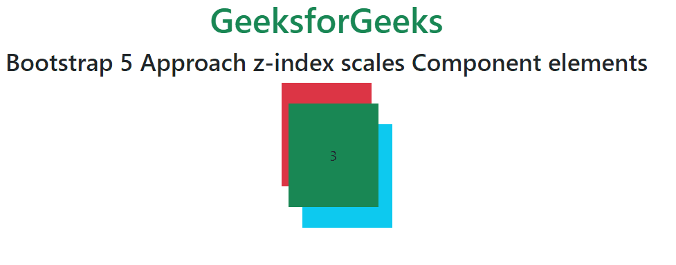
Example 2: In this example, we are demonstrating z-index-1, z-index-2, and z-index-3.
HTML
<!DOCTYPE html>
<html lang="en">
<head>
<link href=
rel="stylesheet">
<style>
.box div:hover {
opacity: 0.5;
cursor: pointer;
}
</style>
</head>
<body>
<div class="text-center">
<h1 class="text-success">
GeeksforGeeks
</h1>
<h3>
Bootstrap 5 Approach z-index
scales Component elements
</h3>
<div class="box d-flex justify-content-center">
<div class="z-index-1 ml-3
position-absolute
p-5 bg-danger">
1
</div>
<div class="ms-5 mt-5 z-index-2
position-absolute
p-5 bg-info">
2
</div>
<div class="ms-3 mt-4 z-index-3
position-absolute
p-5 bg-success">
3
</div>
</div>
</div>
</body>
</html>
|
Output:
Share your thoughts in the comments
Please Login to comment...