Awesome Button Hover Effects in React
Last Updated :
16 Jan, 2024
Buttons play an important role in user interfaces, and adding hover effects can improve the overall user experience. In this tutorial, you’ll explore step-by-step instructions to implement creating awesome button hover effects in a React application.
Preview Image: Let us have a look at how the buttons will look like.
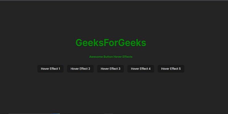
preview
Prerequisites
We will discuss the following approaches to create Awesome Button Hover Effects in React
Steps to Create Application
Step 1: Create a new React app using vite
npx create-vite@latest awesome-button-app --template react
cd awesome-button-app
npm install
Step 2: Create a Components folder and Create “Button.jsx” and ” Button.css” files.
Folder Structure:
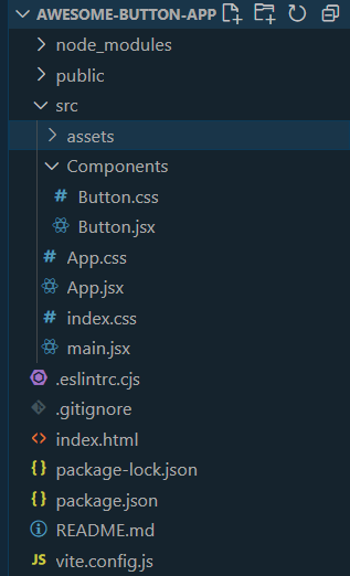
Folder Structure
The updated dependencies in package.json file will look lik:
"dependencies": {
    "react": "^18.2.0",
    "react-dom": "^18.2.0"
  },
  "devDependencies": {
    "@types/react": "^18.2.43",
    "@types/react-dom": "^18.2.17",
    "@vitejs/plugin-react": "^4.2.1",
    "eslint": "^8.55.0",
    "eslint-plugin-react": "^7.33.2",
    "eslint-plugin-react-hooks": "^4.6.0",
    "eslint-plugin-react-refresh": "^0.4.5",
    "vite": "^5.0.8"
}
Example: Write these code in the respective files.
Javascript
import React from 'react';
import './Button.css';
const Button = ({ text, effectType }) => {
return (
<button style={{ margin: "10px" }} className={`custom-button ${effectType}`}>
{text}
</button>
);
};
export default Button;
|
Javascript
import React from 'react';
import Button from './Components/Button';
import './App.css';
function App() {
return (
<div className="App">
<header className="App-header">
<h1 style={{ textAlign: "center" }}
className="button-heading">GeeksForGeeks</h1>
<h4 style={{ textAlign: "center" }}>
Awesome Button Hover Effects
</h4>
</header>
<Button text="Hover Effect 1" effectType="effect1" />
<Button text="Hover Effect 2" effectType="effect2" />
<Button text="Hover Effect 3" effectType="effect3" />
<Button text="Hover Effect 4" effectType="effect4" />
<Button text="Hover Effect 5" effectType="effect5" />
</div>
);
}
export default App;
|
CSS
.effect1 {
transition: transform 0.3s, background-color 0.3s, color 0.3s;
}
.effect1:hover {
transform: scale(1.1);
background-color: #4caf50;
color: white;
}
.effect2 {
transition: box-shadow 0.3s, border-radius 0.3s;
}
.effect2:hover {
box-shadow: 0 4px 8px rgba(94, 203, 233, 0.2);
border-radius: 20px;
}
.effect3 {
transition: transform 0.3s, background-position 0.5s ease;
}
.effect3:hover {
transform: translateX(10px);
background-position: right bottom;
}
.effect4 {
transition: transform 0.3s;
}
.effect4:hover {
transform: rotate(45deg);
}
.effect5 {
transition: transform 0.3s;
}
.effect5:hover {
transform: scaleX(-1);
}
|
1. Using Scale Effect with Background Color Change
The button smoothly scales up on hover, creating a subtle zoom-in effect. Simultaneously, the background color and text color change, providing a good looking transformation.
Code Syntax:
/* Button.css */
.effect1 {
  transition: transform 0.3s, background-color 0.3s, color 0.3s;
}
.effect1:hover {
  transform: scale(1.1);
  background-color: #4caf50;
  color: white;
}
Preview:
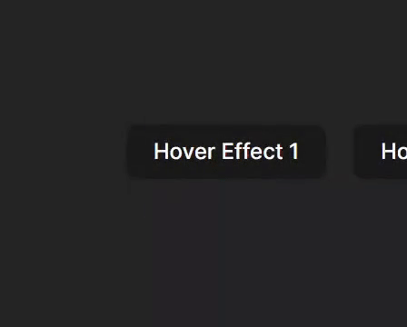
Hover Effect 1
2. Using Shadow Effect with Border Radius Change
As the button is hovered, a shadow appears around it, that giving the illusion of lift and depth. Additionally, the button’s corners gradually round, contributing to a sleek and modern appearance.
Code Syntax:
/* Button.css */
.effect2 {
  transition: box-shadow 0.3s, border-radius 0.3s;
}
.effect2:hover {
  box-shadow: 0 4px 8px rgba(94, 203, 233, 0.2);
  border-radius: 20px;
}
Preview:
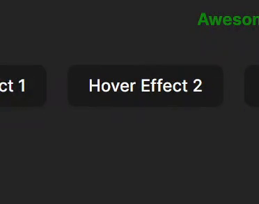
3. Using Slide In Effect with Gradient Hover Effect
As you hover, it gracefully slides to the side while the background undergoes a smooth gradient transition. This combination brings both movement and color to your button.
Code Syntax:
/* Button.css */
.effect3 {
  transition: transform 0.3s, background-position 0.5s ease;
}
.effect3:hover {
  transform: translateX(10px);
  background-position: right bottom;
}
Preview:
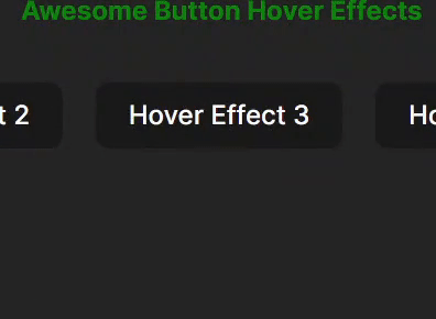
Hover Effect 3
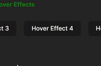
4. Using Rotate Effect
Add a playful twist to your button! When hovered, it rotates, providing a fun and interactive visual effect. It’s a simple yet engaging way to make your button more interesting.
Code Syntax:
/* Button.css */
.effect4 {
  transition: transform 0.3s;
}
.effect4:hover {
  transform: rotate(45deg);
}
Preview:
5. Using Flip Effect
Surprise your users with a unique twist! When hovered, the button flips horizontally, offering an unexpected and eye-catching transformation. This effect adds a touch of creativity to your button design.
Code Syntax:
/* Button.css */
.effect5 {
  transition: transform 0.3s;
}
.effect5:hover {
  transform: scaleX(-1);
}
Preview:
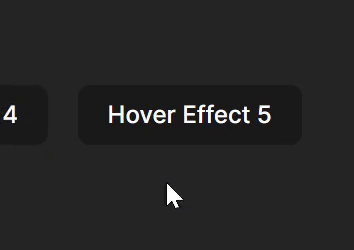
Hover Effect 5
Output:
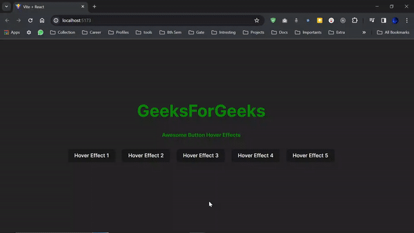
Final Output
Share your thoughts in the comments
Please Login to comment...