Angular PrimeNG Form MultiSelect Template Mode Component
Last Updated :
25 Oct, 2022
Angular PrimeNG is a free and open-source framework with various components that Angular developers can use in their applications to enhance the user experience and speed up the development as they do not have to write everything from the ground up. In this article, we will be discussing Angular PrimeNG Form MultiSelect Template Mode Component.
The MultiSelect Component allows users to select multiple options from the set of provided options. The template for the placeholder of the MultiSelect component can be provided as the value of the selectedItemsLabel property. The number of selected items can be accessed using {0} in the value of the selectedItemsLabel property.
Angular PrimeNG Form MultiSelect Template Mode Properties:
- options: We can pass an array of objects to this property to display the MultiSelect options.
- selectedItemsLabel: It is used to customize the label of the MultiSelect component.
- maxSelectedLabels: It is used to define the maximum number of items that can be selected before showing the template passed to the selectedItemsLabel property.
- defaultLabel: It is the label that is displayed when no items are selected.
- optionLabel: It is the name of the label field of an option of the MultiSelect component.
Syntax:
<p-multiSelect
    [options]="..."
    [(ngModel)]="..."
    defaultLabel="..."
    selectedItemsLabel="Total Selected: {0}"
    [maxSelectedLabels]="..."
    optionLabel="....">
</p-multiSelect>
Creating the Application and Installing the Required Modules:
Step 1: Create the Angular app using the following command.
ng new my_app
Step 2: After creating the app, move to the project folder using the command written below.
cd new_app
Step 3: Finally, Install the following modules in your project directory.
npm install primeng --save
npm install primeicons --save
Project Structure: Now, the project structure will as shown in the below picture.
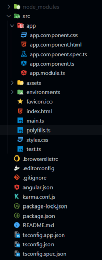
Project Structure
Example 1: This example shows the use of the basic templating of the selectedItemsLabel property.
HTML
<h2>GeeksforGeeks</h2>
<h5>
Angular PrimeNG Form
MultiSelect Template Mode Component
</h5>
<p-multiSelect
[options]="courses"
[(ngModel)]="selected"
defaultLabel="Select Course(s)"
selectedItemsLabel="{0} Options Selected"
[maxSelectedLabels]="1"
optionLabel="name">
</p-multiSelect>
|
Javascript
import { Component } from "@angular/core";
interface Course {
id: number;
name: string;
price: string;
}
@Component({
selector: "app-root",
templateUrl: "./app.component.html",
})
export class AppComponent {
courses: Course[] = [];
selected: Course[] = [];
ngOnInit() {
this.courses = [
{
id: 1,
name: "Self Paced DSA",
price: "3,899"
},
{
id: 2,
name: "CIP - Self Paced",
price: "6,999"
},
{
id: 3,
name: "System Design - Live",
price: "10,999"
},
{
id: 4,
name: "CP - Live",
price: "10,999"
},
{
id: 5,
name: "C++ Self Paced",
price: "1,699"
},
{
id: 6,
name: "GATE 2024",
price: "11,999"
}
];
}
}
|
Javascript
import { NgModule } from "@angular/core";
import { BrowserModule }
from "@angular/platform-browser";
import { FormsModule } from "@angular/forms";
import { BrowserAnimationsModule }
from "@angular/platform-browser/animations";
import { AppComponent } from "./app.component";
import { MultiSelectModule }
from "primeng/multiselect";
@NgModule({
imports: [
BrowserModule,
BrowserAnimationsModule,
MultiSelectModule,
FormsModule
],
declarations: [AppComponent],
bootstrap: [AppComponent],
})
export class AppModule { }
|
Output:
Example 2: The selectedItemsLabel property can also be set to “ellipsis”. This will replace the overflown content with the ellipsis(three dots). This is also the default behavior of the Multiselect.
HTML
<h2>GeeksforGeeks</h2>
<h5>
Angular PrimeNG Form
MultiSelect Template Mode Component
</h5>
<p-multiSelect
class="mySelect"
[options]="courses"
[(ngModel)]="selected"
defaultLabel="Select Course(s)"
selectedItemsLabel="ellipsis"
optionLabel="name">
</p-multiSelect>
|
Javascript
import { Component } from "@angular/core";
interface Course {
id: number;
name: string;
price: string;
}
@Component({
selector: "app-root",
templateUrl: "./app.component.html",
styles: [
`:host ::ng-deep .mySelect
.p-multiselect-label{
width: 300px;
}
`
]
})
export class AppComponent {
courses: Course[] = [];
selected: Course[] = [];
ngOnInit() {
this.courses = [
{
id: 1,
name: "Self Paced DSA",
price: "3,899"
},
{
id: 2,
name: "CIP - Self Paced",
price: "6,999"
},
{
id: 3,
name: "System Design - Live",
price: "10,999"
},
{
id: 4,
name: "CP - Live",
price: "10,999"
},
{
id: 5,
name: "C++ Self Paced",
price: "1,699"
},
{
id: 6,
name: "GATE 2024",
price: "11,999"
}
];
}
}
|
Javascript
import { NgModule } from "@angular/core";
import { BrowserModule }
from "@angular/platform-browser";
import { FormsModule } from "@angular/forms";
import { BrowserAnimationsModule }
from "@angular/platform-browser/animations";
import { AppComponent } from "./app.component";
import { MultiSelectModule }
from "primeng/multiselect";
@NgModule({
imports: [
BrowserModule,
BrowserAnimationsModule,
MultiSelectModule,
FormsModule
],
declarations: [AppComponent],
bootstrap: [AppComponent],
})
export class AppModule { }
|
Output:
Reference: https://www.primefaces.org/primeng/multiselect
Share your thoughts in the comments
Please Login to comment...