Angular PrimeNG Form MultiSelect Styling Component
Last Updated :
07 Nov, 2022
Angular PrimeNG is an AngularJS component library developed by PrimeFaces. It provides developers to select from a wide range of already implemented themes and UI components for their applications. In this article, we will see the Angular PrimeNG Form MultiSelect Styling Component.
The MultiSelect Component allows users to select multiple options from the set of provided options. There are 9 structural styling classes of the Multiselect component which can be used to customize the style according to one’s needs.
Angular PrimeNG Form MultiSelect Styling CSS Classes:
- p-multiselect: It is the container of the multi-select component.
- p-multiselect-label-container: It is the container of the label for displaying the selected items.
- p-multiselect-label: It is the label for displaying the selected items.
- p-multiselect-trigger: This class is applied on the dropdown button.
- p-multiselect-filter-container: It is the container of the filter input of the MultiSelect component.
- p-multiselect-panel: It is the class applied to the panel for displaying the MultiSelect items.
- p-multiselect-items: It is the container of the list of items.
- p-multiselect-item: This class is applied to the items of the MultiSelect component.
- p-multiselect-open: It is the container of the multiselect component when its panel is visible.
There are a few attributes that can be used with the Form MultiSelect, which are described below:
- options: This accepts an array of objects which will be used to display the Multiselect options.
- optionLabel: This property accepts a property of the options objects that will be used as the label for the options.
- showToggleAll: This property is used to enable/disable the toggle all checkbox for the multiselect.
- placeholder: This property is used to pass a string which will be used as the placeholder for the multiselect.
Syntax:
// In app.cpomponent.html
<p-multiSelect

    [options]="..."
    [(ngModel)]="..."
    optionLabel="..."
    defaultLabel="...">
</p-multiSelect>

// In Styles
:host ::ng-deep .Structural-Styling-Class {
    // Custom Styles
}
Creating the Application and Installing the Required Modules:
Step 1: Create the Angular app using the following command.
ng new my_app
Step 2: After creating the app, move to the project folder using the below command.
cd new_app
Step 3: Finally, Install the following modules in your project directory.
npm install primeng --save
npm install primeicons --save
Project Structure: The project structure will be shown in the picture below:
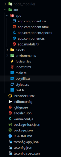
Project Structure
Example 1: In this example, we set the color of the multi-select label to green and the font weight of the label to bold.
HTML
<h2 style="color: green;">
GeeksforGeeks
</h2>
<h5>
Angular PrimeNG Form MultiSelect
Styling Component
</h5>
<p-multiSelect class="custom-ms"
[options]="brands"
[(ngModel)]="selectedBrands"
optionLabel="name"
optionValue="id"
defaultLabel="Select Brand(s)">
</p-multiSelect>
|
Javascript
import { Component } from "@angular/core";
interface Brand {
name: string;
id: string;
}
@Component({
selector: "app-root",
templateUrl: "./app.component.html",
styles: [
`
:host ::ng-deep .custom-ms
.p-multiselect-label {
width: 300px !important;
color: green;
font-weight: bold;
}
`
]
})
export class AppComponent {
brands: Brand[] = [];
selectedBrands: Brand[] = [];
ngOnInit() {
this.brands = [
{
name: "Adidas",
id: "sports_1"
},
{
name: "Puma",
id: "sports_2"
},
{
name: "Nike",
id: "sports_3"
},
{
name: "HRX",
id: "sports_4"
},
{
name: "Delhivery",
id: "trans_1"
},
{
name: "DHL",
id: "trans_2"
},
{
name: "FedEx",
id: "trans_3"
}
];
}
}
|
Javascript
import { NgModule } from "@angular/core";
import { BrowserModule }
from "@angular/platform-browser";
import { FormsModule } from "@angular/forms";
import { BrowserAnimationsModule }
from "@angular/platform-browser/animations";
import { AppComponent } from "./app.component";
import { MultiSelectModule }
from "primeng/multiselect";
@NgModule({
imports: [
BrowserModule,
BrowserAnimationsModule,
MultiSelectModule,
FormsModule
],
declarations: [AppComponent],
bootstrap: [AppComponent],
})
export class AppModule { }
|
Output:
Example 2: In this example, we changed the color of the dropdown button to green and the color of the multi-select item to red and bolded them.
HTML
<h2 style="color: green;">
GeeksforGeeks
</h2>
<h3>
Angular PrimeNG Form MultiSelect
Styling Component
</h3>
<h4>
Multiselect with <i>red & bold
dropdown trigger and item labels</i>
</h4>
<p-multiSelect
class="mSelect"
placeholder="Select Players"
[options]="people"
[showToggleAll]="false"
[(ngModel)]="selected"
optionLabel="name"
optionValue="ranking">
</p-multiSelect>
|
CSS
:host ::ng-deep .mSelect .p-multiselect-label {
width: 300px !important;
}
:host ::ng-deep .mSelect .p-multiselect-item {
color: red;
font-weight: bold;
}
:host ::ng-deep .mSelect .p-multiselect-trigger {
color: red;
font-weight: bold;
}
|
Javascript
import { Component } from "@angular/core";
interface Person {
ranking: number;
name: string;
}
@Component({
selector: "app-root",
templateUrl: "./app.component.html",
styleUrls: ['app.component.css']
})
export class AppComponent {
people: Person[] = [];
selected: Person[] = [];
ngOnInit() {
this.people = [
{
name: "Alex",
ranking: 1
},
{
name: "Smith",
ranking: 2
},
{
name: "Krishna",
ranking: 3
},
{
name: "Shane",
ranking: 4
},
{
name: "Tom",
ranking: 5
},
{
name: "Sebastian",
ranking: 6
},
{
name: "Tushar",
ranking: 7
}
];
}
}
|
Javascript
import { NgModule } from "@angular/core";
import { BrowserModule }
from "@angular/platform-browser";
import { FormsModule } from "@angular/forms";
import { BrowserAnimationsModule }
from "@angular/platform-browser/animations";
import { AppComponent } from "./app.component";
import { MultiSelectModule }
from "primeng/multiselect";
@NgModule({
imports: [
BrowserModule,
BrowserAnimationsModule,
MultiSelectModule,
FormsModule
],
declarations: [AppComponent],
bootstrap: [AppComponent],
})
export class AppModule { }
|
Output:
Reference: https://www.primefaces.org/primeng/multiselect
Share your thoughts in the comments
Please Login to comment...