Angular PrimeNG Form Dropdown Styling Component
Last Updated :
28 Oct, 2022
Angular PrimeNG is an open-source front-end UI framework developed by PrimeTek for developing efficient and scalable angular applications. Using PrimeNG in their projects helps developers to cut down the development time and focus on other important areas of the application. In this article, we will see Angular PrimeNG Form Dropdown Styling Component.
The Dropdown Component is used to provide users with a list of options out of which users can select any one option. It is generally used in implementing filters, asking for the country of the user, etc. It is used to make to choose the objects from the given list of items. The Dropdown Styling classes are used to style the dropdown according to our needs.
Angular PrimeNG Form Dropdown Styling Classes:
- p-dropdown: This class is the container element of the Dropdown component.
- p-dropdown-clearable: This class is a styling container element when showClear is on.
- p-dropdown-label: This class is a styling element to display the label of the selected option.
- p-dropdown-trigger: This class is a styling icon element.
- p-dropdown-panel: This class is a styling panel element.
- p-dropdown-items-wrapper: This class is a styling wrapper element of the items list.
- p-dropdown-items: This class is a styling list element of items.
- p-dropdown-item: This class is a list item.
- p-dropdown-filter-container: This class is a styling container of filter input.
- p-dropdown-filter: This class is a styling filter element.
- p-dropdown-open: This class is a styling container element when the overlay is visible.
Angular PrimeNG Form Dropdown Styling Properties:
- options: This property accepts an array of objects to display as dropdown options.
- placeholder: This property is used to set the placeholder for the dropdown field.
- optionLabel: This property is the name of the label field of an option.
- styleClass: This property is the style class of the component.
Syntax:
// app.component.html
<p-dropdown
   styleClass="dropdown1"
   [options]="sports"
   [(ngModel)]="chosenSport"
   optionLabel="name">

   <ng-template pTemplate="header">
       ...
   </ng-template>
</p-dropdown>

// app.component.css
:host ::ng-deep .Style-Class {
   // CSS
}
Creating Angular application and Installing the Modules:
Step 1: Create an Angular application using the following command.
ng new appname
Step 2: After creating your project folder i.e. appname, move to it using the following command.
cd appname
Step 3: Finally, Install PrimeNG in your given directory.
npm install primeng --save
npm install primeicons --save
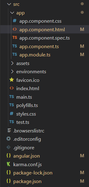
Project Structure: After completing the above steps, the project structure will look like the following:

Project Structure
Steps to run the application: To run the above file run the below command:
ng serve --save
Example 1: In the below code example, we will make use of the above styling to demonstrate the Form Dropdown Styling Component.
HTML
<div style="text-align:center;">
<h2 style="color: green">GeeksforGeeks</h2>
<h3>
A computer science portal for geeks
</h3>
<h4>
Angular PrimeNG Form
Dropdown Styling Component
</h4>
<h5>Default Width</h5>
<p-dropdown
#dd1
[(ngModel)]="selectedCountry"
placeholder="Select Your Country"
optionLabel="name"
[showClear]="true"
[options]="countries">
</p-dropdown>
<h5>Custom Width</h5>
<p-dropdown
#dd2
class="custom-dd"
[(ngModel)]="selectedCountry"
placeholder="Select Your Country"
optionLabel="name"
[showClear]="true"
[options]="countries">
</p-dropdown>
</div>
|
CSS
:host ::ng-deep .custom-dd .p-dropdown {
width: 400px;
}
|
Javascript
import { Component } from '@angular/core';
interface Country {
name: string;
code: string;
}
@Component({
selector: 'app-root',
templateUrl: './app.component.html',
styleUrls: ['./app.component.css']
})
export class AppComponent {
countries: Country[] = [];
selectedCountry?: Country;
ngOnInit() {
this.countries = [
{
name: "India",
code: "+91"
},
{
name: "Nepal",
code: "+977"
},
{
name: "Bhutan",
code: "+975"
},
{
name: "Russia",
code: "+7"
},
{
name: "Bangladesh",
code: "+880"
},
{
name: "Canada",
code: "+1"
}
];
}
}
|
Javascript
import { NgModule } from '@angular/core';
import { BrowserModule }
from '@angular/platform-browser';
import { FormsModule } from '@angular/forms';
import { BrowserAnimationsModule }
from '@angular/platform-browser/animations';
import { AppComponent } from './app.component';
import { DropdownModule } from 'primeng/dropdown';
@NgModule({
imports: [
BrowserModule,
BrowserAnimationsModule,
DropdownModule,
FormsModule
],
declarations: [AppComponent],
bootstrap: [AppComponent]
})
export class AppModule { }
|
Output:
Example 2: In the below code example, we will make use of the above styling to demonstrate the Form Dropdown Styling Component.
HTML
<div style="text-align:center;">
<h2 style="color: green">GeeksforGeeks</h2>
<h3>
A computer science portal for geeks
</h3>
<h4>
Angular PrimeNG Form
Dropdown Styling Component
</h4>
<p-dropdown
[(ngModel)]="selectedCountry"
placeholder="Select Your Country"
optionLabel="name"
[showClear]="true"
[options]="countries">
</p-dropdown>
</div>
|
CSS
:host ::ng-deep .p-dropdown {
width: 250px;
}
:host ::ng-deep .p-dropdown-items {
border: 5px solid green;
}
:host ::ng-deep .p-dropdown-clearable {
background-color: lightgreen;
font-weight: bold;
}
|
Javascript
import { Component } from '@angular/core';
interface Country {
name: string;
code: string;
}
@Component({
selector: 'app-root',
templateUrl: './app.component.html',
styleUrls: ['./app.component.css']
})
export class AppComponent {
countries: Country[] = [];
selectedCountry?: Country;
ngOnInit() {
this.countries = [
{
name: "India",
code: "+91"
},
{
name: "Nepal",
code: "+977"
},
{
name: "Bhutan",
code: "+975"
},
{
name: "Russia",
code: "+7"
},
{
name: "Bangladesh",
code: "+880"
},
{
name: "Canada",
code: "+1"
}
];
}
}
|
Javascript
import { NgModule } from '@angular/core';
import { BrowserModule }
from '@angular/platform-browser';
import { FormsModule } from '@angular/forms';
import { BrowserAnimationsModule }
from '@angular/platform-browser/animations';
import { AppComponent } from './app.component';
import { DropdownModule } from 'primeng/dropdown';
@NgModule({
imports: [
BrowserModule,
BrowserAnimationsModule,
DropdownModule,
FormsModule
],
declarations: [AppComponent],
bootstrap: [AppComponent]
})
export class AppModule { }
|
Output:

Angular PrimeNG Form Dropdown Styling Component
Reference: http://primefaces.org/primeng/dropdown
Share your thoughts in the comments
Please Login to comment...