Angular PrimeNG Form Calendar Time Component
Last Updated :
07 Oct, 2022
Angular PrimeNG is a collection of UI components for the Angular framework developed and maintained by Google. It enables developers to develop scalable and responsive interfaces in less time and hence increases productivity. In this article, we will see Angular PrimeNG Form Calendar Time Component.
The Calendar Component is used to input the user’s date and time. The time picker in a calendar is used to enable the user to pick the time. It can be shown with or without the calendar. The hourFormat property is used to specify the time format to use.
Angular PrimeNG Form Calendar Time Properties:
- showTime: This property is used to specify whether to show the time picker with the calendar.
- hourFormat: It is used to specify whether to display the time picker in 12-hour or 24-hour format.
- showSeconds: It is used to specify whether to display seconds in the time picker.
- timeOnly: If this property is set to true, only the time picker will be shown.
- timeSeparator: This is a string used to separate the hour, minutes, and seconds.
Syntax:
<p-calendar
    [(ngModel)]="..."
    [showTime]="true"
    hourFormat="12"
    [timeOnly]="true">
</p-calendar>
Creating Angular Application and Installing the Module:
Step 1: Create an Angular application using the following command.
ng new appname
Step 2: After creating your project folder i.e. appname, move to it using the following command.
cd appname
Step 3: Finally, Install PrimeNG in your given directory.
npm install primeng --save
npm install primeicons --save
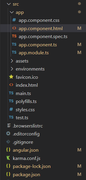
Project Structure: The project Structure will look like this after following the above steps:

Project Structure
- To run the above file run the below command:
ng serve --save
Example 1: This is a basic example illustrating how to enable datepicker in the 12-hour format shown with the calendar.
app.component.html
<h2 style="color: green">GeeksforGeeks</h2>
<h4>Angular PrimeNG Form Calendar Time Component</h4>
<h3>Calendar with Time in 12-hour Format</h3>
<p-calendar [showTime]="true"
hourFormat="12"
[(ngModel)]="calendarVal">
</p-calendar>
|
app.component.ts
import { Component } from "@angular/core";
@Component({
selector: "app-root",
templateUrl: "./app.component.html",
})
export class AppComponent {
calendarVal?: Date;
}
|
app.module.ts
import { NgModule } from '@angular/core';
import { BrowserModule }
from '@angular/platform-browser';
import { FormsModule } from '@angular/forms';
import { BrowserAnimationsModule }
from '@angular/platform-browser/animations';
import { AppComponent } from './app.component';
import { CalendarModule } from 'primeng/calendar';
@NgModule({
imports: [
BrowserModule,
BrowserAnimationsModule,
FormsModule,
CalendarModule
],
declarations: [AppComponent],
bootstrap: [AppComponent],
})
export class AppModule { }
|
Output:
Example 2: In this example, we set the timeOnly property to true to show only the time picker and disable the date picker. The hourFormat has been set to “24”.
app.component.html
<h2 style="color: green">GeeksforGeeks</h2>
<h4>
Angular PrimeNG Form
Calendar Time Component
</h4>
<h3>TimeOnly in 24-hour Format</h3>
<p-calendar [showTime]="true"
[timeOnly]="true"
hourFormat="24"
[(ngModel)]="calendarVal">
</p-calendar>
|
app.component.ts
import { Component } from "@angular/core";
@Component({
selector: "app-root",
templateUrl: "./app.component.html",
})
export class AppComponent {
calendarVal?: Date;
}
|
app.module.ts
import { NgModule } from '@angular/core';
import { BrowserModule }
from '@angular/platform-browser';
import { FormsModule } from '@angular/forms';
import { BrowserAnimationsModule }
from '@angular/platform-browser/animations';
import { AppComponent } from './app.component';
import { CalendarModule } from 'primeng/calendar';
@NgModule({
imports: [
BrowserModule,
BrowserAnimationsModule,
FormsModule,
CalendarModule
],
declarations: [AppComponent],
bootstrap: [AppComponent],
})
export class AppModule { }
|
Output:
Reference: http://primefaces.org/primeng/calendar
Share your thoughts in the comments
Please Login to comment...