Angular PrimeNG Form Calendar Selection Mode Component
Last Updated :
07 Oct, 2022
Angular PrimeNG is a collection of UI components for the Angular framework developed and maintained by Google. It enables developers to develop scalable and responsive interfaces in less time and hence increases productivity. In this article, we will see Angular PrimeNG Form Calendar Selection Mode Component.
The Calendar Component is used to input the user’s date and time. Users can select only one date by default but multiple dates can be selected by setting the selectionMode property to multiple. Here, the values will be stored in a Date array whose length can be controlled using the maxDateCount property. The third selection mode is the range mode where a start and end date can be selected which will be stored in a Date Array of length 2.
Angular PrimeNG Form Calendar Selection Mode Properties:
- selectionMode: It specifies the selection mode of the calendar. It can be set to “multiple” and “range”.
- maxDateCount: When the calendar is in the “multiple” mode, this property is used to restrict the length of the Date array.
Syntax:
<p-calendar
    placeholder="Select the Date"
    selectionMode="..."
    [maxDateCount]="..."
    [(ngModel)]="....">
</p-calendar>
Creating Angular Application and Installing the Module:
Step 1: Create an Angular application using the following command.
ng new appname
Step 2: After creating your project folder i.e. appname, move to it using the following command.
cd appname
Step 3: Finally, Install PrimeNG in your given directory.
npm install primeng --save
npm install primeicons --save
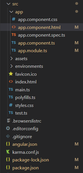
Project Structure: The project Structure will look like this after following the above steps:

Project Structure
Example 1: In this example, we set the selectionMode property to “multiple” and the maxDateCount property to 4.
app.component.html
<h2 style="color: green">GeeksforGeeks</h2>
<h4>Angular PrimeNG Form Calendar
Selection Mode Component</h4>
<p-calendar
placeholder="Select the Date"
selectionMode="multiple"
[maxDateCount]="4"
[(ngModel)]="calendarVal">
</p-calendar>
|
app.component.ts
import { Component } from "@angular/core";
@Component({
selector: "app-root",
templateUrl: "./app.component.html",
})
export class AppComponent {
calendarVal?: Date;
}
|
app.module.ts
import { NgModule } from '@angular/core';
import { BrowserModule }
from '@angular/platform-browser';
import { FormsModule } from '@angular/forms';
import { BrowserAnimationsModule }
from '@angular/platform-browser/animations';
import { AppComponent } from './app.component';
import { CalendarModule } from 'primeng/calendar';
@NgModule({
imports: [
BrowserModule,
BrowserAnimationsModule,
FormsModule,
CalendarModule
],
declarations: [AppComponent],
bootstrap: [AppComponent],
})
export class AppModule { }
|
Output:
Example 2: In this example, we set the selectionMode to “range” that has a start date and an end date.
app.component.html
<h2 style="color: green">GeeksforGeeks</h2>
<h4>Angular PrimeNG Form Calendar
Selection Mode Component</h4>
<p-calendar
placeholder="Select the Range"
selectionMode="range"
[(ngModel)]="calendarVal">
</p-calendar>
|
app.component.ts
import { Component } from "@angular/core";
@Component({
selector: "app-root",
templateUrl: "./app.component.html",
})
export class AppComponent {
calendarVal?: Date;
}
|
app.module.ts
import { NgModule } from '@angular/core';
import { BrowserModule }
from '@angular/platform-browser';
import { FormsModule } from '@angular/forms';
import { BrowserAnimationsModule }
from '@angular/platform-browser/animations';
import { AppComponent } from './app.component';
import { CalendarModule } from 'primeng/calendar';
@NgModule({
imports: [
BrowserModule,
BrowserAnimationsModule,
FormsModule,
CalendarModule
],
declarations: [AppComponent],
bootstrap: [AppComponent],
})
export class AppModule { }
|
Output:
Reference: http://primefaces.org/primeng/calendar
Like Article
Suggest improvement
Share your thoughts in the comments
Please Login to comment...