Android Jetpack Compose – Dynamic Progress Bar with Text
Last Updated :
24 Sep, 2023
Jetpack Compose is Android’s modern toolkit for building native UI. It simplifies and accelerates UI development on Android bringing your apps to life with less code, powerful tools, and intuitive Kotlin APIs. It makes building Android UI faster and easier
This toolkit offers a wide range of pre-built UI components, allowing developers to easily design interactive and visually appealing apps. Jetpack Compose also embraces a reactive programming model, automatically updating UI elements when underlying data changes, which enhances code maintainability and reduces boilerplate code.
What are we going to build today using Jetpack Compose?
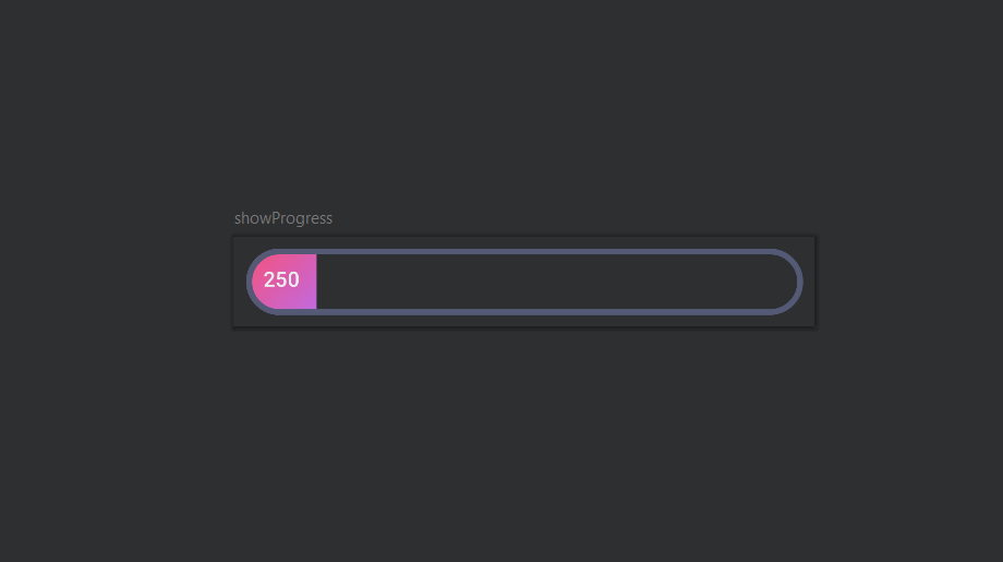
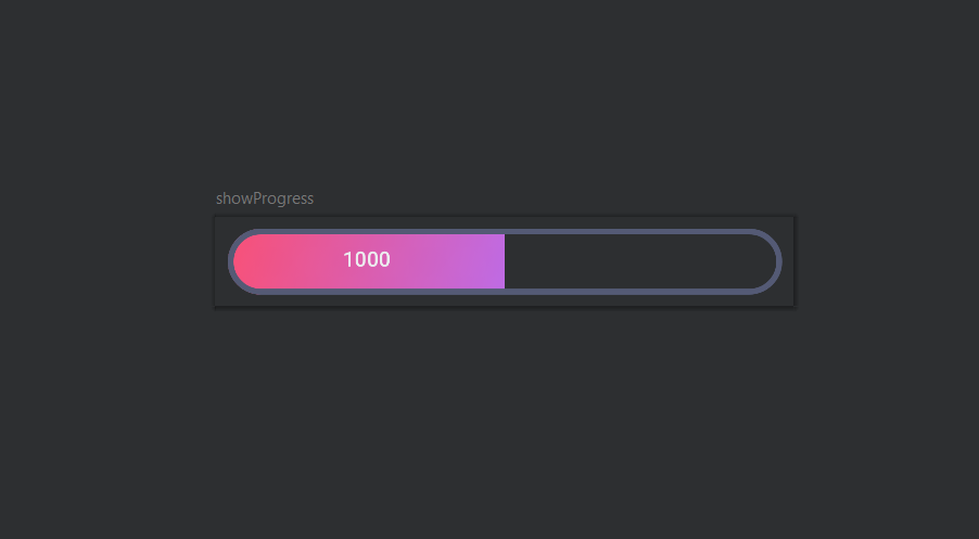
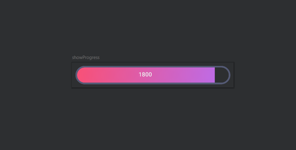
Here we are going to build out a custom progress bar with a gradient background in jetpack compose. These results clearly show that changing the values of the score in the function changes the progress of the bar in output screen. One can check on the multiple values in the function showProgres( ) to observe the changes in the progress bar. In this article i have guided you to create this UI element that you can further use in other applications as well.
Score 25: At the lower end of the spectrum, the progress bar represents a minimal progress level
Score 100: As the score increases, the progress bar dynamically expands, filling the width with vibrant color. This engaging animation provides users with clear feedback on their progress.
Score 180: At higher scores, the progress bar fully extends, delivering a sense of completion.
Step by Step implementation
Step 1: Prerequisites
Before we begin, make sure you have a basic understanding of Kotlin programming and Android development. Familiarity with Jetpack Compose concepts will also be beneficial. Compose’s approach ensures that your UI automatically updates in response to state changes, making your codebase more maintainable and reducing boilerplate. Jetpack Compose is Android’s modern toolkit for building native UI. It simplifies and accelerates UI development.
In summary, Jetpack Compose is a powerful framework that empowers Android developers to create modern, efficient, and highly customizable user interfaces for their apps.
Step 2: Setting Up Jetpack Compose
To get started, create a new Composable function called `showProgress` in your Jetpack Compose project. This function will serve as the foundation for our custom progress bar.
Kotlin
@Preview
@Composable
fun showProgress(score: Int = 100) {
}
|
Step 3: Designing the Custom Progress Bar
Step 3.1 Defining the Gradient
We’ll begin by defining a gradient that will be used for the progress button’s background. In this example, we’re using a linear gradient with two colors.
Kotlin
val gradient = Brush.linearGradient(
colors = listOf(
Color(0xFFF95075),
Color(0xFFBE6BE5)
)
)
|
Step 3.2 Initializing Progress Factor
We’ll use a `mutableStateOf` to track the progress factor, which determines the width of the progress button based on the score.
Kotlin
val progressFactor by remember(score) {
mutableStateOf(score * 0.005f)
}
|
Step 3.3 Styling the Row Container
Let’s style the outer row container that holds our progress button. We’ll use a combination of modifiers to achieve the desired appearance.
Kotlin
Row(
modifier = Modifier
.padding(8.dp)
.fillMaxWidth().height(45.dp)
.border(
width = 4.dp,
brush = Brush.linearGradient(
colors = listOf(
AppColors.mLightPurple,
AppColors.mLightPurple
)
),
shape = RoundedCornerShape(50.dp)
)
.clip(
RoundedCornerShape(
topStartPercent = 50,
topEndPercent = 50,
bottomEndPercent = 50,
bottomStartPercent = 50
)
)
.background(Color.Transparent),
verticalAlignment = Alignment.CenterVertically
) {
}
|
Step 3.4 Creating the Progress Button
Now, we’ll define the progress button itself. This button represents the progress visually, and its width will be determined by the `progressFactor`.
Kotlin
Button(
onClick = { },
modifier = Modifier
.fillMaxWidth(progressFactor)
.background(brush = gradient),
enabled = false,
elevation = null,
colors = buttonColors(
containerColor = Color.Transparent,
disabledContainerColor = Color.Transparent
)
) {
Text(
text = (score * 10).toString(),
modifier = Modifier
.clip(shape = RoundedCornerShape(23.dp))
.fillMaxHeight(0.87f)
.fillMaxWidth()
.padding(7.dp),
color = AppColors.mOffWhite,
textAlign = TextAlign.Center
)
}
|
Step 4. Putting It All Together
With the code pieces in place, you’ve successfully created a custom progress bar using Jetpack Compose! You can now customize the colors, shapes, and other properties to match your app’s design.
Kotlin
@Preview
@Composable
fun showProgress(score : Int =100){
val gradient = Brush.linearGradient(listOf(Color(0xFFF95075),
Color(0xFFBE6BE5)))
val progressFactor by remember(score) {
mutableStateOf(score*0.005f)
}
Row(modifier = Modifier
.padding(8.dp)
.fillMaxWidth().height(45.dp).border(
width = 4.dp,
brush = Brush.linearGradient(
colors = listOf(
AppColors.mLightPurple,
AppColors.mLightPurple
)
) ,
shape = RoundedCornerShape(50.dp)
)
.clip(
RoundedCornerShape(
topStartPercent = 50,
topEndPercent = 50,
bottomEndPercent = 50,
bottomStartPercent = 50
)
)
.background(Color.Transparent),
verticalAlignment = Alignment.CenterVertically
) {
Button(
contentPadding = PaddingValues(1.dp),
onClick = { },
modifier = Modifier
.fillMaxWidth(progressFactor)
.background(brush = gradient),
enabled = false,
elevation = null,
colors = buttonColors(
containerColor = Color.Transparent,
disabledContainerColor = Color.Transparent
)) {
Text(text = (score * 10).toString(),
modifier = Modifier
.clip(shape = RoundedCornerShape(23.dp))
.fillMaxHeight(0.87f)
.fillMaxWidth()
.padding(7.dp),
color=AppColors.mOffWhite,
textAlign = TextAlign.Center)
}
}
}
|
Output:
Now you can play around test your custom progress bar with different score passing as the parameter in the function.
Conclusion
- mutableStateOf: mutableStateOf is a function that creates a mutable state holder for a value. It provides a way to hold a value that can be modified over time, and Compose automatically recomposes the UI whenever the value changes.
- remember: remember is a Composable function that allows you to store a value that survives across recompositions.
Here we have created a dynamic custom progress bar in jetpack Compose , by understanding the code in the form of small modules . We have used modifiers and multiple styling options to customise it. We have also added the gradient look to out progress bar to make it more attaractive and appealing.
Share your thoughts in the comments
Please Login to comment...