Pandas Scatter Plot – DataFrame.plot.scatter()
Last Updated :
25 Feb, 2021
A Scatter plot is a type of data visualization technique that shows the relationship between two numerical variables. For plotting to scatter plot using pandas there is DataFrame class and this class has a member called plot. Calling the scatter() method on the plot member draws a plot between two variables or two columns of pandas DataFrame.
Syntax: DataFrame.plot.scatter(x, y, s = none, c = none)
Parameter:
x: column name to be used as horizontal coordinates for each point
y: column name to be used as vertical coordinates for each point
s: size of dots
c: color of dots
Steps:
- Import necessary libraries.
- Prepare a data
- Convert prepared data into DataFrame
- Draw a scatter plot
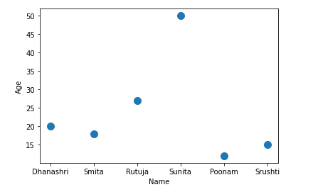
Example 1: In this example, we will plot the scatter plot using dataframe, Here we will create the dataframe and plot the scatter plot using different columns.
Python3
import pandas as pd
data={'Name':['Dhanashri', 'Smita', 'Rutuja',
'Sunita', 'Poonam', 'Srushti'],
'Age':[20, 18, 27, 50, 12, 15]}
df = pd.DataFrame(data = data);
df.plot.scatter(x = 'Name', y = 'Age', s = 100);
|
Output:
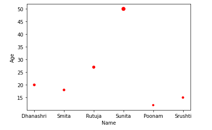
Example 2: Here we will create the dataframe and plot the scatter plot using different columns with style data points.
Python3
import pandas as pd
data={'Name':['Dhanashri', 'Smita', 'Rutuja',
'Sunita', 'Poonam', 'Srushti'],
'Age':[ 20, 18, 27, 50, 12, 15]}
df = pd.DataFrame(data = data);
df.plot.scatter(x = 'Name', y = 'Age', s = 'Age', c = 'red');
|
Output:
Share your thoughts in the comments
Please Login to comment...