How to Change the BorderColor and Fill Values in a Chart ?
Last Updated :
03 Jan, 2024
In Chart.js, to represent the data in a more unique and attractive form, we can customize its appearance by adjusting or applying the borderColor and fill values to the elements of Chart. In this article, we will see two different approaches through which we can change the borderColor and fill values of the chart.
Chart.js CDN Link
<script src="https://cdn.jsdelivr.net/npm/chart.js"></script>
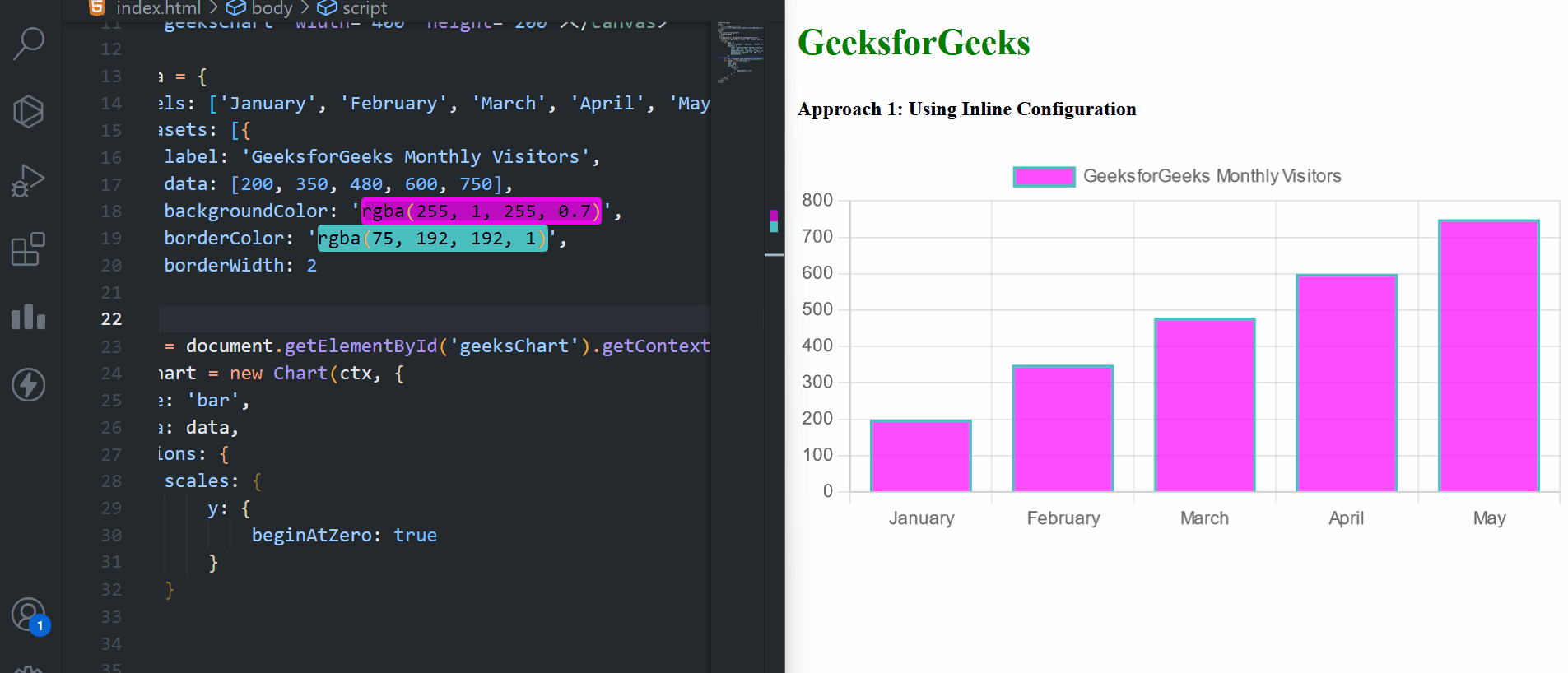
Approach 1: Using Inline Configuration
In this approach, we will use the backgroundColor and borderColor properties of the inline configuration which are in the dataset section to change the border color and fill values of the bars.
Syntax:
datasets: [{
    // Other properties
    backgroundColor: value,
    borderColor: value,
    borderWidth: value
}]
Example: The below code example implements the inline configuration approach to change the borderColor and fill values in a chart.
HTML
<!DOCTYPE html>
<html>
<head>
<title>Example 1</title>
<script src=
</script>
</head>
<body>
<h2 style="color:green">
GeeksforGeeks
</h2>
<h5>
Approach 1: Using Inline Configuration
</h5>
<canvas id="geeksChart"
width="400"
height="200">
</canvas>
<script>
let data = {
labels:
['January', 'February', 'March', 'April', 'May'],
datasets: [{
label:
'GeeksforGeeks Monthly Visitors',
data: [200, 350, 480, 600, 750],
backgroundColor:
'rgba(43, 111, 255, 0.7)',
borderColor:
'rgba(255, 225, 1, 1)',
borderWidth: 2
}]
};
let ctx = document.
getElementById('geeksChart').
getContext('2d');
let myChart = new Chart(ctx, {
type: 'bar',
data: data,
options: {
scales: {
y: {
beginAtZero: true
}
}
}
});
</script>
</body>
</html>
|
Output:
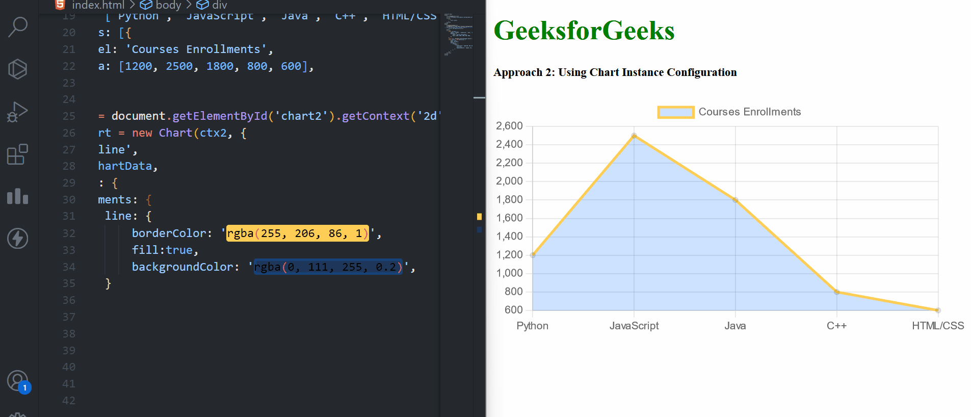
Approach 2: Using Chart Instance Configuration
In this approach, we are using the Chart Instance Configuration to create the line chart. We have given the borderColor and backgroundColor in Chart Instance.
Syntax:
const myChart = new Chart(ctx, {
    type: 'line',
    data: chartData,
    options: {
        elements: {
            line: {
                backgroundColor: value,
                borderColor: value
            }
        }
    }
});
Example: The below code example explains the use of chart instance approach to change borderColor and fill values of a chart.
HTML
<!DOCTYPE html>
<html>
<head>
<title>Example 2</title>
<script src=
</script>
<style>
h1 {
color: green;
}
</style>
</head>
<body>
<h1>GeeksforGeeks</h1>
<h5>
Approach 2: Using Chart
Instance Configuration
</h5>
<div style="width: 100%;
margin: auto;">
<canvas id="chart2">
</canvas>
</div>
<script>
const chartData = {
labels:
['Python', 'JavaScript', 'Java', 'C++', 'HTML/CSS'],
datasets: [{
label: 'Courses Enrollments',
data:
[1200, 2500, 1800, 800, 600],
}]
};
const ctx2 = document.
getElementById('chart2').
getContext('2d');
const myChart = new Chart(ctx2, {
type: 'line',
data: chartData,
options: {
elements: {
line: {
borderColor:
'rgba(255, 120, 86, 1)',
fill: true,
backgroundColor:
'rgba(255, 25, 0, 0.2)',
}
}
}
});
</script>
</body>
</html>
|
Output:
Share your thoughts in the comments
Please Login to comment...