5 Best Practices for Effective and Good Data Visualizations
Last Updated :
30 Apr, 2024
The ability to effectively visualize information is more crucial than ever. Data visualization not only simplifies complex statistics but also enables individuals to identify patterns, trends, and insights that might otherwise remain hidden within vast datasets. As we navigate the digital era, where data proliferates at an exponential rate, mastering the art of creating compelling visualizations becomes an indispensable skill across various industries and professions. This comprehensive guide covers key aspects of creating effective data visualizations, offering practical advice and best practices.
5 Best Practices for Creating Effective Data Visualizations
Data Visualization is an essential aspect of data analysis and communication. It allows us to quickly interpret information and make decisions based on complex data sets. However, the effectiveness of data visualization depends significantly on how it is executed. Below, we explore five best practices that can help create impactful and comprehensible visualizations.
1. Selecting the Appropriate Visualization Type
The choice of visualization depends on the kind of data you have and the story you want to tell. Common types include bar charts for comparisons, line graphs for trends over time, scatter plots for relationships, and pie charts for showing proportions. Before diving into the design, establish a clear goal for your visualization.
- What message are you trying to convey?
- What do you want viewers to understand or take away from the data?
- Having a defined purpose will guide your decisions about the type of chart, the data to include, and the overall design.
For instance, If you want to show the trend of sales over a year, a line graph is appropriate. This would clearly depict changes over time, showing peaks and troughs that help in understanding seasonal effects or the impact of specific campaigns.
.webp)
2. Simplify and Declutter Data for Effective Visualization
A cluttered chart can distract and confuse the viewer. Simplification helps in focusing on the essential parts of the data. To simplify and declutter a chart, remove unnecessary elements while ensuring that the essential information remains clear and easy to understand.
- Remove Heavy Grid Lines: Instead of using heavy grid lines, opt for lighter grid lines or remove them altogether if they are not essential for reference.
- Minimize Colors: Limit the number of colors used in the chart to avoid visual clutter. Stick to a simple color scheme that enhances readability and focus on the data.
- Reduce Decorations: Remove excessive decorations such as unnecessary borders, background colors, or decorative elements that do not contribute to the understanding of the data.
- Clear Labels: Ensure that labels are clear and concise, providing necessary information without overcrowding the chart. Use descriptive labels where necessary to aid comprehension.
- Simplify Axes: Keep the axes clean and uncluttered by removing unnecessary ticks, labels, or annotations. Focus on providing only essential information to guide interpretation.
By simplifying and decluttering your chart, you can enhance clarity and focus on the key insights that the data has to offer, making it easier for viewers to understand and interpret the information.
Example: In a bar chart comparing the population of different countries, you might choose a single color for all bars and avoid heavy grid lines. Labels should be clear and present only when they add value.
.webp)
3. Use Proper Highlights and Color Codes
Color can enhance understanding but can also mislead if not used carefully. Use it to highlight important data points or to group related items. It’s crucial to ensure that colors are distinct enough for everyone, including those with color vision deficiencies.
For example:
- Highlighting Important Data Points: Suppose we have sales data for four products (A, B, C, D) over four quarters (Q1, Q2, Q3, Q4). We want to highlight the highest sales value for each product. We can use a distinctive color (e.g., green) to emphasize these high points. This makes it easy for viewers to quickly identify the most significant data.
- Grouping Related Items: Now, let’s say we want to compare the performance of different product categories. We can group products by their categories (e.g., electronics, clothing, accessories) and assign each category a unique color. This helps viewers to discern patterns and trends within each group more easily.
- Ensuring Accessibility for Color Vision Deficiencies: It’s crucial to choose colors that are distinct and accessible to all viewers, including those with color vision deficiencies. For example, instead of relying solely on color to differentiate data points, we can also use patterns or labels. This ensures that everyone can interpret the chart accurately.
4. Choose the Right Chart Type
There are many chart types available, each suited for different purposes. Here are some common ones:
- Bar Charts: Effective for comparing categories (e.g., comparing sales figures across regions).
- Line Charts: Ideal for showing trends over time (e.g., tracking website traffic over months).
- Pie Charts: Useful for depicting proportions of a whole (e.g., customer satisfaction survey results).
- Scatter Plots: Used to reveal relationships between two variables (e.g., correlation between advertising spend and customer acquisition).
- Histograms: Used to represent the distribution of a continuous variable. Helpful in understanding the frequency or density distribution of data.
- Box Plots (Box-and-Whisker Plots): Box plots are useful for summarizing the distribution of a dataset and identifying outliers.
- Area Charts: Area charts are similar to line charts but with the area below the lines filled with color. They are effective for showing changes in quantities over time while also emphasizing the magnitude of those changes.
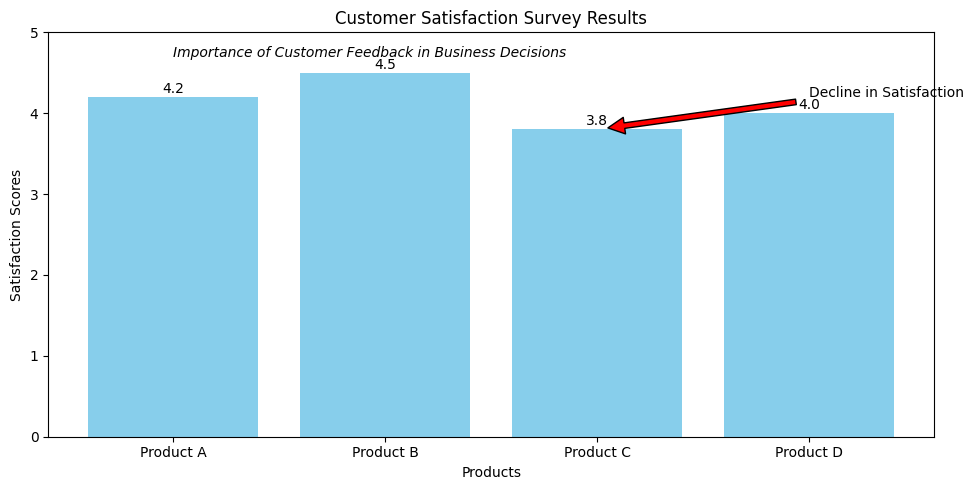
5. Tell a Story
A good visualization tells a story, guiding the viewer through the data. Annotations, titles, and descriptive labels can help convey context and insights, making the data more relatable and understandable. By creating a narrative around the data, you make it more relatable and understandable to your audience.
Annotations play a crucial role in drawing attention to key points or insights within the data. Whether it’s highlighting significant fluctuations, pointing out outliers, or providing explanations for unexpected trends, annotations help viewers focus on what matters most. By strategically placing annotations throughout the visualization, you can guide viewers’ attention and shape their understanding of the data.
For example, imagine you’re presenting a visualization of customer satisfaction survey results for a retail company. Instead of simply displaying a bar chart of satisfaction ratings, you might start by providing context about the importance of customer feedback in driving business decisions. You could then annotate the chart to highlight specific trends or areas of concern, such as a decline in satisfaction scores for a particular product line. Finally, you might use descriptive labels to explain the factors contributing to these trends, such as changes in product quality or customer service initiatives.
Why Good Data Visualization is Important?
There are several reasons why data visualization is crucial.
- Better Comprehension: By converting difficult-to-understand numerical data into consumable representations, visualizations may facilitate viewers’ understanding and interpretation of the information.
- Finding Hidden Patterns and Trends: With huge datasets, data visualizations may assist users in finding hidden patterns, outliers, and trends that may be difficult to find in raw data alone.
- Effective Communication: Succinct and captivating representations of important thoughts and discoveries may facilitate improved decision-making and teamwork.
- Storytelling: Complex information may be made more interesting and memorable for the audience by using data visualizations to tell tales and construct narratives.
- Informed Decision-Making: Visualizations may assist data-driven decision-making and strategic planning by presenting facts in an aesthetically pleasing and understandable manner.
Common Mistakes to Avoid for a Good Data Visualization?
- Typical Errors to Prevent Overwhelming the Audience: Refrain from overloading a single visualization with data or visual clutter.
- Data Misrepresentation: Make that the visualization correctly depicts the underlying data, free from any information manipulation or distortion.
- Lack of Accessibility: Certain audience members may be excluded if accessibility characteristics like color blindness and screen reader compatibility are ignored.
- Inconsistent or Inappropriate Styling: An unprofessional visualization may be created by using inconsistent typefaces, colors, and visual components.
- Failure to Provide Context: If crucial contextual details like labels, units, and explanations are missing, the viewer may get perplexed.
Conclusion
A strong tool for comprehending complicated information, sharing insights, and assisting in data-driven decision-making is effective data visualization. You may produce visualizations that captivate your audience, tell gripping tales, and effect significant change by using the essential traits and best practices covered in this article.
5 Practices for Creating Effective and Good Data Visualizations – FAQs
What distinguishes infographics from data visualization?
The primary goal of data visualizations is to directly depict data, often via the use of plots, graphs, and charts. However, infographics produce a more comprehensive and narrative-driven depiction of information by fusing data visualizations with other visual components like icons and pictures.
What steps can I take to make my data visualizations more accessible?
Use of high contrast color schemes, unambiguous labeling and annotations, making sure the visualization is screen reader-friendly, and flexible layouts that function well on a range of devices are some strategies to increase accessibility.
Which are some popular tools for data visualization?
A few well-liked tools for data visualization include D3.js, Tableau, Matplotlib, Power BI, and Plotly. The style of visualization that is intended, the amount of customisation needed, and data sources all influence the tool selection.
How can I assess if my data visualizations are effective?
Assess the efficacy of your data visualizations by taking into account variables like task completion rates, user feedback, and the capacity to communicate the desired insights. You can consistently raise the quality of your visualizations by carrying out user testing and making design iterations
Share your thoughts in the comments
Please Login to comment...