What is at-rules and why use of “at” in CSS ?
Last Updated :
10 Oct, 2021
In this tutorial, we will learn about At-rules & their usage in CSS. At-rules are simply some CSS statements that instruct the CSS how to behave in particular conditions. ie., At-rules allow developers to change the design or layout of websites based on certain conditions. Every At-rule command begins with ‘@’ followed by an identifier and end with a semi-colon ‘;’ or next CSS block.
Syntax:
@identifier (condition);
@identifier (condition) {}
We will understand both the syntaxes through the examples. Let’s first discuss the @charset.
- @charset: It defines the character set to be used by the website. We can use it easily if the CSS file contains non-ASCII characters. The list of charsets that can be used is UTF-8, iso-8859-15, iso-8859-1 etc. You can check out any specific character sets but the most common and popular, set is UTF-8 on the websites.
Example:
@charset "UTF-8";
- @import: It is used to import CSS styles or rules from other CSS files that are either located in the local system or from the internet. It is usually mentioned at the top of the stylesheet that is instructed to include the external stylesheet. The below example illustrates all kinds of @import that we generally use.
Example: In this example, we will create the index.html file along with creating the required stylesheet.
index.html
HTML
<!DOCTYPE html>
<html>
<head>
<meta charset="utf-8" />
<meta name="viewport"
content="width=device-width" />
<title>GeeksforGeeks</title>
<link href="style.css"
rel="stylesheet" type="text/css" />
</head>
<body>
<h2 class="heading">GeeksforGeeks</h2>
</body>
</html>
|
Inside the index.html, we have imported the style.css which will just change the colour of the heading which is “GeeksforGeeks”.
style.css:
@import 'mobile.css' screen and (max-width: 300px);
@import url('desktop.css') screen and (min-width: 300px);
mobile.css:
.heading{
    color: red;
}
desktop.css:
.heading{
    color: green;
}
Explanation: Lets us understand the CSS files one by one. The mobile.css file changes the colour of the heading to red whereas desktop.css to green. Now instead of media querying on a single file, style.css we have used two different files for desktop screens and mobile screens. You can see, we have used the “and” condition with the “max-width” to ensure the media query.
Output: In the output, we are running on the browser for both desktop and mobile screens.
@import
- @namespace: It is used to tell the CSS engine that all the XML namespaces are to be used in the CSS style sheet.
Example:
<!--Normal namespaces-->
@namespace url/String; /* Url or string of XML namespace */

<!--Prefixed namespace-->
@namespace anything url/String; /* Anything is identifie */
Using it in Selector
anything|title {your style}
- @media: It is used on a part or block of HTML code based on the results of media queries. For example, responsive navigation bars are made using the media screen width.
Example: In this example, we will use the same code as above for the index.html.
HTML
<!DOCTYPE html>
<html>
<head>
<meta charset="utf-8" />
<meta name="viewport"
content="width=device-width" />
<style>
.heading {
color: red;
}
@media screen and (min-width: 450px) {
.heading {
color: green !important;
}
}
</style>
</head>
<body>
<h2 class="heading">GeeksforGeeks</h2>
</body>
</html>
|
Explanation: Here, when the screen width is less than 450 px, the colour of the heading will be red else green. The @media is used with the screen to get the correct context that we want to check the screen width and the condition is “min-width: 450px”. You can use more queries also.
Output:
@media
- @support: It is used to know the support capability of the browser, ie. if the condition meets then it applies the style for those elements. For example, if the browser supports grid.
Example:
HTML
<!DOCTYPE html>
<html>
<head>
<meta charset="utf-8" />
<meta name="viewport" content="width=device-width" />
<title>Geeks for geeks</title>
<style>
@supports (display: grid) {
#lists {
display: grid;
grid-template-columns: auto auto auto auto;
}
#lists>div {
padding: 20px;
border: 4px solid blue;
background-color: lightblue;
}
}
</style>
</head>
<body>
<div id="lists">
<div>Geeks</div>
<div>Geeks</div>
<div>Geeks</div>
<div>Geeks</div>
<div>Geeks</div>
<div>Geeks</div>
<div>Geeks</div>
<div>Geeks</div>
<div>Geeks</div>
<div>Geeks</div>
<div>Geeks</div>
<div>Geeks</div>
</div>
</body>
</html>
|
Output:
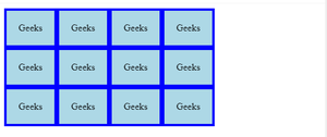
grid layout
In case, if the browser is not supporting the display: grid property then you can use the below code:
@supports not (display: grid)
{
 /*code for no grid support*/
}
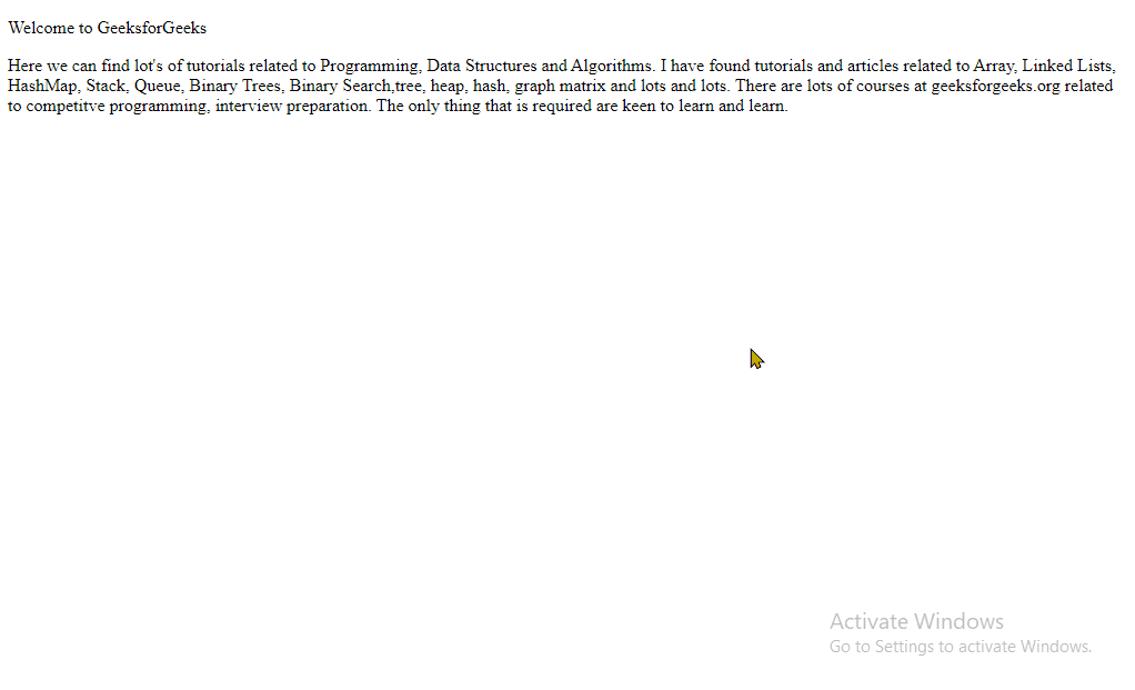
- @page: It is used to modify some CSS properties & applies the style to the individual pages when printing a document.
Example:
HTML
<!DOCTYPE html>
<html>
<head>
<meta charset="utf-8" />
<meta name="viewport"
content="width=device-width" />
<style>
@page {
size: A5 landscape;
margin: 2in;
}
</style>
</head>
<body>
<div id="page">
<p>Welcome to GeeksforGeeks</p>
<p>
Here we can find lot's of tutorials
related to Programming, Data Structures
and Algorithms. I have found tutorials
and articles related to Array, Linked
Lists, HashMap, Stack, Queue, Binary
Trees, Binary Search,tree, heap, hash,
graph matrix and lots and lots. There
are lots of courses at geeksforgeeks.org
related to competitve programming,
interview preparation. The only thing
that is required are keen to learn and
learn.
</p>
</div>
</body>
</html>
|
Explanation: Here in the @page at-rule, we mention the details that how to page should be printed. If you right-click on the webpage, the print option comes which when printed shows the output as specified.
Output:
@page
- @font-face: It specifies a custom font with which to display the text. Font can be loaded from anywhere on the server or system. Firstly, we must define the font name and then provide the URL of the font to be loaded from.
Example:
HTML
<!DOCTYPE html>
<html>
<head>
<meta charset="utf-8" />
<meta name="viewport"
content="width=device-width" />
<style>
@font-face {
font-family: "Roboto";
src: url("Roboto/Roboto-Bold.ttf");
}
#page p {
font-family: "Roboto";
}
</style>
</head>
<body>
<div id="page">
<p>
GeeksforGeeks is website for programming
geeks. It has tons of articles for
programming in almost all popular
programming language.
</p>
</div>
</body>
</html>
|
We need to download the Roboto font from fonts.google.com, to download click here. Ensure that it must be downloaded in the same working directory where index.html is placed, in order to work it properly.
Output:
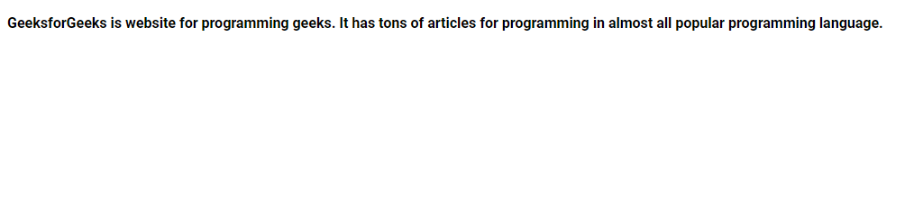
@font-face
- @keyframes: It gradually changes from one set of CSS to another set of CSS styles.
Example:
HTML
<!DOCTYPE html>
<html>
<head>
<meta charset="utf-8" />
<meta name="viewport" content="width=device-width" />
<style>
#page {
animation-duration: 3s;
font-size: 24px;
animation-name: gfgexpanding;
}
@keyframes gfgexpanding {
from {
font-size: 12px;
}
to {
font-size: 24px;
}
}
</style>
</head>
<body>
<div id="page">
<p>
GeeksforGeeks is website for programming
geeks. It has tons of articles for
programming in almost all popular
programming language.
</p>
</div>
</body>
</html>
|
The syntax is very clear. First, we have linked the container with the animation. Next, we have used the @keyframes with the same name as in #page to make the animation.
Output:
@keyframe
Also, you can provide the percentage change as follows:
@keyframes gfgexpanding{
  0%    {font-size: 12px;}
  25%    {font-size: 16px;}
  50%    {font-size: 18px;}
  100%    {font-size: 24px;}
}
- @counter-style: It lets you define counter styles that are not part of the predefined set of styles. A @counter-style rule defines how to convert a counter value into another string.
Syntax:
@counter-style counter-style-name {
  system: system;
  symbols: symbols;
  additive-symbols: additive-symbols;
  negative: negative-symbol;
  prefix: prefix;
  suffix: suffix;
  range: range;
  pad: padding;
}
Example:
HTML
<!DOCTYPE html>
<html>
<head>
<meta charset="utf-8" />
<meta name="viewport"
content="width=device-width" />
<style>
@counter-style mynums {
system: numeric;
symbols: "0""1""2""3""4""5""6""7""8""9";
prefix: "(";
suffix: ") ";
}
#gfg>ul {
list-style-type: mynums;
}
</style>
</head>
<body>
<div id="gfg">
<ul>
<li>Geeks</li>
<li>for</li>
<li>Geeks</li>
</ul>
</div>
</body>
</html>
|
Here the important thing is the system. If it is alphabetic, you have to mention all the characters and if numeric all the digits.
Output:
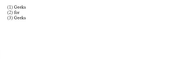
@counter-style
Share your thoughts in the comments
Please Login to comment...