Web API Popover
Last Updated :
23 Nov, 2023
Web API Popover is used to display Popovers in the form of Help, Modals, Toasts, etc. in some messages that require instant attention. It is a standard and consistent mechanism that provides a flexible implementation of popovers in HTML or Javascript.
Concepts and usage
- modals: The rest of the content in the background becomes non-interactive until the user takes some form of action for the modals.
- non-modals: The user can interact with the rest of the page while the popover is shown.
Syntax:
HTML
<button popovertarget="gfgpopover">Toggle popover</button>
<div id="gfgpopover" popover>This is popover</div>
Javascript
popover.togglePopover();
Web API Popover HTML Attributes
The following are the HTML attributes used for the Popovers:
- popover: It is a global attribute and makes the element popover. It takes the popover state as manual or auto.
- popovertarget: It turns a button or input element into a toggle controller of popover.
- popovertargetaction: It specifies the action to be performed by the input element or the controller of the popover. The possible actions are show, hide, and toggle.
Web API Popover CSS Features
The following CSS Features allow us to customize the popover design.
- ::backdrop: It is a pseudo-element that is placed behind the popover element to add effects such as blurring it out, to the page content behind the popover(s).
- :popover-open: It is a pseudo-class that only matches when the popover is open. It is used to style popover elements.
Web API Popover Interfaces
- ToggleEvent: It represents the event notifying the user when a popover’s state toggles. It is the event object for beforetoggle and toggle events.
Web API Popover Instance Properties
- HTMLElement.popover: It gets and sets the popover element’s state (“auto” or “manual”) via javascript.
- HTMLButtonElement.popoverTargetElement and HTMLInputElement.popoverTargetElement: It gets and sets the control element for the popover.
- HTMLButtonElement.popoverTargetAction and HTMLInputElement.popoverTargetAction: It gets or sets the action to be performed by the control button or input that is show, hide or toggle.
Web API Popover Instance Methods
- HTMLElement.hidePopover(): It hides the element from top layer and styles it with display none.
- HTMLElement.showPopover():It shows the popover by adding it to the top layer.
- HTMLElement.togglePopover(): It toggles the view of popover.
Web API Popover Events
The different events fired by the popover are as follows:
- beforetoggle: It is fired just before a popover’s state changes.
- toggle: It is fired just after the popover is shown that is its state changes.
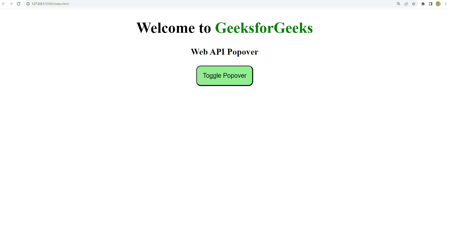
Example 1: Displaying a popover using HTML attributes
HTML
<!DOCTYPE html>
<html lang="en">
<head>
<meta charset="UTF-8" />
<meta name="viewport"
content="width=device-width, initial-scale=1.0" />
<title>Web API Popover</title>
<style>
#gfgpopover::backdrop {
background-color: rgba(0, 0, 0, 0.2);
backdrop-filter: blur(3px);
}
</style>
</head>
<body>
<h1 style="text-align: center">
Welcome to <span style="color: green">
GeeksforGeeks</span>
</h1>
<h3 style="text-align: center">
Web API Popover
</h3>
<div style="width: 100%;
display: flex;
justify-content: center">
<button style="background-color: lightgreen;
padding: 12px;
border-radius: 10px" popovertarget="gfgpopover">
Toggle Popover
</button>
</div>
<div id="gfgpopover" style="background-color:
lightgreen; padding: 12px;
border-radius: 10px" popover>
<h3 style="text-align: center">Popover</h3>
<p style="text-align: center">
Welcome to GeeksforGeeks.
This is a popover. Click outside to close it.
</p>
</div>
</body>
</html>
|
Output
Example 2: Displaying a popover using Javascript
HTML
<!DOCTYPE html>
<html lang="en">
<head>
<meta charset="UTF-8" />
<meta name="viewport"
content="width=device-width, initial-scale=1.0" />
<title>Web API Popover</title>
<style>
#gfgpopover::backdrop {
background-color: rgba(0, 0, 0, 0.2);
backdrop-filter: blur(3px);
}
</style>
</head>
<body>
<h1 style="text-align: center">
Welcome to <span style="color: green">
GeeksforGeeks</span>
</h1>
<h3 style="text-align: center">
Web API Popover
</h3>
<div style="width: 100%;
display: flex;
justify-content: center">
<button style="background-color: lightgreen;
padding: 12px;
border-radius: 10px" onclick="handleClick()">
Show Popover
</button>
</div>
<div id="gfgpopover" style="background-color: lightgreen;
padding: 12px;
border-radius: 10px" popover>
<h3 style="text-align: center">Popover</h3>
<p style="text-align: center">
Welcome to GeeksforGeeks. This is a popover.
Click outside to close it.
</p>
<button style="background-color: lightcoral;
padding: 12px;
border-radius: 10px" onclick="handleClose()">
Close Popover
</button>
</div>
<script>
function handleClick() {
const popover =
document.getElementById("gfgpopover");
popover.showPopover();
}
function handleClose() {
const popover =
document.getElementById("gfgpopover");
popover.hidePopover();
}
</script>
</body>
</html>
|
Output:

Browsers Support
Except Firefox and Samsung Browser, all browses are supported.
Share your thoughts in the comments
Please Login to comment...