SHAP : A Comprehensive Guide to SHapley Additive exPlanations
Last Updated :
03 Jan, 2024
SHAP is a unified framework for interpreting machine learning models. It provides a way to understand the contributions of each input feature to the model’s predictions. SHAP helps us understand how machine learning models work. We will explore more about SHAP and how to plot important graphs using SHAP in this article.
What is SHAP?
SHAP is a framework used to interpret the output of machine learning models. The key idea behind SHAP values is rooted in cooperative game theory and the concept of Shapley values.
Unlike other methods, SHAP gives us a detailed understanding of how each feature contributes to predictions. This not only ensures fairness but also makes it easier for everyone to understand.
SHAP is useful because it shows us the importance of each feature in making predictions. Providing Shapley values, helps us understand complex models and how input features affect predictions.
Creating a Simple XGBRegression Model for SHAP Interpretation:
Install necessary packages:
! pip install xgboost shap pandas scikit-learn ipywidgets matplotlib
Creating a model:
In the following code snippet, XGBoost is used to train a regression model on the abalone dataset then using SHAP (SHapley Additive exPlanations) to explain the model’s predictions.
We have imported necessary packages: xgboost, shap, pandas. And loaded the abalone dataset.
Data preprocessing and Feature Engineering:
- The target variable (
Rings) is separated from the features (X and y).
- One-hot encoding is applied to the categorical feature
Sex.
- The dataset is split into training and testing sets.
After data processing step we have created an XGBRegressor Model and trained on the training model.
The SHAP Explainer is created using the loaded XGBoost model and the SHAP values are calculated for the test set.
And last, we have initialized the JavaScript visualization library for displaying SHAP summary plots.
Python3
import xgboost as xgb
import shap
import pandas as pd
from sklearn.model_selection import train_test_split
columns = ["Sex", "Length", "Diameter", "Height", "WholeWeight",
"ShuckedWeight", "VisceraWeight", "ShellWeight", "Rings"]
abalone_data = pd.read_csv(url, header=None, names=columns)
X = abalone_data.drop("Rings", axis=1)
y = abalone_data["Rings"]
X = pd.get_dummies(X, columns=["Sex"], drop_first=True)
X_train, X_test, y_train, y_test = train_test_split(
X, y, test_size=0.2, random_state=42)
model = xgb.XGBRegressor()
model.fit(X_train, y_train)
model.save_model('model.json')
loaded_model = xgb.XGBRegressor()
loaded_model.load_model('model.json')
explainer = shap.Explainer(loaded_model)
shap_values = explainer(X_test)
shap.initjs()
|
Waterfall Plot:
- Gives the contribution of each feature to the model’s output for a specific prediction. The output is sequential view of how features influence the model’s prediction.
Python3
loaded_model = xgb.XGBRegressor()
loaded_model.load_model('model.json')
explainer = shap.Explainer(loaded_model)
shap_values = explainer(X_test)
shap.waterfall_plot(shap_values[0])
|
Output:
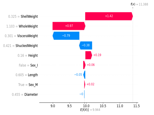
Waterfall plot
- Color Coding: Features pushing the prediction higher are shown in red, while those pushing it lower are in blue.
Force Plot:
- It shows a detailed breakdown of the features’ contributions for a specific prediction. Typically interactive, it allows users to explore and understand individual feature contributions.
Python3
explainer = shap.Explainer(model)
shap_values = explainer(X_test)
if isinstance(shap_values, shap.Explanation):
shap_values = shap_values.values
shap.force_plot(explainer.expected_value, shap_values[0], X_test.iloc[0, :], matplotlib=True)
|
Output:
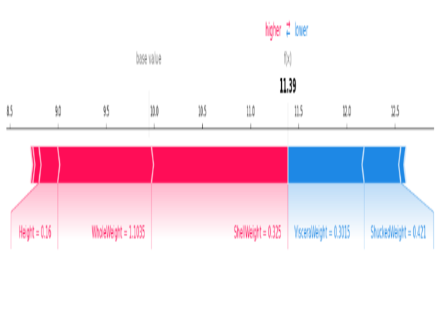
Force plot
- Color Coding: Similar to the waterfall plot, with red indicating positive contributions and blue indicating negative ones.
Stacked Force Plot:
- It Extends the force plot concept to visualize explanations for an entire dataset.
- It Allows stacking force plots for multiple predictions, providing an overview of feature contributions across various instances.
- It is useful for identifying patterns and trends in feature contributions across a dataset.
Python3
if isinstance(shap_values, shap.Explanation):
shap_values = shap_values.values
shap.initjs()
for i in range(100):
shap.force_plot(explainer.expected_value, shap_values[0], X_test.iloc[0, :], matplotlib=True)
|
Output:
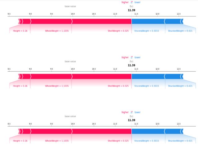
Stacked force plot
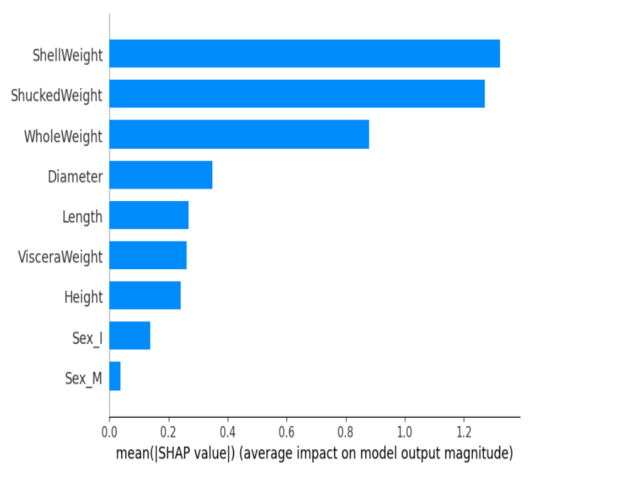
Mean SHAP Plot:
- It Represents the mean absolute SHAP values for each feature across all predictions. It displays as a bar plot, indicating the average impact of each feature.
Python3
shap.summary_plot(shap_values, X_test)
|
Output:
.png)
Mean SHAP plot
Beeswarm Plot:
- Beeswarm plot provides a detailed view of feature contributions for every prediction in the dataset. Each point represents a prediction, and the plot shows the distribution of feature contributions.
Python3
shap.summary_plot(shap_values, X_test, plot_type="bar")
|
Output:
Beeswarm Plot
- Color Coding: Features are color-coded, and the plot reveals the spread of contributions for each feature.
Dependence Plots:
- It shows how the SHAP value of a single feature changes based on the values of that feature across the whole dataset.
Python3
shap.dependence_plot("ShellWeight", shap_values, X_test)
|
Output:
.png)
Dependence Plots
Feature Importance with SHAP:
To understand machine learning models SHAP (SHapley Additive exPlanations) provides a comprehensive framework for interpreting the portion of each input feature in a model’s predictions.
Shapley Values:
- SHAP allocates a shapely value to each category or feature based on the marginal contributions across all possible combinations.
Individual Feature Contributions:
- SHAP provides a unique value to each feature to represent its impact on the model’s output. it gives a clear understanding of the contribution of each feature to a specific prediction.
Quantifying Impact:
- SHAP assigns a unique number to each feature, it helps to measure how important that feature is in predicting outcomes.
Interpretability Across Models:
- SHAP is model-agnostic, meaning it can be applied to various machine learning models, including tree-based models, linear models, neural networks, and more.
- This helps in always understanding which features are important, no matter what kind of model is being used.
Consistency in Summation:
- Adding up the SHAP values for a prediction is the same as finding the difference between the model’s prediction for that case and the average prediction for all cases.
- This makes sure we can trust and rely on measuring how important each feature is.
Visual Representation:
- SHAP values can be visually represented through plots such as waterfall plots, force plots, and beeswarm plots.
- These visualizations help in intuitively grasping the relative contributions of each feature.
Interpreting Black Box Models with SHAP:
Python3
import xgboost as xgb
import shap
import pandas as pd
from sklearn.datasets import load_iris
from sklearn.model_selection import train_test_split
iris = load_iris()
X = pd.DataFrame(iris.data, columns=iris.feature_names)
y = pd.Series(iris.target, name="Target")
model = xgb.XGBRegressor()
X_train, X_test, y_train, y_test = train_test_split(X, y, test_size=0.2, random_state=42)
model.fit(X_train, y_train)
from sklearn.tree import DecisionTreeClassifier
black_box_model = DecisionTreeClassifier(random_state=42)
black_box_model.fit(X_train, y_train)
explainer = shap.Explainer(black_box_model)
shap_values = explainer.shap_values(X_test)
shap.summary_plot(shap_values, X_test)
|
Output:
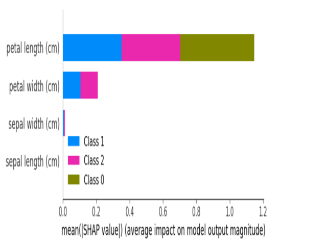
Summary plot of BlackBox model
Applications of SHAP:
- Explain ability in Machine Learning Models: SHAP makes it easier to understand how complex machine models make decisions.
- Feature Importance Analysis: It shows us which parts are more important for better understanding.
- Interpreting Black Box Models: SHAP works with both straightforward and confusing models, making it simple to understand how they work.
- Model Fairness Evaluation: SHAP can help us see if models are making fair decisions.
- Understanding Relationships Between Features: SHAP helps us find connections between different features in a dataset.
- Risk Assessment Models: SHAP can be applied in models that evaluate risks.
Challenges of SHAP:
- Computational Intensity: SHAP might be slow with big sets of data.
- Model Dependency: SHAP’s functioning can vary based on the type of model being employed.
- High-Dimensional Data Challenges: SHAP face challenges when dealing with data that has many features.
- Model Training Overhead: Using SHAP might require additional time for training the model.
- Sensitivity to Input Order: The appearance of SHAP values can change depending on the order of the data.
In summary, SHAP is like a powerful tool that helps us see which parts of our data matter the most in making predictions. It works for different kinds of models and shows us clear pictures to make things easier to understand. This makes it really useful for people who want to trust and better understand their complicated models.
Share your thoughts in the comments
Please Login to comment...