Semantic-UI Input Disabled State
Last Updated :
24 Feb, 2022
Semantic UI is an open-source framework that uses CSS and jQuery to build great user interfaces. It is the same as a bootstrap for use and has great different elements to use to make your website look more amazing.
Semantic UI has a bunch of components for user interface design. One of them is the Inputs component. Inputs are used for various purposes on a web page. It is useful in taking information from the user in real-time and saving it in a database. Depending on the requirements of the usage of inputs there are different states of inputs. One of them is the disabled state.
Semantic UI Input Disabled State: The user might need to show a disabled input by default. The user might need to display some inputs in UI whose values are not to be changed or the person does not have the access to perform this action. In that case, a disabled state comes in handy.
Semantic UI Input Disabled State Class:
- disabled: This class is used to specify the disabled state of inputs.
Syntax:
<div class="ui disabled input">
    <input type="text" placeholder="">
    ...
</div>
Example 1: This example demonstrates the input disabled state using the disabled class. You can see the output in the image below which shows labeled disabled input.
HTML
<!DOCTYPE html>
<html>
<head>
<link href=
rel="stylesheet" />
</head>
<body>
<div class="ui container">
<br /><br />
<h2 class="ui header green">GeeksforGeeks</h2>
<b>
<p>Semantic UI Input Disabled State</p>
</b>
<hr>
<br />
<div class="ui labeled disabled input">
<div class="ui label">
Disabled Input
</div>
<input type="text"
placeholder="Enter your text">
</div>
</div>
</body>
</html>
|
Output:
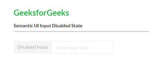
Semantic-UI Input Disabled State
Example 2: This example demonstrates the input disabled state using the disabled class. You can see the output in the image below which shows different disabled inputs.
HTML
<!DOCTYPE html>
<html>
<head>
<link rel="stylesheet"
href=
</head>
<body>
<div class="ui container">
<h2 class="ui header green">GeeksforGeeks</h2>
<b>
<p>Semantic UI Input Disabled State</p>
</b>
<hr><br />
<strong></strong>
<strong>Disabled State text input :</strong>
<div class="ui disabled input">
<input type="text"
placeholder="Enter your name here">
</div>
<br /><br />
<strong>Disabled State date input :</strong>
<div class="ui disabled input" />
<input type="date">
</div>
<br /><br />
<strong>Disabled State local date input :</strong>
<div class="ui disabled input">
<input type="datetime-local" />
</div>
<br /><br />
<strong>Disabled State email input :</strong>
<div class="ui disabled input">
<input type="email"
placeholder="email" />
</div>
<br /><br />
<strong>Disabled State password input :</strong>
<div class="ui disabled input">
<input type="password"
placeholder="password" />
</div>
</body>
</html>
|
Output:
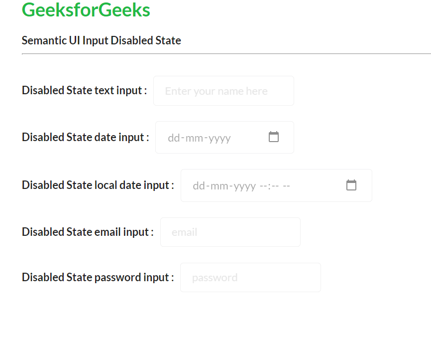
Semantic-UI Input Disabled State
Reference: https://semantic-ui.com/elements/input.html#disabled
Share your thoughts in the comments
Please Login to comment...