React Suite Modal Component
Last Updated :
11 Apr, 2022
React Suite is a popular front-end library with a set of React components that are designed for the middle platform and back-end products. Modal component allows the user to provide a solid foundation for creating dialogs, lightboxes, popovers, etc. We can use the following approach in ReactJS to use the React Suite Modal Component.
Modal Props:
- autoFocus: The Modal is opened and is automatically focused on its own when this is set to true.
- backdrop: The Modal will display the background in its opened state when this is set to true.
- backdropClassName: It is used to add an optional extra class name to .modal-backdrop.
- classPrefix: It is used to denote the prefix of the component CSS class.
- dialogClassName: It is used for the CSS class applied to Dialog DOM nodes.
- dialogComponentClass: It can be used for the custom element type for Dialog.
- enforceFocus: The Modal will prevent the focus from leaving when opened when this is set to true.
- full: It is used for the full screen.
- keyboard: Close Modal when the ESC key is pressed.
- onEnter: It is a callback function that is triggered before the Modal transitions in.
- onEntered: It is a callback function that is triggered after the Modal finishes transitioning in.
- onEntering: It is a callback function that is triggered as the Modal begins to transition in.
- onExit: It is a callback function that is triggered right before the Modal transitions out.
- onExited: It is a callback function that is triggered after the Modal finishes transitioning out.
- onExiting: It is a callback function that is triggered as the Modal begins to transition out.
- onHide: It is a callback function that is triggered when Modal hides.
- onShow: It is a callback function that is triggered when Modal displays.
- overflow: Automatically sets the height when the body content is too long.
- show: It is used to show the Modal.
- size: It is used to set the Modal size.
Modal.Header Props:
- classPrefix: It is used to denote the prefix of the component CSS class.
- closeButton: It is used to display the close button.
- onHide: It is a callback function that is triggered when Modal is hidden.
Modal.Title Props:
- classPrefix: It is used to denote the prefix of the component CSS class.
Modal.Footer Props:
- classPrefix: It is used to denote the prefix of the component CSS class.
Modal.Body Props:
- classPrefix: It is used to denote the prefix of the component CSS class.
Creating React Application And Installing Module:
-
Step 1: Create a React application using the following command:
npx create-react-app foldername
-
Step 2: After creating your project folder i.e. foldername, move to it using the following command:
cd foldername
-
Step 3: After creating the ReactJS application, Install the required module using the following command:
npm install rsuite
Project Structure: It will look like the following.

Project Structure
Example: Now write down the following code in the App.js file. Here, App is our default component where we have written our code.
App.js
import React from 'react'
import 'rsuite/dist/styles/rsuite-default.css';
import { Button, Modal } from 'rsuite';
export default function App() {
const [show, setShow] = React.useState(false)
const close = () => {
setShow(false);
}
const open = () => {
setShow(true);
}
return (
<div style={{
display: 'block', width: 700, paddingLeft: 30
}}>
<h4>React Suite Modal Component</h4>
<Button onClick={open}> Open</Button>
<Modal show={show} onHide={close}>
<Modal.Header>
<Modal.Title>Sample Modal Title</Modal.Title>
</Modal.Header>
<Modal.Body>
Greetings from GeeksforGeeks
</Modal.Body>
<Modal.Footer>
<Button onClick={close} appearance="primary">
Confirm
</Button>
<Button onClick={close} appearance="subtle">
Cancel
</Button>
</Modal.Footer>
</Modal>
</div>
);
}
|
Step to Run Application: Run the application using the following command from the root directory of the project:
npm start
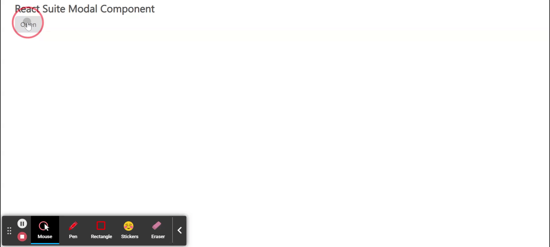
Output: Now open your browser and go to http://localhost:3000/, you will see the following output:
Reference: https://rsuitejs.com/components/modal/
Share your thoughts in the comments
Please Login to comment...