How to Style the Native File Upload Input Field ?
Last Updated :
08 Feb, 2024
Web forms play a pivotal role in user interactions, and among their components, the native file upload input field often lacks the design flair that today’s websites demand. This article deeply delves into imaginative methods to style the native file upload input field, going beyond mere functionality to create a visually appealing and user-friendly experience that resonates with modern design trends.
This approach involves creating a stylish button that, when clicked, activates the hidden file input. The label acts as a styled button, and when clicked, it triggers the hidden file input. The display: none style keeps the file input hidden until the button is clicked.
Syntax:
<label for="fileInput" class="custom-file-upload">
  Choose a File
</label>
<input type="file" id="fileInput" style="display:none;">
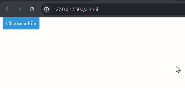
Example: Illustration of styling the Native File Upload Input Field.
HTML
<!DOCTYPE html>
<html lang="en">
<head>
<meta charset="UTF-8">
<meta name="viewport"
content="width=device-width, initial-scale=1.0">
<style>
.custom-file-upload {
padding: 10px;
cursor: pointer;
background-color: #3498db;
color: #fff;
border-radius: 5px;
}
</style>
</head>
<body>
<label for="fileInput" class="custom-file-upload">
Choose a File
</label>
<input type="file" id="fileInput" style="display:none;">
</body>
</html>
|
Output:
CSS Pseudo-classes
This approach uses CSS pseudo-classes to dynamically change the style of the file input when a user interacts with it, like hovering over it. The CSS rule selects the file input and applies specified styles when the user hovers over it. This gives a visual cue to the user.
Syntax:
input[type="file"]:hover {
  /* Your hover styles */
}
Example: Illustration of styling the Native File Upload Input Field using CSS Pseudo-classes.
HTML
<!DOCTYPE html>
<html lang="en">
<head>
<meta charset="UTF-8">
<meta name="viewport"
content="width=device-width, initial-scale=1.0">
<style>
input[type="file"]:hover {
background-color: #3498db;
color: #fff;
}
</style>
</head>
<body>
<input type="file" id="fileInput">
</body>
</html>
|
Output:
CSS opacity Property
We can hide the actual file input by setting its opacity to zero and overlays a styled element to create a visually appealing custom button. The .custom-file-upload div acts as the styled button, and the hidden file input (opacity: 0) is layered on top. Clicking the button activates the file input without showing it.
Syntax:
<input type="file" id="fileInput" class="file-input">

// CSS opacity Property
.file-input
{
  opacity: 0;
}
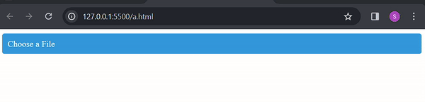
Example: Illustration of styling the Native File Upload Input Field using CSS opacity Property.
HTML
<!DOCTYPE html>
<html lang="en">
<head>
<meta charset="UTF-8">
<meta name="viewport"
content="width=device-width, initial-scale=1.0">
<style>
.custom-file-upload {
position: relative;
padding: 10px;
cursor: pointer;
background-color: #3498db;
color: #fff;
border-radius: 5px;
}
.file-input {
position: absolute;
top: 0;
left: 0;
width: 100%;
height: 100%;
opacity: 0;
cursor: pointer;
}
</style>
</head>
<body>
<div class="custom-file-upload">
Choose a File
<input type="file" id="fileInput" class="file-input">
</div>
</body>
</html>
|
Output:
Share your thoughts in the comments
Please Login to comment...