How to Style Lists in Tailwind CSS ?
Last Updated :
19 Apr, 2024
Styling lists in Tailwind CSS helps make lists on websites look better and more unique. By customizing the appearance of lists, it enhances the look and feel of a website, making it easier for people to read and navigate.
These are the following approaches to Style the list in Tailwind CSS:
By using List Styles classes
- In this approach, we are using tailwind CSS classes to style the list.
- Every class represent the different kind of list. we will see some of them in the below example.
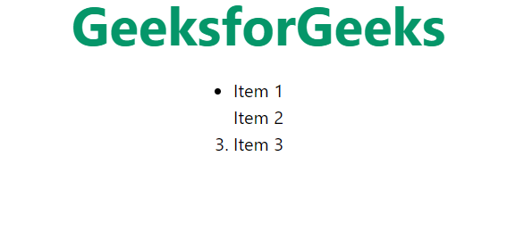
- “list-none” class Removes default list styles such as bullet points or numbering from unordered (<ul>) and ordered (<ol>) lists.
- “list-disc” class Applies a filled circle bullet point to each list item in an unordered list (<ul>).
- “list-decimal” class Applies decimal numbering to each list item in an ordered list (<ol>).
Syntax:
<ul class="list-none">
    <li>Item 1</li>
    <li>Item 2</li>
    <li>Item 3</li>
</ul>
Example: This example shows the uses of classes to style the list.
HTML
<!DOCTYPE html>
<html lang="en">

<head>
    <meta charset="UTF-8">
    <meta name="viewport"
        content="width=device-width,
                initial-scale=1.0">
    <link href=
"https://cdn.jsdelivr.net/npm/tailwindcss@2.2.19/dist/tailwind.min.css"
        rel="stylesheet">
        <link rel="stylesheet" href="style.css">
    <title>
        Tailwind CSS Lists
    </title>
</head>

<body class="text-center">
    <h1 class="text-green-600 text-5xl font-bold">
        GeeksforGeeks
    </h1>
    <div class="flex justify-center items-center mt-6">

        <ul >
            <li class="list-none" >Item 1</li>
            <li class="list-disc">Item 2</li>
            <li class="list-decimal">Item 3</li>
        </ul><br><br>
    </div>
</body>

</html>
Output:
output
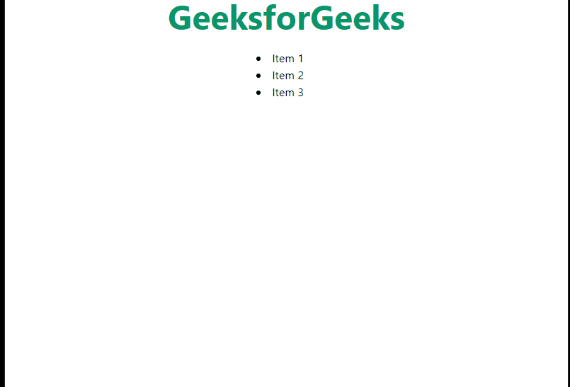
- Breakpoints and media queries are essential for creating responsive web designs that adapt to various screen sizes.
- In Tailwind CSS, breakpoints are predefined thresholds that trigger layout adjustments and style changes.
- Tailwind simplifies the use of media queries with utility classes prefixed by abbreviations like `sm`, `md`, `lg`, `xl`, and `2xl`, corresponding to different screen sizes.
- By applying these utility classes directly to HTML elements, developers can effortlessly craft responsive layouts without writing custom CSS media queries.
- This approach allows for granular control over element styles at specific breakpoints, ensuring a consistent user experience across devices.
- With Tailwind CSS, developers can efficiently build web applications that seamlessly transition between desktop and mobile environments, delivering compelling experiences to users regardless of the device they use.
- Tailwind CSS provides utility classes that allow you to apply styles based on breakpoints.
Example: This example shows the list in bullet point at big screen and no format at all in small screens.
HTML
<!DOCTYPE html>
<html lang="en">
<head>
<meta charset="UTF-8">
<meta name="viewport"
content="width=device-width,
initial-scale=1.0">
<link href=
"https://cdn.jsdelivr.net/npm/tailwindcss@2.2.19/dist/tailwind.min.css"
rel="stylesheet">
<link rel="stylesheet"
href="style.css">
<title>
Tailwind CSS Lists
</title>
</head>
<body class="text-center">
<h1 class="text-green-600 text-5xl font-bold">
GeeksforGeeks
</h1>
<div class="flex justify-center items-center mt-6">
<ul class="list-none md:list-disc">
<li> Item 1</li>
<li> Item 2</li>
<li> Item 3</li>
</ul>
</div>
</body>
</html>
Output:
By using Arbitrary Values and customizing the theme
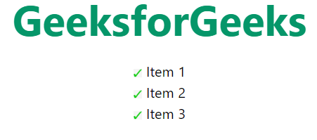
Tailwind CSS offers flexibility in styling elements with arbitrary values. we are firstly setting the theme into the module of the tailwind config file so that we can access that theme locally. The listStyleImage of theme can be any type of image. in this approach we are using right check image to show the customize list style type in tailwind CSS.
Example: This example shows the customize list style type.
HTML
<!-- index.html -->
<!DOCTYPE html>
<html lang="en">
<head>
<meta charset="UTF-8">
<meta name="viewport"
content="width=device-width,
initial-scale=1.0">
<link href=
"https://cdn.jsdelivr.net/npm/tailwindcss@2.2.19/dist/tailwind.min.css"
rel="stylesheet">
<link rel="stylesheet" href="style.css">
<title>
Tailwind CSS Lists
</title>
</head>
<body class="text-center">
<h1 class="text-green-600 text-5xl font-bold">
GeeksforGeeks
</h1>
<div class="flex justify-center items-center mt-6">
<ul class="list-image-[url(img.png)] ">
<li> Item 1</li>
<li> Item 2</li>
<li> Item 3</li>
</ul>
</div>
</body>
</html>
module.exports = {
  theme: {
    extend: {
      listStyleImage: {
        img: 'url("/img/img.png")',
      },
    }
  }
}
Output:
output
Share your thoughts in the comments
Please Login to comment...