How to stop submit button from expanding along with textarea?
Last Updated :
26 Jul, 2021
Below is an example of the problem encountered. Here the button tag includes the ‘form-control’ class. The form control class aligns all the elements that incorporates it. The button is no exception and hence gets aligned or flexed with the textarea.
html
<!DOCTYPE html>
<html>
<head>
<link rel="stylesheet"
href=
integrity=
"sha384-Vkoo8x4CGsO3+Hhxv8T/Q5PaXtkKtu6ug5TOeNV6gBiFeWPGFN9MuhOf23Q9Ifjh"
crossorigin="anonymous" />
</head>
<body>
<div class="container mt-5">
<div class="row">
<div class="col-4">
<textarea class="form-control"
id=
"exampleFormControlTextarea1"
rows="3">
</textarea>
<button type="button"
class=
"form-control btn btn-primary">
Submit</button>
</div>
</div>
</div>
</body>
</html>
|
Output
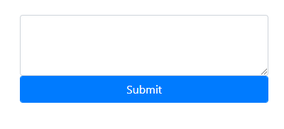
Bootstrap 4 is one of the most popular CSS framework adopted by web developers for the creation of dynamic and interactive user interface. Bootstrap 4 comes bundled with variety of components that can be used to build attractive websites. One such component is the Form Control which is used to create form designs. The form control class has predefined CSS properties which makes it easier to use these components directly in the code without the hassle of rewriting CSS properties for individual components. However, using the form control class for both textarea and button causes the button to expand along with the text area.
Some terminologies that are used in these examples are:
- container: The container class pads the contents inside it. It is a response fixed width container.
- mt-5: The mt-5 is a utility or helper class that is used to set the top margin to 3rem ie thrice the size of the font.
- form-control: .form-control class is added to all textual input, textarea, and select elements. It has global properties which maintains the spacing and alignment of the form elements.
- form-inline: The .form-inline class ensures that the elements are inline.
- btn: .btn class is supposed to be used with <button> tags in Bootstrap 4./li>
- btn-primary: .btn-primary provides blue colored button.
- mb-2: The mb-2 is a utility or helper class that is used to set the bottom margin to 0.5rem ie 0.5 times the size of the font.
First Approach:
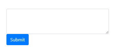
The following approaches can be considered to prevent the expansion of button along with the textarea. The bootstrap cdn is imported at first. This allows the components used to have global properties as defined in the Bootstrap stylesheets. Next the container is formed and a row and column is defined. The column contains the textarea along with the button. The button does not include the form control class in this example. As a result the button is placed below the textarea. Thus even if the textarea expands along with the text the button size remains completely unchanged.
Example:
html
<!DOCTYPE html>
<html>
<head>
<link rel="stylesheet"
href=
integrity=
"sha384-Vkoo8x4CGsO3+Hhxv8T/Q5PaXtkKtu6ug5TOeNV6gBiFeWPGFN9MuhOf23Q9Ifjh"
crossorigin="anonymous" />
</head>
<body>
<div class="container mt-5">
<div class="row">
<div class="col-4">
<textarea class="form-control"
id=
"exampleFormControlTextarea1"
rows="3">
</textarea>
<button type="button"
class="btn btn-primary">
Submit</button>
</div>
</div>
</div>
</body>
</html>
|
Output :
Second Approach:
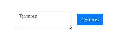
In this approach we use the form-inline class which ensures that the textarea and button are placed along the same line yet the button size remains unaffected from the expanding textarea. The bootstrap cdn is imported at first. This allows the components used to have global properties as defined in the Bootstrap stylesheets. Next the container is formed and a form is defined. The form contains the textarea as a input field along with a button. The button tag does not include the form control class hence it does not flex with the textarea. Also due to the inline property, the button is placed right next to the textarea. But since the button is independent of the textarea, so even if the textarea increases in terms of height the button size remains unchanged.
Example:
html
<!DOCTYPE html>
<html>
<head>
<link rel="stylesheet"
href=
integrity=
"sha384-Vkoo8x4CGsO3+Hhxv8T/Q5PaXtkKtu6ug5TOeNV6gBiFeWPGFN9MuhOf23Q9Ifjh"
crossorigin="anonymous" />
</head>
<body>
<div class="container mt-5">
<form class="form-inline">
<div class="form-group mx-sm-3 mb-2">
<textarea type="textarea"
class="form-control"
id="textarea"
placeholder="Textarea">
</textarea>
</div>
<button type="submit"
class="btn btn-primary mb-2">
Confirm</button>
</form>
</div>
</body>
</html>
|
Output :
Share your thoughts in the comments
Please Login to comment...