How to Monitor Changing Window Sizes in VueJS ?
Last Updated :
05 Jan, 2024
Monitoring changing window sizes in a Vue.js application is crucial for creating responsive designs. Vue provides a few ways to achieve this, allowing you to dynamically respond to changes in the window dimensions. In this article, we will learn How to monitor changing window sizes in Vue.
Two common approaches involve using the window object directly or utilizing the Vue resize event.
Approach 1: Using window Object Directly
In this approach, we will directly listen to the resize event on the window object. This is a straightforward method, but it involves adding a global event listener.
Syntax:
window.addEventListener('resize', callbackFunctionMonitorChanges);
Example: The below wexample will explain how to use window object to detect the window size change.
HTML
<!DOCTYPE html>
<html lang="en">
<head>
<meta charset="UTF-8">
<meta name="viewport"
content="width=device-width,
initial-scale=1.0">
<title>GFG</title>
</head>
<body>
<div id="app"></div>
<script src=
</script>
<script>
new Vue({
el: '#app',
data() {
return {
windowWidth: window.innerWidth,
windowHeight: window.innerHeight,
};
},
mounted() {
// Add a global event listener
// for window resize
window.addEventListener
('resize', this.handleWindowSizeChange);
},
beforeDestroy() {
// Remove the event listener when
// the component is destroyed
window.removeEventListener
('resize', this.handleWindowSizeChange);
},
methods: {
handleWindowSizeChange() {
// Update data properties with
// new window dimensions
this.windowWidth = window.innerWidth;
this.windowHeight = window.innerHeight;
// Additional logic based on
// window size changes
console.log('Window dimensions changed:',
this.windowWidth,
this.windowHeight);
},
},
template: `
<div>
<h2 style="color:green">
GeeksforGeeks
</h2>
<h2>
How to monitor changing
window sizes in Vue?
</h2>
<p>
Window Width: {{ windowWidth }}px
</p>
<p>
Window Height: {{ windowHeight }}px
</p>
</div>
`,
});
</script>
</body>
</html>
|
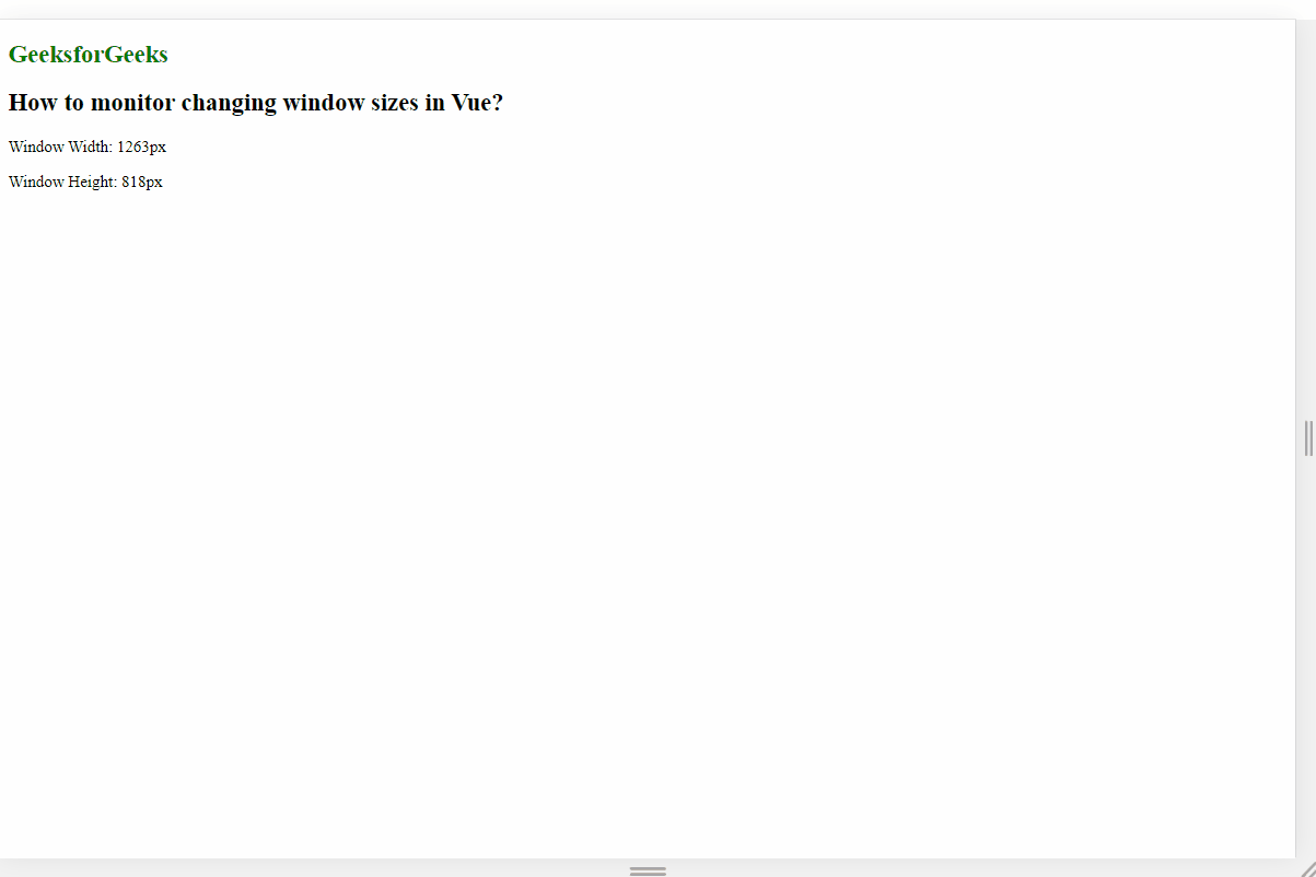
Output:
Approach 2: Define a custom Vue directive
In this approach, we will define a custom vue directive to monitor changes. The bind hook will be used to attach a window resize event listener. This approach allows you to apply the v-resize directive to any element and customize the behavior in the associated method. We define a custom Vue directive named resize. The directive calls the specified method (handleResize in this case) with the current width and height of the element whenever a resize occurs. The unbind hook removes the event listener when the element is unbound.
Example: The below code example explains the use of the custom vue directive to monitor changes in the window sizes.
HTML
<!DOCTYPE html>
<html lang="en">
<head>
<meta charset="UTF-8">
<meta name="viewport"
content="width=device-width,
initial-scale=1.0">
<title>
Vue Window Resize Monitor
</title>
</head>
<body>
<div id="app">
<div v-resize-window="handleResize">
<h1>
Vue Window Resize Monitor
</h1>
<p>
Window Width: {{ windowWidth }}px
</p>
<p>
Window Height: {{ windowHeight }}px
</p>
</div>
</div>
<script src=
</script>
<script>
Vue.directive('resize-window', {
bind(el, binding) {
const handleResize = () => {
binding.value(
window.innerWidth,
window.innerHeight);
};
window.addEventListener
('resize', handleResize);
el._handleResize = handleResize;
// Call the handler once
// to initialize the dimensions
handleResize();
},
unbind(el) {
window.removeEventListener
('resize', el._handleResize);
},
});
new Vue({
el: '#app',
data() {
return {
windowWidth: 0,
windowHeight: 0,
};
},
methods: {
handleResize(width, height) {
// Update data properties
// with new dimensions
this.windowWidth = width;
this.windowHeight = height;
// Additional logic based on
// window size changes
console.log(
'Window dimensions changed:',
this.windowWidth, this.windowHeight);
},
},
});
</script>
</body>
</html>
|
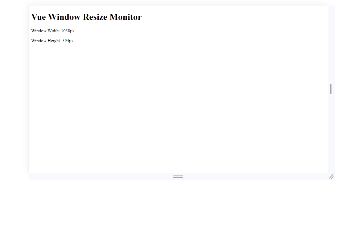
Output:
Conclusion
Monitoring and responding to changing window size in a Vue.js application is essential for creating responsive and dynamic user interfaces. There are several approaches to achieve this, and the choice depends on your specific requirements and preferences.
Share your thoughts in the comments
Please Login to comment...