How to Create Dividers with CSS ?
Last Updated :
04 Mar, 2024
A divider is a crucial element in web design to visually separate content and enhance the overall layout. In CSS, there are several approaches to creating dividers, each offering flexibility and customization options. We can achieve this effect in many ways like CSS Border Property, Pseudo-elements, Gradient, and styling hr element.
Approach 1: Using CSS Border Property
This method utilizes the border property to create a simple divider. You can customize the color, style, and thickness of the border to achieve the desired look.
Example: Illustration of creating a divider using CSS
HTML
<!DOCTYPE html>
<html lang="en">
<head>
<meta charset="UTF-8">
<meta name="viewport"
content="width=device-width, initial-scale=1.0">
<title>Divider</title>
<style>
.divider {
border-top: 1px solid #000;
}
</style>
</head>
<body>
<div class="divider"></div>
</body>
</html>
|
Output:

Border Approach
Approach 2: Using Pseudo-elements
This approach involves using pseudo-elements (::before or ::after) to generate a virtual element and style it as a divider. It provides more flexibility and allows for additional customization.
Example: Illustration of creating a divider Using Pseudo-elements
HTML
<!DOCTYPE html>
<html lang="en">
<head>
<meta charset="UTF-8">
<meta name="viewport"
content="width=device-width, initial-scale=1.0">
<title>Divider</title>
<style>
.divider::after {
content: "";
display: block;
border-top: 1px solid #333;
margin: 20px 0;
}
</style>
</head>
<body>
<div class="divider"></div>
</body>
</html>
|
Output:

Output
Approach 3: Using Gradient
Using gradients, you can create a smooth transition between colors to form a visually appealing divider. This approach is ideal for adding a subtle and modern touch to your design.
Example: Illustration of creating a divider Using Gradient
HTML
<!DOCTYPE html>
<html lang="en">
<head>
<meta charset="UTF-8">
<meta name="viewport"
content="width=device-width, initial-scale=1.0">
<title>Divider</title>
<style>
.divider {
height: 5px;
background: linear-gradient(to right, #ffcc00, #ffffff, #ffcc00);
}
</style>
</head>
<body>
<div class="divider"></div>
</body>
</html>
|
Output

Gradient Approach
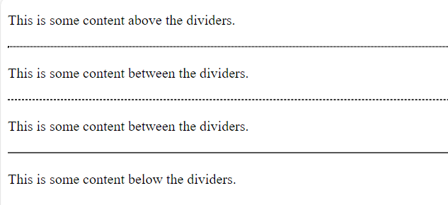
Approach 4: Using hr Element with different styles
Style the <hr> tag with different border styles like dotted, dashed, solid. This approach is ideal for adding a subtle and modern touch to your design.
Example: Illustration of creating a divider Using hr Element with different styles
HTML
<!DOCTYPE html>
<html lang="en">
<head>
<meta charset="UTF-8">
<meta name="viewport"
content="width=device-width, initial-scale=1.0">
<title>Styled Dividers</title>
<style>
/* Styling for the dotted divider */
.dotted-divider {
border: 1px dotted #000;
}
/* Styling for the dashed divider */
.dashed-divider {
border: 1px dashed #333;
}
/* Styling for the solid divider */
.solid-divider {
border: 1px solid #555;
}
/* Additional styling for spacing and visibility */
hr {
margin: 20px 0;
}
</style>
</head>
<body>
<p>This is some content above the dividers.</p>
<hr class="dotted-divider">
<p>This is some content between the dividers.</p>
<hr class="dashed-divider">
<p>This is some content between the dividers.</p>
<hr class="solid-divider">
<p>This is some content below the dividers.</p>
</body>
</html>
|
Output:
Share your thoughts in the comments
Please Login to comment...