How to Control the Background Size in Tailwind CSS ?
Last Updated :
08 Feb, 2024
To control background-size in Tailwind CSS, use the bg-{size} utility classes. These classes allow you to adjust the background size, providing options like bg-cover for covering the entire element, bg-contain for fitting the content within, and custom sizes such as bg-auto or bg-50%. Tailwind simplifies background sizing, offering flexibility and ease of customization for a seamless design experience.
Using bg-cover
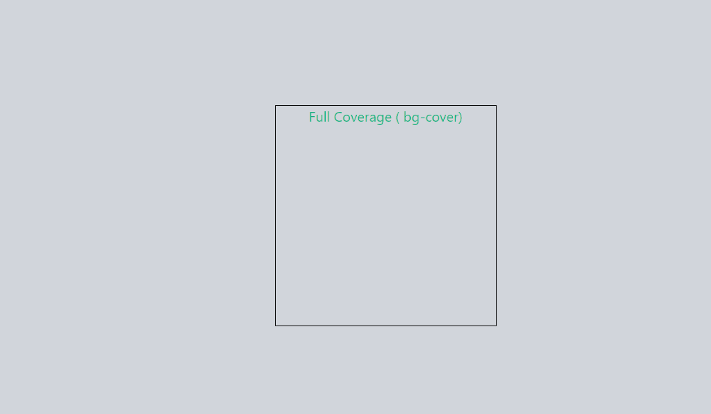
The “bg-cover” class in Tailwind CSS ensures full coverage of the background image within the container.
Syntax:
<element class="bg-cover">
  <!-- Your content goes here -->
</element>
Example: Implementation to show bg-cover property.
HTML
<!DOCTYPE html>
<html lang="en">
<head>
<meta charset="UTF-8">
<meta name="viewport"
content="width=device-width, initial-scale=1.0">
<title>Full Coverage</title>
<link rel="stylesheet" href=
</head>
<body class="min-h-screen flex items-center justify-center bg-gray-300">
<div class="bg-cover w-64 h-64 border border-black">
<p class="text-green-500 text-center">Full Coverage ( bg-cover)</p>
</div>
</body>
</html>
|
Output:
Using bg-contain
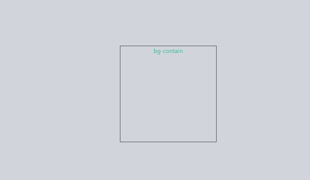
The “bg-contain” class sets the background image size to fit within the container dimensions, scaling it accordingly.
<element class="bg-contain">
  <!-- Your content goes here -->
</element>
Example: Implementation to show bg-contain property.
HTML
<!DOCTYPE html>
<html lang="en">
<head>
<meta charset="UTF-8">
<meta name="viewport"
content="width=device-width, initial-scale=1.0">
<title>Contain</title>
<link rel="stylesheet" href=
</head>
<body class="min-h-screen flex items-center justify-center bg-gray-300">
<div class="bg-contain w-64 h-64 border border-black">
<p class="text-green-500 text-center">bg-contain</p>
</div>
</body>
</html>
|
Output:
Using bg-auto
Tailwind’s “bg-auto” class adjusts the background size automatically based on its content.
<element class="bg-auto">
  <!-- Your content goes here -->
</element>
Example: Implementation to show bg-auto property.
HTML
<!DOCTYPE html>
<html lang="en">
<head>
<meta charset="UTF-8">
<meta name="viewport"
content="width=device-width, initial-scale=1.0">
<title>Automatic Size</title>
<link rel="stylesheet" href=
</head>
<body class="min-h-screen flex items-center justify-center bg-gray-300">
<div class="bg-auto w-64 h-64 border border-black">
<p class="text-green-500 text-center">Automatic Size (bg-auto)</p>
</div>
</body>
</html>
|
Output:

Share your thoughts in the comments
Please Login to comment...