Bootstrap | Tables | Set-2
Last Updated :
27 Apr, 2022
Bootstrap provides us a series of classes that can be used to apply various styling to tables such as changing the heading appearance, making the rows striped, adding or removing borders, and making rows hoverable. Bootstrap also provides classes for making tables responsive.
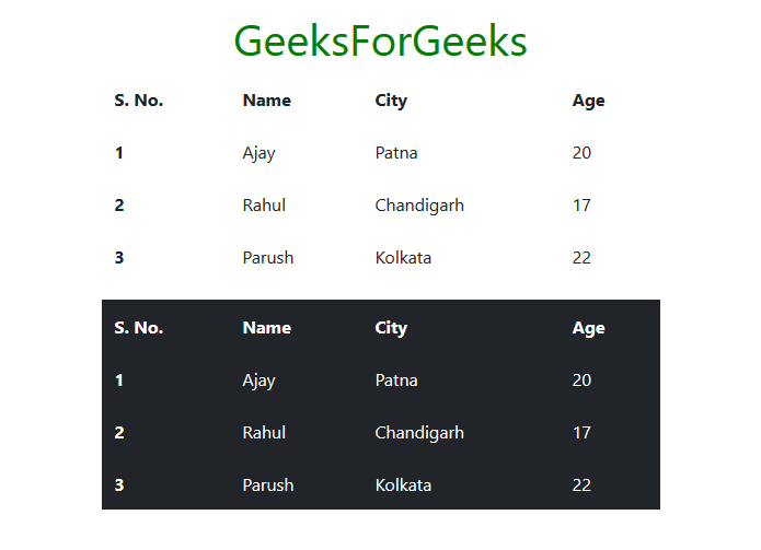
Borderless table: To make the table borderless use the class table-borderless along with the class table class within the <table> tag. We can also make the dark table borderless by using the combination of classes table, table-dark, and table-borderless within the <table> tag. See the example below for illustration.
Example:
HTML
<!DOCTYPE html>
<html lang="en">
<head>
<meta charset="utf-8">
<meta name="viewport" content="width=device-width,
initial-scale=1, shrink-to-fit=no">
<link rel="stylesheet" href=
integrity=
"sha384-GJzZqFGwb1QTTN6wy59ffF1BuGJpLSa9DkKMp0DgiMDm4iYMj70gZWKYbI706tWS"
crossorigin="anonymous">
<title>Bootstrap | Tables</title>
<style>
h1 {
color: green;
text-align: center;
}
div {
margin-top: 10px;
}
</style>
</head>
<body>
<div class="container">
<h1>GeeksForGeeks</h1>
<table class="table table-borderless">
<thead>
<tr>
<th scope="col">S. No.</td>
<th scope="col">Name</td>
<th scope="col">City</td>
<th scope="col">Age</td>
</tr>
</thead>
<tbody>
<tr>
<th scope="row">1</td>
<td>Ajay</td>
<td>Patna</td>
<td>20</td>
</tr>
<tr>
<th scope="row">2</td>
<td>Rahul</td>
<td>Chandigarh</td>
<td>17</td>
</tr>
<tr>
<th scope="row">3</td>
<td>Parush</td>
<td>Kolkata</td>
<td>22</td>
</tr>
</tbody>
</table>
<table class="table table-borderless table-dark">
<thead>
<tr>
<th scope="col">S. No.</td>
<th scope="col">Name</td>
<th scope="col">City</td>
<th scope="col">Age</td>
</tr>
</thead>
<tbody>
<tr>
<th scope="row">1</td>
<td>Ajay</td>
<td>Patna</td>
<td>20</td>
</tr>
<tr>
<th scope="row">2</td>
<td>Rahul</td>
<td>Chandigarh</td>
<td>17</td>
</tr>
<tr>
<th scope="row">3</td>
<td>Parush</td>
<td>Kolkata</td>
<td>22</td>
</tr>
</tbody>
</table>
</div>
</body>
</html>
|
Output:
Hoverable table: To make the rows of table hoverable use the class table-hover along with the class table within the <table> tag. We can also make the rows of dark tables hoverable using the combination of classes table, table-hover, and table-dark within the <table> tag. See the example below for illustration.
Example:
HTML
<!DOCTYPE html>
<html lang="en">
<head>
<meta charset="utf-8">
<meta name="viewport" content="width=device-width,
initial-scale=1, shrink-to-fit=no">
<link rel="stylesheet" href=
integrity=
"sha384-GJzZqFGwb1QTTN6wy59ffF1BuGJpLSa9DkKMp0DgiMDm4iYMj70gZWKYbI706tWS"
crossorigin="anonymous">
<title>Bootstrap | Tables</title>
<style>
h1 {
color: green;
text-align: center;
}
div {
margin-top: 10px;
}
</style>
</head>
<body>
<div class="container">
<h1>GeeksForGeeks</h1>
<table class="table table-hover">
<thead>
<tr>
<th scope="col">S. No.</td>
<th scope="col">Name</td>
<th scope="col">City</td>
<th scope="col">Age</td>
</tr>
</thead>
<tbody>
<tr>
<th scope="row">1</td>
<td>Ajay</td>
<td>Patna</td>
<td>20</td>
</tr>
<tr>
<th scope="row">2</td>
<td>Rahul</td>
<td>Chandigarh</td>
<td>17</td>
</tr>
<tr>
<th scope="row">3</td>
<td>Parush</td>
<td>Kolkata</td>
<td>22</td>
</tr>
</tbody>
</table>
<table class="table table-hover table-dark">
<thead>
<tr>
<th scope="col">S. No.</td>
<th scope="col">Name</td>
<th scope="col">City</td>
<th scope="col">Age</td>
</tr>
</thead>
<tbody>
<tr>
<th scope="row">1</td>
<td>Ajay</td>
<td>Patna</td>
<td>20</td>
</tr>
<tr>
<th scope="row">2</td>
<td>Rahul</td>
<td>Chandigarh</td>
<td>17</td>
</tr>
<tr>
<th scope="row">3</td>
<td>Parush</td>
<td>Kolkata</td>
<td>22</td>
</tr>
</tbody>
</table>
</div>
</body>
</html>
|
Output:

Small table: To make the table smaller in size use the class table-sm along with the class table within the <table> tag. This reduces the cell padding to half. To make the dark table smaller in size use the combination of classes table, table-sm, and table-dark within the <table> tag. See the example below for illustration.
Example:
HTML
<!DOCTYPE html>
<html lang="en">
<head>
<meta charset="utf-8">
<meta name="viewport" content="width=device-width,
initial-scale=1, shrink-to-fit=no">
<link rel="stylesheet" href=
integrity=
"sha384-GJzZqFGwb1QTTN6wy59ffF1BuGJpLSa9DkKMp0DgiMDm4iYMj70gZWKYbI706tWS"
crossorigin="anonymous">
<title>Bootstrap | Tables</title>
<style>
h1 {
color: green;
text-align: center;
}
div {
margin-top: 10px;
}
</style>
</head>
<body>
<div class="container">
<h1>GeeksForGeeks</h1>
<table class="table table-sm">
<thead>
<tr>
<th scope="col">S. No.</td>
<th scope="col">Name</td>
<th scope="col">City</td>
<th scope="col">Age</td>
</tr>
</thead>
<tbody>
<tr>
<th scope="row">1</td>
<td>Ajay</td>
<td>Patna</td>
<td>20</td>
</tr>
<tr>
<th scope="row">2</td>
<td>Rahul</td>
<td>Chandigarh</td>
<td>17</td>
</tr>
<tr>
<th scope="row">3</td>
<td>Parush</td>
<td>Kolkata</td>
<td>22</td>
</tr>
</tbody>
</table>
<table class="table table-sm table-dark">
<thead>
<tr>
<th scope="col">S. No.</td>
<th scope="col">Name</td>
<th scope="col">City</td>
<th scope="col">Age</td>
</tr>
</thead>
<tbody>
<tr>
<th scope="row">1</td>
<td>Ajay</td>
<td>Patna</td>
<td>20</td>
</tr>
<tr>
<th scope="row">2</td>
<td>Rahul</td>
<td>Chandigarh</td>
<td>17</td>
</tr>
<tr>
<th scope="row">3</td>
<td>Parush</td>
<td>Kolkata</td>
<td>22</td>
</tr>
</tbody>
</table>
</div>
</body>
</html>
|
Output:

Colored table: Bootstrap provides us with a number of contextual classes that can be used to color the entire row or a single cell of the table. These classes should be used with a light table and not with a dark table for a better appearance. To color dark tables, we can use the background color classes of Bootstrap. The contextual classes are given below. See the example for illustration.
| table-primary |
table-secondary |
table-success |
| table-danger |
table-warning |
table-info |
| table-light |
table-dark |
table-active |
HTML
<!DOCTYPE html>
<html lang="en">
<head>
<meta charset="utf-8">
<meta name="viewport" content="width=device-width,
initial-scale=1, shrink-to-fit=no">
<link rel="stylesheet" href=
integrity=
"sha384-GJzZqFGwb1QTTN6wy59ffF1BuGJpLSa9DkKMp0DgiMDm4iYMj70gZWKYbI706tWS"
crossorigin="anonymous">
<title>Bootstrap | Tables</title>
<style>
h1 {
color: green;
text-align: center;
}
div {
margin-top: 10px;
}
</style>
</head>
<body>
<div class="container">
<h1>GeeksForGeeks</h1>
<table class="table">
<thead>
<tr>
<th scope="col">S. No.</td>
<th scope="col">Name</td>
<th scope="col">City</td>
<th scope="col">Age</td>
</tr>
</thead>
<tbody>
<tr class="table-primary">
<th scope="row">1</td>
<td>Ajay</td>
<td>Patna</td>
<td>20</td>
</tr>
<tr class="table-warning">
<th scope="row">2</td>
<td>Rahul</td>
<td>Chandigarh</td>
<td>17</td>
</tr>
<tr class="table-danger">
<th scope="row">3</td>
<td>Parush</td>
<td>Kolkata</td>
<td>22</td>
</tr>
</tbody>
</table>
<table class="table table-dark">
<thead>
<tr>
<th scope="col">S. No.</td>
<th scope="col">Name</td>
<th scope="col">City</td>
<th scope="col">Age</td>
</tr>
</thead>
<tbody>
<tr class="bg-danger">
<th scope="row">1</td>
<td>Ajay</td>
<td>Patna</td>
<td>20</td>
</tr>
<tr>
<th scope="row">2</td>
<td>Rahul</td>
<td>Chandigarh</td>
<td>17</td>
</tr>
<tr class="bg-primary">
<th scope="row">3</td>
<td>Parush</td>
<td>Kolkata</td>
<td>22</td>
</tr>
</tbody>
</table>
</div>
</body>
</html>
|
Output:

Responsive tables: To make the table responsive on all viewport sizes, wrap the table within an opening and closing <div> tags, having class table-responsive within the opening <div> tag. Similarly, to make the table responsive depending on the viewport size, we use the class table-responsive{-sm|-md|-lg|-xl}, according to the viewport size according to which we want to make our table responsive.
In responsive tables, a horizontal scroll bar will appear if the table does not fit within the viewport of the current size.
In the case of viewport specific responsive table, the table will become responsive if the viewport size is less than the viewport specified by the class table-responsive{-sm|-md|-lg|-xl}. See the examples below for illustration.
Example 1: table-responsive
HTML
<!DOCTYPE html>
<html lang="en">
<head>
<meta charset="utf-8">
<meta name="viewport" content="width=device-width,
initial-scale=1, shrink-to-fit=no">
<link rel="stylesheet" href=
integrity=
"sha384-GJzZqFGwb1QTTN6wy59ffF1BuGJpLSa9DkKMp0DgiMDm4iYMj70gZWKYbI706tWS"
crossorigin="anonymous">
<title>Bootstrap | Tables</title>
<style>
h1 {
color: green;
text-align: center;
}
div {
margin-top: 10px;
}
</style>
</head>
<body>
<div class="container">
<h1>GeeksForGeeks</h1>
<div class="table-responsive">
<table class="table">
<thead>
<tr>
<th scope="col">Head</td>
<th scope="col">Head</td>
<th scope="col">Head</td>
<th scope="col">Head</td>
<th scope="col">Head</td>
<th scope="col">Head</td>
<th scope="col">Head</td>
<th scope="col">Head</td>
<th scope="col">Head</td>
<th scope="col">Head</td>
<th scope="col">Head</td>
<th scope="col">Head</td>
</tr>
</thead>
<tbody>
<tr>
<td>Data</td>
<td>Data</td>
<td>Data</td>
<td>Data</td>
<td>Data</td>
<td>Data</td>
<td>Data</td>
<td>Data</td>
<td>Data</td>
<td>Data</td>
<td>Data</td>
<td>Data</td>
</tr>
<tr>
<td>Data</td>
<td>Data</td>
<td>Data</td>
<td>Data</td>
<td>Data</td>
<td>Data</td>
<td>Data</td>
<td>Data</td>
<td>Data</td>
<td>Data</td>
<td>Data</td>
<td>Data</td>
</tr>
<tr>
<td>Data</td>
<td>Data</td>
<td>Data</td>
<td>Data</td>
<td>Data</td>
<td>Data</td>
<td>Data</td>
<td>Data</td>
<td>Data</td>
<td>Data</td>
<td>Data</td>
<td>Data</td>
</tr>
</tbody>
</table>
</div>
</div>
</body>
</html>
|
Output:

Example 2: table-responsive-md
HTML
<!DOCTYPE html>
<html lang="en">
<head>
<meta charset="utf-8">
<meta name="viewport" content="width=device-width,
initial-scale=1, shrink-to-fit=no">
<link rel="stylesheet" href=
integrity=
"sha384-GJzZqFGwb1QTTN6wy59ffF1BuGJpLSa9DkKMp0DgiMDm4iYMj70gZWKYbI706tWS"
crossorigin="anonymous">
<title>Bootstrap | Tables</title>
<style>
h1 {
color: green;
text-align: center;
}
div {
margin-top: 10px;
}
</style>
</head>
<body>
<div class="container">
<h1>GeeksForGeeks</h1>
<div class="table-responsive-md">
<table class="table">
<thead>
<tr>
<th scope="col">Head</td>
<th scope="col">Head</td>
<th scope="col">Head</td>
<th scope="col">Head</td>
<th scope="col">Head</td>
<th scope="col">Head</td>
<th scope="col">Head</td>
<th scope="col">Head</td>
<th scope="col">Head</td>
<th scope="col">Head</td>
<th scope="col">Head</td>
<th scope="col">Head</td>
</tr>
</thead>
<tbody>
<tr>
<td>Data</td>
<td>Data</td>
<td>Data</td>
<td>Data</td>
<td>Data</td>
<td>Data</td>
<td>Data</td>
<td>Data</td>
<td>Data</td>
<td>Data</td>
<td>Data</td>
<td>Data</td>
</tr>
<tr>
<td>Data</td>
<td>Data</td>
<td>Data</td>
<td>Data</td>
<td>Data</td>
<td>Data</td>
<td>Data</td>
<td>Data</td>
<td>Data</td>
<td>Data</td>
<td>Data</td>
<td>Data</td>
</tr>
<tr>
<td>Data</td>
<td>Data</td>
<td>Data</td>
<td>Data</td>
<td>Data</td>
<td>Data</td>
<td>Data</td>
<td>Data</td>
<td>Data</td>
<td>Data</td>
<td>Data</td>
<td>Data</td>
</tr>
</tbody>
</table>
</div>
</div>
</body>
</html>
|
Output:

Supported Browser:
- Google Chrome
- Internet Explorer
- Firefox
- Opera
- Safari
Share your thoughts in the comments
Please Login to comment...