Bootstrap 5 Cards SASS
Last Updated :
23 Feb, 2023
Bootstrap 5 Cards SASS can be used to change the default values provided for the card by customizing scss file.
SASS variables of cards:
- $card-spacer-y: This variable provides the top padding and bottom padding of the content inside the card header, card body, and card footer. By default, it is 1rem.
- $card-spacer-x: This variable provides the left padding and right padding of the content inside the card header, card body, and card footer. By default, it is 1rem.
- $card-title-spacer-y: This variable provides the bottom padding of the card title inside the class ‘card-body’. By default, it is 0.5rem.
- $card-border-width: This variable provides the width of the card border. By default, it is 1px.
- $card-border-radius: This variable provides the border radius of the border of the card. By default, it is 0.375rem.
- $card-border-color: This variable provides the border color of the card component. By default, it is black color with an opacity of 0.125
- $card-inner-border-radius: This variable provides the inner border radius of the card. By default, it is -0.315rem.
- $card-cap-padding-y: This variable provides the top padding and bottom padding of the content in the header and footer of the card. By default, it is 0.5rem.
- $card-cap-padding-x: This variable provides the left padding and right padding of the content in the header and footer of the card. By default, it is 1rem.
- $card-cap-bg: This variable provides the background color of the card header and card footer. By default, it is black color with an opacity of 0.03
- $card-cap-color: This variable provides the font color of the content in the card header and card footer. By default, it is null.
- $card-height: This variable provides the total height of the card component. By default, it is null.
- $card-color: This variable provides the color of the text to the content inside the element with the class ‘card-body’. By default, it is “null”.
- $card-bg: This variable provides the background color of the card. By default, it is “white” in color.
- $card-img-overlay-padding: This variable provides the padding of the content inside the element with the class ‘card-img-overlay’ which overlays an image in the card component. By default, it is 1rem.
- $card-group-margin: This variable provides the margin of the card group. By default, it is 0.75rem.
Steps to override scss of Bootstrap:
Step 1: Install bootstrap using the following command.
npm i bootstrap
Step 2: Create your custom SCSS file and write the variable you want to override. Then include the bootstrap scss file using import.
$class_to_override: values;
@import "node_modules/bootstrap/scss/bootstrap"
Step 3: Convert the file to CSS using a live server extension.
Step 4: Include the converted scss file to your HTML after the link tag of Bootstrap CSS.
Project Structure: The custom scss file name is “custom.scss” and “custom.css” is the converted file.
Syntax:
$variable:value;
@import "./node_modules/bootstrap/scss/bootstrap"
Example 1: In this example, we make use of some of the above variables of the cards and assign new values to them.
HTML
<!DOCTYPE html>
<html lang="en">
<head>
<meta charset="UTF-8">
<meta name="viewport"
content= "width=device-width,
initial-scale=1.0">
<title>Bootstrap 5 Cards SASS</title>
<link href=
rel="stylesheet">
<link rel="stylesheet"
href="./custom.css">
<script src=
"node_modules/bootstrap/dist/js/bootstrap.js">
</script>
</head>
<body class="text-center">
<h1 class="text-success">
GeeksforGeeks
</h1>
<div class="container">
<div class="card">
<p class="card-header">
Card
</p>
<div class="card-body">
<h5 class="card-title">
Topics available:
</h5>
<p class="card-text">
DSA, Web development, Java, C, Python and more.
</p>
</div>
<div class="card-footer">
Contact number: 111111, Location: India
</div>
</div>
</div>
</body>
</html>
|
CSS
$card-height:250px;
$card-bg:green;
$card-cap-bg: white;
$card-color: white;
$card-border-color:black;
$card-cap-color:green;
$card-color:white;
@import "./node_modules/bootstrap/scss/bootstrap"
|
CSS
.card {
--bs-card-spacer-y: 1rem;
--bs-card-spacer-x: 1rem;
--bs-card-title-spacer-y: 0.5rem;
--bs-card-border-width: 1px;
--bs-card-border-color: black;
--bs-card-border-radius: 0.375rem;
--bs-card-box-shadow: ;
--bs-card-inner-border-radius: calc(0.375rem - 1px);
--bs-card-cap-padding-y: 0.5rem;
--bs-card-cap-padding-x: 1rem;
--bs-card-cap-bg: white;
--bs-card-cap-color: green;
--bs-card-height: 250px;
--bs-card-color: white;
--bs-card-bg: green;
--bs-card-img-overlay-padding: 1rem;
--bs-card-group-margin: 0.75rem;
position: relative;
display: flex;
flex-direction: column;
min-width: 0;
height: var(--bs-card-height);
word-wrap: break-word;
background-color: var(--bs-card-bg);
background-clip: border-box;
border: var(--bs-card-border-width)
solid var(--bs-card-border-color);
border-radius: var(--bs-card-border-radius);
}
|
Output:
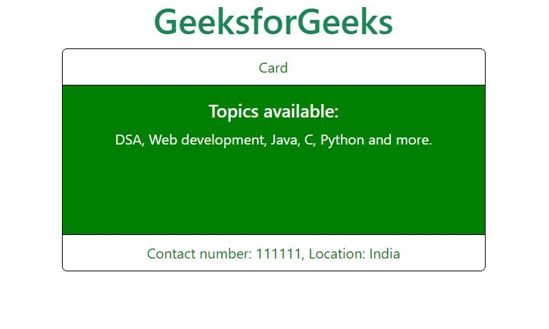
Output
Example 2: In this example, we make use of some of the above variables of the cards and assign new values to them.
HTML
<!DOCTYPE html>
<html lang="en">
<head>
<meta charset="UTF-8">
<meta name="viewport" content=
"width=device-width, initial-scale=1.0">
<title>Bootstrap 5 Cards SASS</title>
<link href=
rel="stylesheet">
<link rel="stylesheet"
href="./custom.css">
<script src=
"node_modules/bootstrap/dist/js/bootstrap.js">
</script>
</head>
<body class="text-center">
<h1 class="text-success">
GeeksforGeeks
</h1>
<div class="container">
<div class="card">
<p class="card-header">
Card
</p>
<div class="card-body">
<h5 class="card-title">
Topics available:
</h5>
<p class="card-text">
DSA, Web development, Java, C, Python and more.
</p>
</div>
<div class="card-footer">
Contact number: 111111, Location: India
</div>
</div>
</div>
</body>
</html>
|
CSS
$card-spacer-y: 3rem;
$card-spacer-x: 4rem;
$card-title-spacer-y: 30px;
$card-border-width: 5px;
$card-border-color:black;
$card-border-radius:50px;
$card-color: green;
$card-cap-color:green;
@import "./node_modules/bootstrap/scss/bootstrap"
|
CSS
.card {
--bs-card-spacer-y: 3rem;
--bs-card-spacer-x: 4rem;
--bs-card-title-spacer-y: 30px;
--bs-card-border-width: 5px;
--bs-card-border-color: black;
--bs-card-border-radius: 50px;
--bs-card-box-shadow: ;
--bs-card-inner-border-radius: 45px;
--bs-card-cap-padding-y: 1.5rem;
--bs-card-cap-padding-x: 4rem;
--bs-card-cap-bg: rgba(0, 0, 0, 0.03);
--bs-card-cap-color: green;
--bs-card-height: ;
--bs-card-color: green;
--bs-card-bg: #fff;
--bs-card-img-overlay-padding: 1rem;
--bs-card-group-margin: 0.75rem;
position: relative;
display: flex;
flex-direction: column;
min-width: 0;
height: var(--bs-card-height);
word-wrap: break-word;
background-color: var(--bs-card-bg);
background-clip: border-box;
border: var(--bs-card-border-width)
solid var(--bs-card-border-color);
border-radius: var(--bs-card-border-radius);
}
|
Output:

Output
Reference: https://getbootstrap.com/docs/5.0/components/card/#sass
Share your thoughts in the comments
Please Login to comment...