Angular PrimeNG StyleClass Animations
Last Updated :
14 Sep, 2022
Angular PrimeNG is an open-source library that consists of native Angular UI components that are used for great styling and this framework is used to make responsive websites with very much ease. In this article, we will be seeing Angular PrimeNG StyleClass Animations.
StyleClass is used to manage CSS classes on an element. It can be used to implement enter and leave animations of an element.
Syntax:
<button
     pButton
     label="..."
     pStyleClass="#gfg"
     enterClass="..."
     enterActiveClass="...">
</button>
<div id="gfg"> ... </div>
Creating Angular Application and Installing the Module:
Step 1: Create an Angular application using the following command.
ng new appname
Step 2: After creating your project folder i.e. appname, move to it using the following command.
cd appname
Step 3: Finally, Install PrimeNG in your given directory.
npm install primeng --save
npm install primeicons --save
Project Structure: The project Structure will look like this after following the above steps:
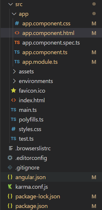
Project Structure
Run the below command:
ng serve --open
Example 1: This example shows how to add enter animation to an element using StyleClass.
app.component.html
<h2 style="color: green">GeeksforGeeks</h2>
<h3>Angular PrimeNG StyleClass Animations</h3>
<h4>Enter Animation Demo</h4>
<button
pButton
class="mb-4 block"
label="Show Avatar"
pStyleClass="#gfg"
enterClass="hidden"
enterToClass="inline"
enterActiveClass="inAnimClass">
</button>
<p-avatar
size="large"
shape="circle"
id="gfg"
class="hidden"
</p-avatar>
|
app.component.css
@keyframes inAnim {
0%{
opacity: 0;
}
100%{
opacity: 1;
}
}
.inAnimClass{
animation: inAnim 2s linear;
}
|
app.component.ts
import { Component } from "@angular/core";
@Component({
selector: "app-root",
templateUrl: "./app.component.html",
styleUrls: ["./app.component.css"]
})
export class AppComponent { }
|
app.module.ts
import { NgModule } from "@angular/core";
import { BrowserModule }
from "@angular/platform-browser";
import { BrowserAnimationsModule }
from "@angular/platform-browser/animations";
import { AppComponent } from "./app.component";
import { ButtonModule } from "primeng/button";
import { StyleClassModule } from 'primeng/styleclass';
import { AvatarModule } from 'primeng/avatar';
@NgModule({
imports: [
BrowserModule,
BrowserAnimationsModule,
ButtonModule,
StyleClassModule,
AvatarModule
],
declarations: [AppComponent],
bootstrap: [AppComponent],
})
export class AppModule { }
|
Output:
Example 2:
app.component.html
<h2 style="color: green">GeeksforGeeks</h2>
<h3>Angular PrimeNG StyleClass Animations</h3>
<h4>Leave Animation Demo</h4>
<button
pButton
class="mb-4 block"
label="Hide Avatar"
pStyleClass="#gfg"
leaveActiveClass="outAnimClass"
leaveToClass="hidden">
</button>
<p-avatar
size="large"
shape="circle"
id="gfg"
</p-avatar>
|
app.component.css
@keyframes outAnim {
0%{
opacity: 1;
}
100%{
opacity: 0;
}
}
.outAnimClass{
animation: outAnim 2s linear;
}
|
app.component.ts
import { Component } from "@angular/core";
@Component({
selector: "app-root",
templateUrl: "./app.component.html",
styleUrls: ["./app.component.css"]
})
export class AppComponent { }
|
app.module.ts
import { NgModule } from "@angular/core";
import { BrowserModule }
from "@angular/platform-browser";
import { BrowserAnimationsModule }
from "@angular/platform-browser/animations";
import { AppComponent } from "./app.component";
import { ButtonModule } from "primeng/button";
import { StyleClassModule } from 'primeng/styleclass';
import { AvatarModule } from 'primeng/avatar';
@NgModule({
imports: [
BrowserModule,
BrowserAnimationsModule,
ButtonModule,
StyleClassModule,
AvatarModule
],
declarations: [AppComponent],
bootstrap: [AppComponent],
})
export class AppModule { }
|
Output:
Reference: http://primefaces.org/primeng/styleclass
Share your thoughts in the comments
Please Login to comment...