Angular PrimeNG Polar Area Chart Component
Last Updated :
07 Nov, 2022
Angular PrimeNG is an open-source framework with a rich set of native Angular UI components that are used for great styling and this framework is used to make responsive websites with very much ease. In this article, we will see the Polar Area Chart Component in Angular PrimeNG.
Polar area charts are similar to pie charts, but each segment has the same angle – the radius of the segment differs depending on the value.
Angular PrimeNG Polar Area Chart Attributes:
- data: It represents the data that is to be displayed.
- options: It represents the options to be customized in the chart.
Syntax
<p-chart type="polarArea"
        [data]="data"
        [options]="chartOptions" >
</p-chart>
Creating Angular application & Module Installation:
Step 1: Create an Angular application using the following command.
ng new appname
Step 2: After creating your project folder i.e. appname, move to it using the following command.
cd appname
Step 3: Install PrimeNG in your given directory.
npm install primeng --save
npm install primeicons --save
npm install chart.js --save
Project Structure: It will look like the following:
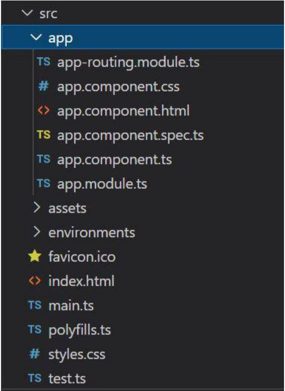
Project Structure
Example 1: This example describes the Polar Area Chart Component in Angular PrimeNG, by implementing only 1 Dataset.
HTML
<div id="GFG">
<h1 style="color:green">GeeksforGeeks</h1>
<h2>Angular PrimeNG PolarArea Chart </h2>
<div style="width:30%;">
<p-chart type="polarArea"
[data]="data"
[options]="chartOptions"
[style]="{'width': '40%'}">
</p-chart>
</div>
</div>
|
HTML
import { Component } from '@angular/core';
@Component({
selector: 'app-root',
templateUrl: './app.component.html',
styleUrls: ['./app.component.css']
})
export class AppComponent {
title = 'GFG';
data = {
datasets: [{
data: [11,16,7,3,14],
label: 'Dataset 1'
},
],
labels: ["A","B","C","D","E"]
};
chartOptions = {
plugins: {
legend: {
labels: {
color: '#495057'
}
}
},
scales: {
r: {
grid: {
color: '#ebedef'
}
}
}
}
}
|
Javascript
import { NgModule } from '@angular/core';
import { BrowserModule }
from '@angular/platform-browser';
import { AppComponent } from './app.component';
import { ChartModule } from 'primeng/chart';
@NgModule({
declarations: [
AppComponent,
],
imports: [
BrowserModule,
ChartModule
],
providers: [],
bootstrap: [AppComponent]
})
export class AppModule { }
|
Output:
Example 2: This example describes the Polar Area Chart Component in Angular PrimeNG, where, we will add some background colors to the polar area chart.
HTML
<div id="GFG">
<h1 style="color:green">GeeksforGeeks</h1>
<h2>Angular PrimeNG PolarArea Chart </h2>
<div style="width:30%;">
<p-chart type="polarArea"
[data]="data"
[options]="chartOptions"
[style]="{'width': '40%'}">
</p-chart>
</div>
</div>
|
Javascript
import { Component } from '@angular/core';
@Component({
selector: 'app-root',
templateUrl: './app.component.html',
styleUrls: ['./app.component.css']
})
export class AppComponent {
title = 'GFG';
data = {
datasets: [{
data: [11,16,7,3,14],
backgroundColor: [
"#42A5F5",
"#66BB6A",
"#FFA726",
"#26C6DA",
"#7E57C2"
],
label: 'Dataset 1'
},
],
labels: [
"Red",
"Green",
"Yellow",
"Pink",
"Blue"
]
};
chartOptions = {
plugins: {
legend: {
labels: {
color: '#495057'
}
}
},
scales: {
r: {
grid: {
color: '#ebedef'
}
}
}
}
}
|
Javascript
import { NgModule } from '@angular/core';
import { BrowserModule }
from '@angular/platform-browser';
import { AppComponent } from './app.component';
import { ChartModule } from 'primeng/chart';
@NgModule({
declarations: [
AppComponent,
],
imports: [
BrowserModule,
ChartModule
],
providers: [],
bootstrap: [AppComponent]
})
export class AppModule { }
|
Output:
Reference: http://primefaces.org/primeng/chart/polararea
Share your thoughts in the comments
Please Login to comment...