Angular PrimeNG Form CascadeSelect Component
Last Updated :
19 Oct, 2022
Angular PrimeNG is an open-source framework with a rich set of native Angular UI components that are used for great styling and this framework is used to make responsive websites with very much ease. This article will show us how to use the Angular PrimeNG Form CascadeSelect Component.
The CascadeSelect Component is used to display a nested structure of options. It is like a Dropdown component where the items have their nested items which the user can select.
Syntax:
<p-cascadeSelect
    [options]="..."
    optionLabel="..."
    optionGroupLabel="..."
    [optionGroupChildren]="..."
    ...
    [(ngModel)]="...">
</p-cascadeSelect>
Angular PrimeNG Form CascadeSelect Component Properties:
- options: This property is used to define an array of select items to display as the available options.
- optionLabel: This property is used to label the option.
- optionValue: This property is used to define the value of the option.
- optionGroupLabel: This property is used to label the option group.
- optionGroupChildren: This property is used to retrieve the items of the group.
- placeholder: This property is used when no option is selected.
- disabled: This property is used to disable the component.
- dataKey: This property is used to uniquely identify an option.
- tabindex: This property is used to define the index of the element in tabbing order.
- inputId: This property is used to define the unique identity of the input.
- ariaLabelledBy: This property is used to establish relationships between the component and label(s) where its value should be one or more element IDs.
- appendTo: This property defines the Id of the element or “body” for the document to which the overlay should be appended.
- style: This property is used to define the inline style of the component.
- panelStyle: This property is used to define the inline style of the overlay panel.
- styleClass: This property is used to style the class of the component.
- panelStyleClass: This property is used to style the class of the overlay panel.
- inputLabel: This property is used to label the input for accessibility.
- ariaLabel: This property is used to define the string that labels the input for accessibility.
- ariaLabelledBy: This property is used to specify one or more IDs in the DOM that labels the input field.
- showClear: This property is used to display the clear icon to clear the value.
Angular PrimeNG Form CascadeSelect Component Events:
- onChange: This event is used to invoke value change.
- onGroupChange: This event is used to invoke when a group changes.
- onBeforeShow: This event is used to invoke before the overlay is shown.
- onBeforeHide: This event is used to invoke before the overlay is hidden.
- onShow: This event is used to invoke when the overlay is shown.
- onHide: This event is used to invoke when the overlay is hidden.
- onClear: This event is used to invoke when the input field is cleared.
Angular PrimeNG Form CascadeSelect Component Templates:
- value: This template is used to define the value.
- option: This template is used to define the options.
Angular PrimeNG Form CascadeSelect Component Styling:
- p-cascadeselect: This styling is used to define the container element.
- p-cascadeselect-label: This styling is used to display the label of the selected option.
- p-cascadeselect-trigger: This styling is used to define the Icon element.
- p-cascadeselect-panel: This styling is used to define the Icon element.
- p-cascadeselect-items-wrapper: This styling is used to define the Wrapper element of the items list.
- p-cascadeselect-items: This styling is used to define the list element of items.
- p-cascadeselect-item: This styling is used to define an item in the list.
Creating Angular Application & Module Installation:
Step 1: Create an Angular application using the following command.
ng new appname
Step 2: After creating your project folder i.e. appname, move to it using the following command.
cd appname
Step 3: Install PrimeNG in your given directory.
npm install primeng --save
npm install primeicons --save
Project Structure:
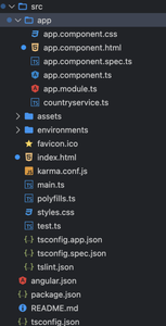
Project Structure
Example1: In the below code, we will make use of the above syntax to demonstrate the use of the Form CascadeSelect Component.
HTML
<!DOCTYPE html>
<head>
<title>GFG</title>
<style>
body {
background-color: lightgrey;
width: 100%;
height: 540px;
}
</style>
</head>
<html>
<body>
<div style="text-align:center;">
<h1 style="color:green;">
GeeksforGeeks
</h1>
<h3>A computer science portal for geeks</h3>
<h4>
Angular PrimeNG Form
CascadeSelect Component
</h4>
<h5>Basic</h5>
<p-cascadeSelect
[(ngModel)]="selectedCity1"
[options]="countries"
optionLabel="cname"
optionGroupLabel="name"
[optionGroupChildren]="['states', 'cities']"
[style]="{ minWidth: '14rem' }"
placeholder="Select a City">
</p-cascadeSelect>
</div>
</body>
</html>
|
Javascript
import { Component } from "@angular/core";
@Component({
selector: "app-root",
templateUrl: "./app.component.html"
})
export class AppComponent {
countries: any[] = [];
selectedCity1: any;
selectedCity2: any;
ngOnInit() {
this.countries = [
{
name: "India",
code: "AU",
states: [
{
name: "Mumbai",
cities: [
{
cname: "Nallasopara",
code: "NSP"
},
{
cname: "Mira Road",
code: "MR"
},
{
cname: "Dahisar",
code: "DHI"
}
]
},
{
name: "UP",
cities: [
{
cname: "Varansi",
code: "VR"
},
{
cname: "Balia",
code: "BA"
}
]
}
]
},
];
}
}
|
Javascript
import { NgModule } from "@angular/core";
import { BrowserModule }
from "@angular/platform-browser";
import { FormsModule } from "@angular/forms";
import { BrowserAnimationsModule }
from "@angular/platform-browser/animations";
import { AppComponent } from "./app.component";
import { CascadeSelectModule }
from "primeng/cascadeselect";
@NgModule({
imports: [
BrowserModule,
BrowserAnimationsModule,
CascadeSelectModule,
FormsModule
],
declarations: [AppComponent],
bootstrap: [AppComponent]
})
export class AppModule { }
|
Output:
Example2: In the below code, we will make use of the above syntax to demonstrate the use of the Form CascadeSelect Component.
HTML
<!DOCTYPE html>
<head>
<title>GFG</title>
<style>
body {
background-color: lightgrey;
width: 100%;
height: 540px;
}
</style>
</head>
<html>
<body>
<div style="text-align:center;">
<h1 style="color:green;">GeeksforGeeks</h1>
<h3>A computer science portal for geeks</h3>
<h4>
Angular PrimeNG Form
CascadeSelect Component
</h4>
<h5>Templating</h5>
<p-cascadeSelect
[(ngModel)]="selectedCity2"
[options]="countries"
optionLabel="cname"
optionGroupLabel="name"
[optionGroupChildren]="['states', 'cities']"
[style]="{ minWidth: '14rem' }"
placeholder="Select a City">
<ng-template pTemplate="option" let-option>
<div class="country-item">
<i
class="pi pi-compass p-mr-2"
*ngIf="option.cities">
</i>
<i
class="pi pi-map-marker p-mr-2"
*ngIf="option.cname">
</i>
<span>
{{ option.cname || option.name }}
</span>
</div>
</ng-template>
</p-cascadeSelect>
</div>
</body>
</html>
|
Javascript
import { Component } from "@angular/core";
@Component({
selector: "app-root",
templateUrl: "./app.component.html"
})
export class AppComponent {
countries: any[] = [];
selectedCity1: any;
selectedCity2: any;
ngOnInit() {
this.countries = [
{
name: "India",
code: "AU",
states: [
{
name: "Mumbai",
cities: [
{
cname: "Nallasopara",
code: "NSP"
},
{
cname: "Mira Road",
code: "MR"
},
{
cname: "Dahisar",
code: "DHI"
}
]
},
{
name: "UP",
cities: [
{
cname: "Varansi",
code: "VR"
},
{
cname: "Balia",
code: "BA"
}
]
}
]
},
];
}
}
|
Javascript
import { NgModule } from "@angular/core";
import { BrowserModule }
from "@angular/platform-browser";
import { FormsModule } from "@angular/forms";
import { BrowserAnimationsModule }
from "@angular/platform-browser/animations";
import { AppComponent } from "./app.component";
import { CascadeSelectModule }
from "primeng/cascadeselect";
@NgModule({
imports: [
BrowserModule,
BrowserAnimationsModule,
CascadeSelectModule,
FormsModule
],
declarations: [AppComponent],
bootstrap: [AppComponent]
})
export class AppModule { }
|
Output:
Reference: https://www.primefaces.org/primeng/cascadeselect
Share your thoughts in the comments
Please Login to comment...