Angular PrimeNG Button Properties of pButton
Last Updated :
07 Nov, 2022
Angular PrimeNG is an open-source framework with a rich set of native Angular UI components that are used for great styling and this framework is used to make responsive websites with very much ease. This article will show us how to style the Tooltip component in Angular PrimeNG.
A Button is generally used for carrying out some action when clicked. Buttons in the PrimeNG library come in different shapes, sizes, and many other properties.
Properties of pButton:
- label: It is used to add the text of the button.
- icon: It is used to add the name of the icon.
- iconPos: It is used to indicate the position of the icon.
- loading: It is used to indicate the loading state of the button.
- loadingIcon: It is used to indicate the icon of the loading button.
Approach: Let us create an Angular project and install PrimeNG UI module. Then we will create a UI that will showcase Angular PrimeNG Button Properties of pButton.
Creating Angular Project and Installing module:
Step 1: To create an angular app, you need to install the angular command line interface through npm command.
npm install -g angular-cli
Step 2: Now we will create a angular project.
ng new project_name
Step 3: After creating your react project, move into the folder to perform different operations.
cd project_name
Step 4: After creating the Angular application, Install the required module using the following command:
npm install primeng --save
npm install primeicons --save
Project Structure: After running the commands mentioned in the above steps, if you open the project in an editor, you can see a similar project structure as shown below. The new component user makes or the code changes, we will be performing will be done in the source folder.

Project Structure
Step to Run Application: Run the application using the following command from the root directory of the project:
ng serve --open
Example 1: We are creating a UI that shows above mentioned Properties of pButton.
HTML
<div style="margin:100px; text-align: center;">
<h1 style="color: green;">
GeeksforGeeks
</h1>
<h3>
Angular PrimeNG Button
Properties of pButton
</h3><br />
<p>Button with Label: </p>
<button pButton type="button" label="Label"
class="p-button-lg p-button-raised
p-button-text p-button-success">
</button>
<br /><br />
<p> Icon Button:</p>
<button pButton type="button" icon="pi pi-check"
class="p-button-lg p-button-raised
p-button-rounded p-button-text p-button-success">
</button>
<p>Button with Label and Icon: </p>
<button pButton type="button"
label="Sign Up" icon="pi pi-user"
class="p-button-lg p-button-success ">
</button><br /><br />
<button pButton type="button" label="Log In"
icon="pi pi-check-circle" iconPos="right"
class="p-button-lg p-button-success ">
</button>
</div>
|
Javascript
import { NgModule } from '@angular/core';
import { BrowserModule } from '@angular/platform-browser';
import { AppComponent } from './app.component';
import { ButtonModule } from "primeng/button";
@NgModule({
declarations: [
AppComponent
],
imports: [
BrowserModule,
ButtonModule,
],
providers: [],
bootstrap: [AppComponent]
})
export class AppModule { }
|
Output: Now open your browser and go to http://localhost:3000/, you will see the following output:
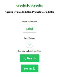
Properties of pButton
Example 2: We are creating a UI that shows above mentioned Properties of pButton.
HTML
<div style="margin:100px; text-align: center;">
<h1 style="color: green;">
GeeksforGeeks
</h1>
<h3>
Angular PrimeNG Button
Properties of pButton
</h3><br />
<p>Button with Loading state: </p>
<button pButton type="button"
label="Loading.." [loading]="true"
class="p-button-lg p-button-raised
p-button-text p-button-success">
</button>
<br /><br />
<button pButton type="button" label="Loading.."
[loading]="true" iconPos="right"
class="p-button-lg p-button-raised
p-button-text p-button-success">
</button>
<br /><br />
<p> Button with Loading state & Custom icon:</p>
<button pButton type="button"
loadingIcon="pi pi-spin pi-sun" [loading]="true"
class="p-button-lg p-button-rounded
p-button-success">
</button>
</div>
|
Javascript
import { NgModule } from '@angular/core';
import { BrowserModule } from '@angular/platform-browser';
import { AppComponent } from './app.component';
import { ButtonModule } from "primeng/button";
@NgModule({
declarations: [
AppComponent
],
imports: [
BrowserModule,
ButtonModule,
],
providers: [],
bootstrap: [AppComponent]
})
export class AppModule { }
|
Output: Now open your browser and go to http://localhost:3000/, you will see the following output:
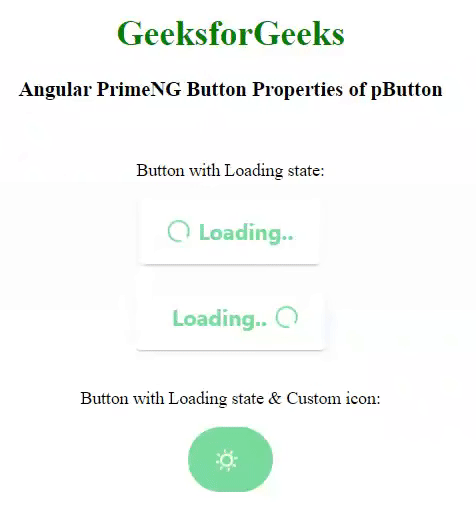
Properties of pButton
Reference: http://primefaces.org/primeng/button
Share your thoughts in the comments
Please Login to comment...