Semantic-UI Input Size Variation
Last Updated :
28 Feb, 2022
Semantic UI is an open-source framework that uses CSS and jQuery to build great user interfaces. It is the same as a bootstrap for use and has great different elements to use to make your website look more amazing.
Semantic UI has a bunch of components for user interface design. One of them is “Inputs”. Inputs are used for various purposes on a web page. It is useful in taking information from the user in real-time and saving it a in database. Depending on the requirements of the usage of inputs there are different variations of inputs. One of them is the size variation.
Semantic UI Input Size Variation : The user might need to show different inputs in different sizes according to his requirements. To depict a input data significance its size can be increased accordingly. This is when the size variation comes in handy.
Syntax:
<div class="ui *size input">
<input type="text" placeholder="">
.........
</div>
Example 1: This example demonstrates the input size variations horizontally using the different sizes . You can see the output in the image below which shows different size inputs.
HTML
<!DOCTYPE html>
<html>
<head>
<link href=
rel="stylesheet" />
<script src=
</script>
<style>
input {
margin-right: 20px !important;
}
</style>
</head>
<body>
<div class="ui container">
<br /><br />
<h2 class="ui header green">GeeksforGeeks</h2>
<b>
<p>Semantic UI Input Size Variations</p>
</b>
<hr />
<br />
<div class="ui mini input">
<input type="text" value="Mini" />
</div>
<div class="ui small input">
<input type="text" value="Small " />
</div>
<div class="ui large input">
<input type="text" value="Large " />
</div>
<div class="ui big input">
<input type="text" value="Big" />
</div>
<div class="ui huge input">
<input type="text" value="Huge" />
</div>
</div>
</body>
</html>
|
Output:
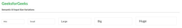
Input size variations
Example 2: This example demonstrates the input size variation using the different sizes mentioned in class. You can see the output in the image below which shows different size inputs.
HTML
<!DOCTYPE html>
<html>
<head>
<link href=
rel="stylesheet" />
<script src=
</script>
<style>
input {
margin: 10px !important;
color: green !important;
}
</style>
</head>
<body>
<div class="ui container">
<br /><br />
<h2 class="ui header green">GeeksforGeeks</h2>
<b>
<p>Semantic UI Input Size Variations</p>
</b>
<hr />
<br />
<div class="ui mini input">
<input type="text" placeholder="Mini text input :" />
</div>
<br />
<div class="ui small input">
<input type="text" placeholder="Small text input :" />
</div>
<br />
<div class="ui large input">
<input type="text" placeholder="Large text input :" />
</div>
<br />
<div class="ui big input">
<input type="text" placeholder="Big text input :" />
</div>
<br />
<div class="ui huge input">
<input type="text" placeholder="Huge text input :" />
</div>
<br />
<div class="ui massive input">
<input type="text" placeholder="Massive text input :" />
</div>
</div>
</body>
</html>
|
Output: You can see the input boxes with different sizes . User can use any of them as per his choice to extract data from the user.
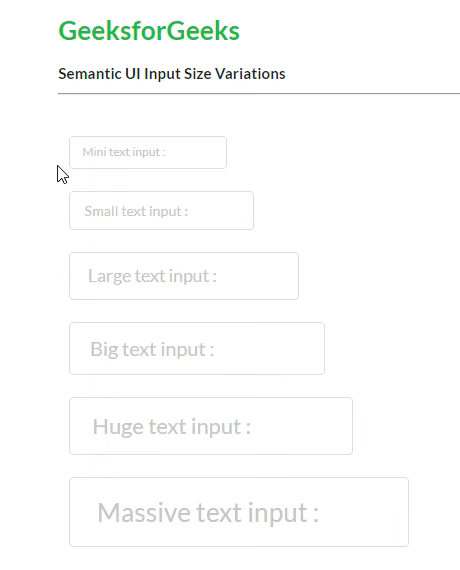
Input size variations
Reference: https://semantic-ui.com/elements/input.html#size
Share your thoughts in the comments
Please Login to comment...