How to add border in the clip-path: polygon() using CSS ?
Last Updated :
26 Dec, 2023
Adding a border around shapes can substantially improve the visual attractiveness of your website when it comes to web design. Using the clip-path: polygon() Property is one great and inventive approach to accomplish this. This not only allows you to make unusual shapes but also allows you to add a border that fits your design. In this article, we will learn how to create a custom shape and apply a beautiful border using CSS style.
We will explore both approaches for including the Border to the clip-path Property.
clip-path: polygon() Property
Clip-path Property is used to shape items on your website. By default, an element is a rectangle, but using this property, you can choose which part should be visible. The clip-path polygon() function allows you to construct customized shapes by utilizing coordinates.
In this approach, a basic square-shaped div element is created by providing 200px width and height. Now, we will use the clip-path CSS property to change the shape of this div element from square to hexagon with the help of polygon() function and coordinates. Update the custom-shape class CSS by adding the clip-path property. Now, the div element will look like a hexagon-shaped element instead of a square.
Example: This example illustrates the creation of a Polygon using the clip-path Property by setting the value as a polygon() function, which helps to define a polygon with the help of an SVG filling rule and a set of vertices.
HTML
<!DOCTYPE html>
<html lang="en">
<head>
<meta charset="UTF-8">
<meta name="viewport"
content="width=device-width,
initial-scale=1.0">
<title>Clip-Path CSS property</title>
<style>
h1 {
color: green;
}
.custom-shape {
width: 200px;
height: 200px;
background-color: #3498db;
clip-path: polygon(50% 0%, 100% 25%, 100% 75%,
50% 100%, 0% 75%, 0% 25%);
}
</style>
</head>
<body>
<h1>GeeksforGeeks</h1>
<div class="custom-shape"></div>
</body>
</html>
|
Output:
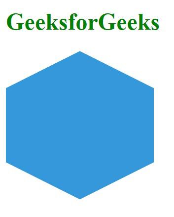
hexagon-shaped div element
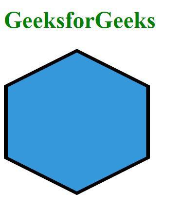
Example: In the below code example, we have used the span element as the original element and div as a border.
HTML
<!DOCTYPE html>
<html lang="en">
<head>
<meta charset="UTF-8">
<meta name="viewport"
content="width=device-width,
initial-scale=1.0">
<link rel="stylesheet"
href="styles.css">
<title>Clip-Path polygon Border</title>
<style>
h1 {
color: green;
}
.custom-shape {
position: relative;
width: 200px;
background-color: black;
height: 200px;
clip-path: polygon(50% 0%, 100% 25%, 100% 75%,
50% 100%, 0% 75%, 0% 25%);
display: flex;
align-items: center;
justify-content: center;
}
.border-span {
width:190px;
height:190px;
clip-path: polygon(50% 0%, 100% 25%, 100% 75%,
50% 100%, 0% 75%, 0% 25%);
background-color: #3498db;
}
</style>
</head>
<body>
<h1>GeeksforGeeks</h1>
<div class="custom-shape">
<span class="border-span"></span>
</div>
</body>
</html>
|
Output:
Using pseudo-element ::after or ::before
To add a border to an element with a clip-path: polygon(); style using pseudo-elements ::after or ::before, you can create an additional pseudo-element with the same clip-path property and then apply the border to it.
Example: In this example, we will see the implementation of the above approach with an example.
HTML
<!DOCTYPE html>
<html lang="en">
<head>
<meta charset="UTF-8">
<meta name="viewport"
content="width=device-width,
initial-scale=1.0">
<title>Clip-Path polygon Border</title>
<style>
h1 {
color: green;
}
.custom-shape {
width: 200px;
height: 200px;
position: relative;
background-color: black;
clip-path: polygon(50% 0%, 61% 35%, 98% 35%, 68% 57%, 79% 91%,
50% 70%, 21% 91%, 32% 57%, 2% 35%, 39% 35%);
display: flex;
align-items: center;
justify-content: center;
}
.custom-shape::after {
content: "";
width: 190px;
height: 190px;
position: absolute;
background-color: #3498db;
clip-path: polygon(50% 0%, 61% 35%, 98% 35%, 68% 57%, 79% 91%,
50% 70%, 21% 91%, 32% 57%, 2% 35%, 39% 35%);
}
</style>
</head>
<body>
<h1>GeeksforGeeks</h1>
<div class="custom-shape"></div>
</body>
</html>
|
Output:

start shape element
Share your thoughts in the comments
Please Login to comment...