Web API Visual Viewport
Last Updated :
06 Dec, 2023
The visual Viewport is the actual screen size of the device after removing keyboard space, the pinch zoom area, or any other kind of space that takes up screen size. The Visual Viewport API can be understood as an interface that exposes information about what is currently visible on the screen and provides us with various methods to modify the properties of the Visual Viewport.
Types of Visual View Port:
- Layout Viewport: The entire layout of the web-page, including the content that is off-screen due to scrolling.
- Visual Viewport: It refers to the currently visible portion of the web page within the user device.
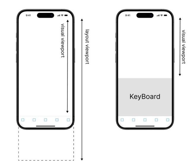
Understanding Visual and Layout Viewport
Accessing the API
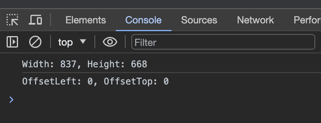
Accessing the Visual View port API involves interacting with the Visual Viewport object from the ‘window’ object in JavaScript. This object gives information about the position, width, height, and scale of the visual viewport.
Example:
Javascript
const visualViewport =
window.visualViewport;
const width = visualViewport.width;
const height = visualViewport.height;
const offsetX =
visualViewport.offsetLeft;
const offsetY =
visualViewport.offsetTop;
console.log(
"Width: " +
width +
", Height: " +
height);
console.log(
"OffsetLeft: " +
offsetX +
", OffsetTop: " +
offsetY);
|
HTML
<!DOCTYPE html>
<html lang="en">
<head>
<meta charset="UTF-8">
<meta name="viewport"
content="width=device-width,
initial-scale=1.0">
<title>
Visual Viewport API Exploration
</title>
<link rel="stylesheet" href="style.css">
</head>
<body>
<h1>Hello, World!</h1>
</body>
<script src="./script.js"></script>
</html>
|
CSS
body {
margin: 0;
padding: 0;
height: 200vh;
}
h1 {
font-size: 2rem;
transition: font-size 0.3s ease;
text-align: center;
margin-top: 50vh;
padding: 20px;
}
|
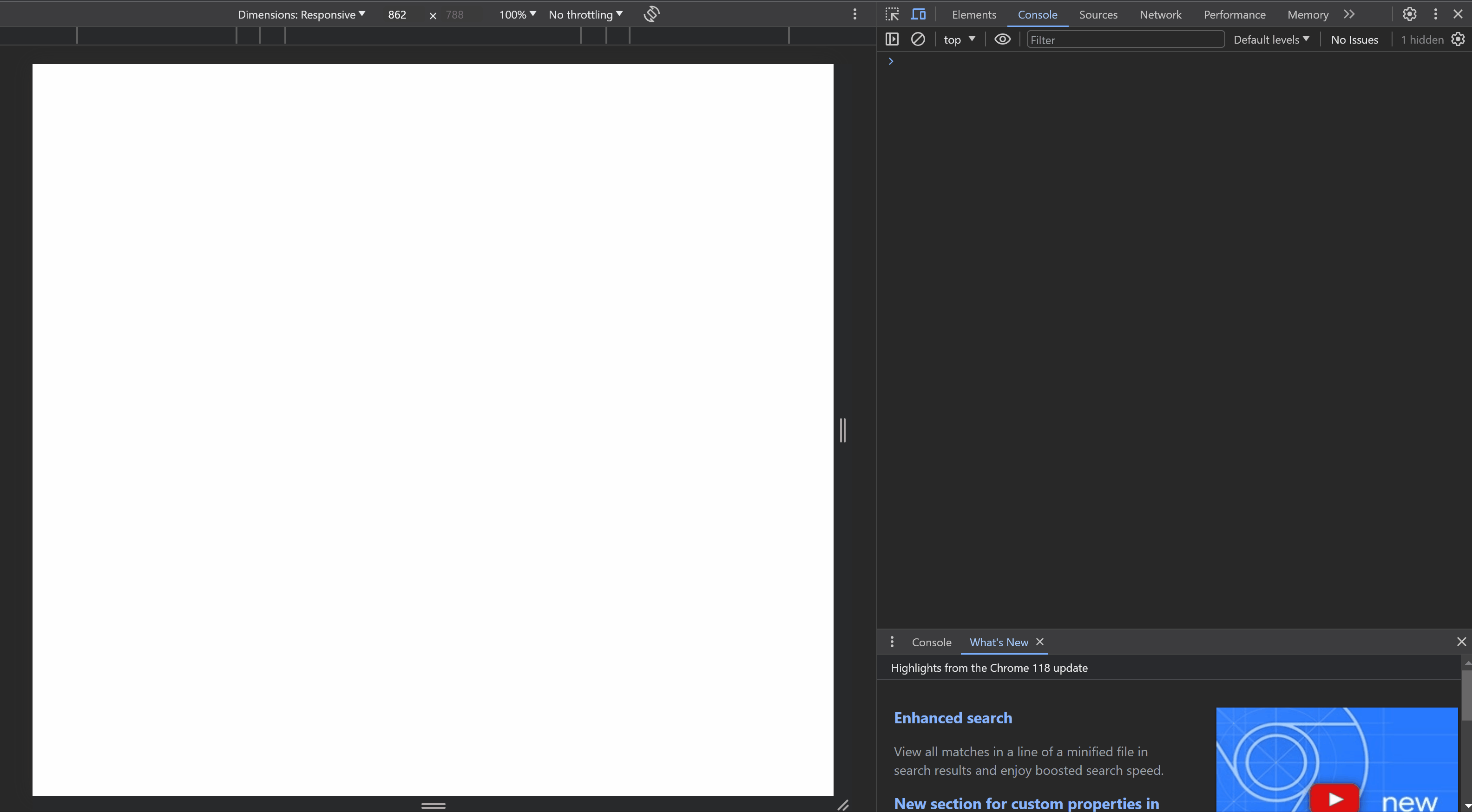
Output:
Output of the above HTML page
Events/ Interface
The Visual Viewport API includes two events that can be listened to for changes in the Visual Viewport. The changes can be listened to via addEventListener() in JavaScript.
- Resize: Event is fired when the visual viewport is changed.
- Scroll: Event is fired when the visual viewport is scrolled.
Example:
Javascript
const visualViewport =
window.visualViewport;
window.addEventListener(
"resize",
function () {
window.alert(
"Visual viewport resized!"
);});
window.addEventListener(
"scroll",
function () {
window.alert(
"User is scrolling!"
);});
|
HTML
<!DOCTYPE html>
<html lang="en">
<head>
<meta charset="UTF-8">
<meta name="viewport"
content="width=device-width,
initial-scale=1.0">
<title>Visual Viewport API Exploration</title>
<style>
body{
height:100vh;
}
</style>
</head>
<body>
<h1>Please Scroll or Resize Screen</h1>
</body>
<script src="./script.js"></script>
</html>
|
Output:
Share your thoughts in the comments
Please Login to comment...