How to create a Button in Bootstrap 5?
Last Updated :
16 Feb, 2024
To create a button in Bootstrap 5, use the <button> element with the class “btn” along with additional styling classes for appearance and behavior. For example, you can add classes like “btn-primary” for a primary button or “btn-outline-secondary” for a secondary outlined button.
Preview:
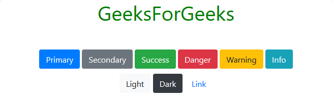
Preview
Syntax:
<button type="button" class="btn btn-primary">Primary Button</button>
The table below illustrates the various button types and their respective descriptions.
| Button Type |
Description |
| Primary Button |
Represents the primary action or main button in a UI. |
| Secondary Button |
Represents a secondary action or button with less emphasis. |
| Success Button |
Indicates a successful action, such as saving or submitting. |
| Danger Button |
Highlights potentially dangerous or critical actions. |
| Warning Button |
Alerts users to cautionary actions or potential issues. |
| Info Button |
Provides additional information or non-critical actions. |
| Light Button |
Offers a light-colored button for non-urgent actions. |
| Dark Button |
Represents a darker-colored button for important actions. |
Key Features:
- Button Type: The
type attribute is set to “button” to define the button’s behavior.
- Button Class: The
btn class is fundamental for styling buttons in Bootstrap.
- Button Variant: Use classes
btn-primary to specify different button variants (e.g., primary, secondary, success).
- Button Size: Adjust the size with classes like
btn-lg for large buttons or btn-sm small ones.
Share your thoughts in the comments
Please Login to comment...