Conditional Formatting – PowerBI
Last Updated :
25 Sep, 2023
Conditional formatting in Power BI is a powerful feature that allows you to visually enhance and customize the appearance of your data based on certain conditions or rules. It lets you apply different styles, colors, and formats to your data to make it stand out and convey important insights more effectively.
With conditional formatting, you can set up rules or conditions that specify how the data should be formatted.
For example, you can:
- Change the color of data cells based on their values (e.g, making cells with high sales figures appear in green and low sales figures in red).
- Apply data bars or color scales to show the relative magnitude of values in a column or row.
- Display icons or symbols based on specific data conditions (e.g, using arrows up or down to indicate sales growth or decline).
- Format text or numbers with specific font styles, sizes, or background colors based on specific criteria.
There are five types of conditional formatting in Power BI:
- Font color: Conditional formatting allows you to change the color of the text in your data based on specific rules. For example, you can make numbers that are above a certain value appear in red or below a certain value in green. This way, you can highlight important information and make it more noticeable.
- Background color: Conditional formatting allows you to modify the color of the cell’s background based on certain conditions. For example,, you can give cells with high sales a blue background or cells with low scores a yellow background. This makes it easier to spot important data points and see patterns in your data.
- Data bars: Data bars are like small horizontal bars that you can add to your numbers. The length of the bar represents the value of the number, so bigger bars mean higher values, and smaller bars mean lower values. This visual representation allows you to quickly compare data and see which values are the highest or lowest.
- Icons: Conditional formatting lets you add small icons or symbols to your data cells based on specific rules. These icons can represent different things like happy faces for positive results or sad faces for negative results. They provide a quick way to understand the status or meaning of your data at a glance.
- Web URL: This feature allows you to turn your data into clickable links. You can add web URLs to your visuals, so when users click on a data point, it takes them to an external website or additional information related to that data. It makes your reports more interactive and gives users easy access to more details.
Follow these steps to apply conditional formatting:
Step 1: Open your PowerBI desktop. Click on the Get Data button.
By following these steps, you can start importing data into your Power BI project.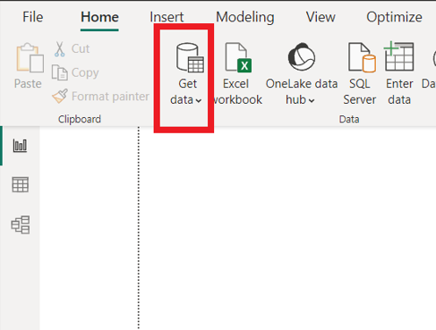
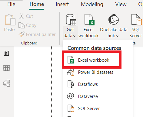
Step 2: A drop-down appears. To add data click on the Excel Workbook and select file and click on load.
By doing this, you wil import the data from your Excel file into Power BI.
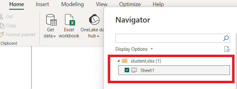
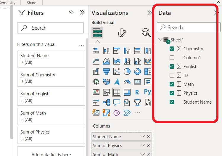
Step 3: After clicking on the “Load” button in Step 2, you will see this Power BI data view. Here, you will see a list of tables or sheets from the Excel file you recently uploaded.
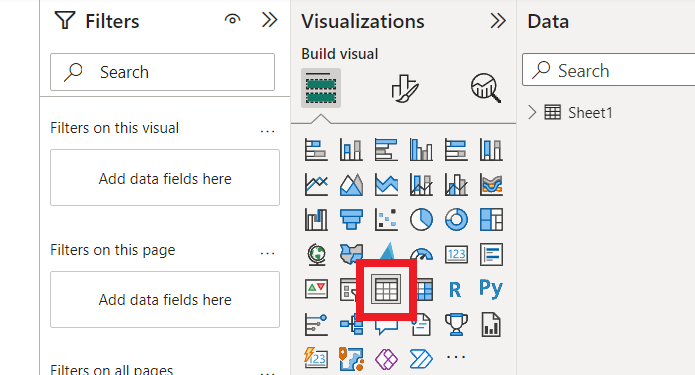
Step 4: Now that you have selected the data from Step 3, it’s time to create a table visualization to display the data in a tabular format. so select table from visualization section then Power BI will automatically generate a basic table with your selected data, displaying the columns and rows from the dataset.
Step 5: After adding the table visualization you will see a list of available fields on the right side of the Power BI window. This is where you can choose which data from your uploaded file you want to include in the table.
Step 6: You can now apply conditional formatting to make the data stand out and easier to understand.
Here’s how you can do it:
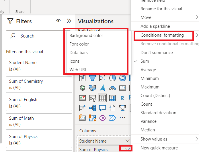
- In the table visualization, click on any column header to select it.
- After selecting the column, right-click on it. A context menu will appear.
- In the context menu, you will see an option called “Conditional formatting.” Click on it.
- Inside the “Conditional formatting” menu, you’ll find five different options to format your data: Background color, Font color, Data bars, icons, WEb URLs.
- Choose the appropriate option that best fits your data and the insights you want to emphasize. You can customize the conditions and formatting styles according to your preferences.
Examples:
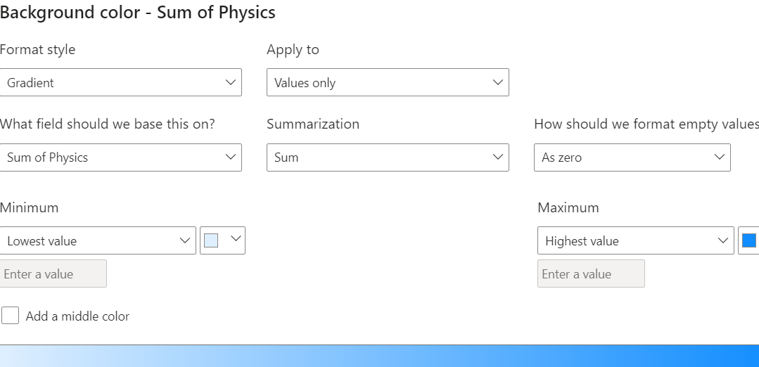
1) Background Color:
In this step, we will apply a background color to the “Sum of Physics” column in our table visualization. This allows us to highlight specific data based on certain conditions. Here’s how you can do it:
Now, you have several choices to apply the background color based on different conditions:
a) By field: You can apply background color based on the values in the selected field.
b) By rules: You can use this option to create custom rules to apply background colors.
c) Color scale: You can choose a color scale that fits your data best.
d) By comparison: This option allows you to compare the selected field’s value with another field.
After selecting the appropriate option, you can customize the colors and rules according to your preference.
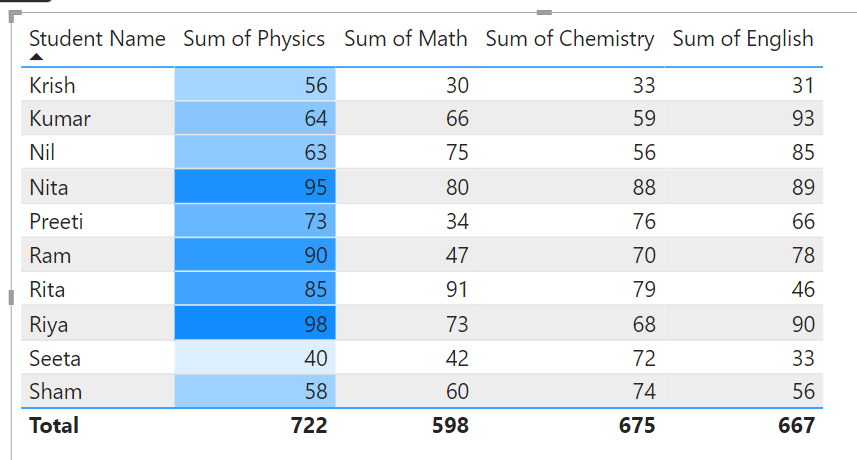
Output will be this,
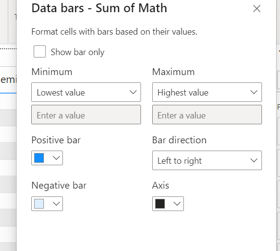
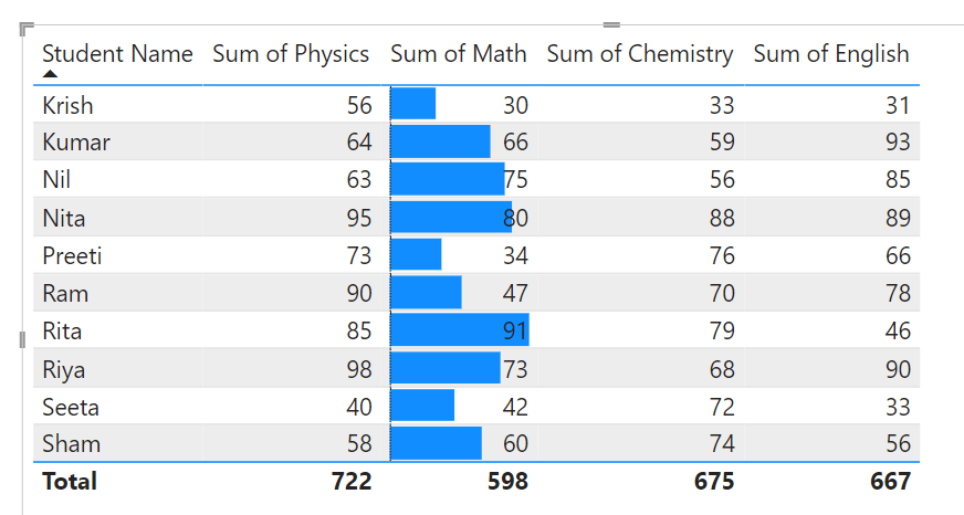
2) Data Bars:
Here let’s apply data bars to the “Sum of Maths” section in our table visualization. Data bars will visually represent the values in this column as horizontal bars, allowing us to quickly compare the magnitude of each value. here Power BI will automatically add data bars to the cells in the “Sum of Maths” column also you can customize the appearance of the data bars by adjusting the formatting options, such as changing the color or size of the bars.
Output:
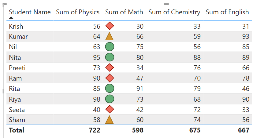
3) Icons:
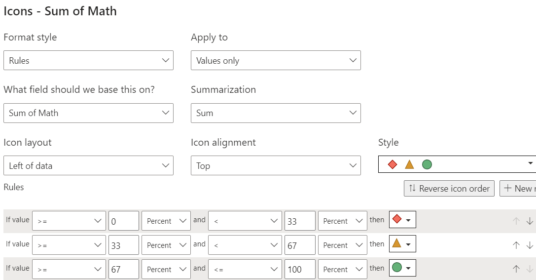
Output:
Share your thoughts in the comments
Please Login to comment...