Bootstrap 5 Popovers Four directions
Last Updated :
05 Dec, 2022
The popover is a bootstrap component used to mainly add additional information to a website. It is a pop-up box that appears when the user clicks on an element. Using bootstrap attributes, It can be aligned in any of the four directions left, top, right, and bottom.
Bootstrap 5 Popovers Four directions Class: There is no pre-defined class for the direction you need to use the data-bs-placement attribute.
Bootstrap 5 Popovers Four directions Attributes:
- data-bs-placement: This attribute defines the direction of the popover. Accepted values are right, left, top, and bottom.
Syntax:
 <button
    data-bs-placement="left | right | bottom | top"
    ...
</button>
Below examples illustrate the Bootstrap 5 Popovers Four directions:
Example 1: In this example, we show how to show the popover on the left and right of the parent element. Here we set the “data-bs-placement” attribute of the popover to left and right respectively.
HTML
<!DOCTYPE html>
<html lang="en">
<head>
<meta charset="UTF-8">
<meta http-equiv="X-UA-Compatible" content="IE=edge">
<meta name="viewport" content="width=device-width, initial-scale=1.0">
<title>Bootstrap 5 Popovers Four directions</title>
<link href=
rel="stylesheet">
<script src=
</script>
<script src=
</script>
</head>
<body>
<div class="container text-center d-flex flex-column
justify-content-center align-items-center">
<div class="header">
<h3 class="text-success">GeeksforGeeks</h3>
<h5>Bootstrap 5 Popovers Four directions</h5>
</div>
<div>
<button
tabindex="0"
class="btn btn-success d-block mt-5"
role="button"
data-bs-toggle="popover"
title="GFG Popover"
data-bs-trigger="focus"
data-bs-placement="left"
data-bs-content="This popover will show on the
left side when user clicks
on the GeeksforGeeks popover button .">
GeeksforGeeks Left Popover.
</button>
<button tabindex="0"
class="btn btn-warning d-block mt-5"
role="button" data-bs-toggle="popover"
title="GFG Popover"
data-bs-trigger="focus"
data-bs-placement="right"
data-bs-content="This popover will show on the
right side when user clicks on
the GeeksforGeeks popover button.">
GeeksforGeeks Right Popover.
</button>
</div>
</div>
<script>
var popoverTriggerList =
[].slice.call(document.querySelectorAll('[data-bs-toggle="popover"]'))
var popoverList = popoverTriggerList.map(function (popoverTriggerEl) {
return new bootstrap.Popover(popoverTriggerEl)
})
</script>
</body>
|
Output:
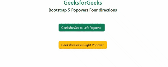
Popovers Four directions
Example 2: This example illustrates how to show the popover on the top and bottom of the parent element. Here we set the “data-bs-placement” attribute of the popover to top and bottom respectively.
HTML
<!DOCTYPE html>
<html lang="en">
<head>
<meta charset="UTF-8">
<meta http-equiv="X-UA-Compatible" content="IE=edge">
<meta name="viewport" content="width=device-width, initial-scale=1.0">
<title>Bootstrap 5 Popovers Four directions</title>
<link href=
rel="stylesheet">
<script src=
</script>
<script src=
</script>
</head>
<body>
<div class="container text-center d-flex flex-column
justify-content-center align-items-center">
<div class="header mb-5">
<h3 class="text-success">GeeksforGeeks</h3>
<h5>Bootstrap 5 Popovers Four directions</h5>
</div>
<div>
<button
tabindex="0"
class="btn btn1 btn-success d-block mt-5"
role="button"
data-bs-toggle="popover"
title="GFG Popover"
data-bs-trigger="focus"
data-bs-placement="top"
data-bs-content="This popover will show on the
top side when user clicks on the
GeeksforGeeks popover button .">
GeeksforGeeks Top Popover.
</button>
<button
tabindex="0"
class="btn btn2 btn-warning d-block mt-3"
role="button"
data-bs-toggle="popover"
title="GFG Popover"
data-bs-trigger="focus"
data-bs-placement="bottom"
data-bs-content="This popover will show on the
bottom side when user clicks
on the GeeksforGeeks popover button.">
GeeksforGeeks Bottom Popover.
</button>
</div>
</div>
<script>
var popoverTriggerList =
[].slice.call(document.querySelectorAll('[data-bs-toggle="popover"]'))
var popoverList = popoverTriggerList.map(function (popoverTriggerEl) {
return new bootstrap.Popover(popoverTriggerEl)
})
</script>
</body>
|
Output:

Popovers four directions
Reference:https://getbootstrap.com/docs/5.0/components/popovers/#four-directions
Share your thoughts in the comments
Please Login to comment...