Bootstrap 5 List group SASS
Last Updated :
24 Jan, 2023
Bootstrap 5 List Group SASS can be used to change the default values provided for the list group by customizing scss file of bootstrap 5.
SASS variables of List Group:
- $list-group-color: This variable provides the text color of the list group. By default, it is gray color.
- $list-group-bg: This variable provides the background color of the list group. By default, it is white color.
- $list-group-border-color: This variable provides the border color of the list group. By default, it is black color with an opacity of 0.125
- $list-group-border-width: This variable provides the border width of the list group. By default, it is 1px.
- $list-group-border-radius: This variable provides the border radius of the list group. By default, it is 0.375rem.
- $list-group-item-padding-y: This variable provides the top and bottom padding of the item in the list group. By default, it is 0.5rem
- $list-group-item-padding-x: This variable provides the left and right padding of the item in the list group. By default, it is 1rem
- $list-group-item-bg-scale: This variable provides the contrast of the background color of the list group item. By default, it is -80%
- $list-group-item-color-scale: This variable provides the contrast of the text color of the list group item. By default, it is 40%
- $list-group-hover-bg: This variable provides the background color of the list group on hover. By default, it is gray color.
- $list-group-active-color: This variable provides the text color of the list group item which is active. By default, it is white color.
- $list-group-active-bg: This variable provides the background color of the list group item which is active. By default, it is blue color.
- $list-group-active-border-color: This variable provides the border color of the list group item which is active. By default, it is blue color.
- $list-group-disabled-color: This variable provides the text color of the list group item which is disabled. By default, it is gray color.
- $list-group-disabled-bg: This variable provides the background color of the list group item which is disabled. By default, it is white color.
- $list-group-action-color: This variable provides the text color of the actionable list group. By default, it is gray color.
- $list-group-action-hover-color: This variable provides the text color of the actionable list group on hover. By default, it is gray color.
- $list-group-action-active-color: This variable provides the text color of the actionable list group on active. By default, it is white color.
- $list-group-action-active-bg: This variable provides the background color of the actionable list group which is active. By default, it is gray color.
Steps to override scss of Bootstrap:
Step 1: Install bootstrap using following command:
npm i bootstrap
Step 2: Create your custom scss file and write the variable you want to override. Then include the bootstrap scss file using import.
$class_to_override: values;
@import "node_modules/bootstrap/scss/bootstrap"
Step 3: Convert the file to CSS using live server extension.
Step 4: Include the converted scss file to your HTML after the link tag of Bootstrap css
Project Structure: Here the custom scss file name is “custom.scss” and custom.css is converted file
Syntax:
$variable:value;
@import "./node_modules/bootstrap/scss/bootstrap"
Example 1: In this example, making use of some of the above variables.
custom.scss
SCSS
$list-group-color:white;
$list-group-bg:green;
$list-group-border-color:black;
$list-group-border-width:5px;
$list-group-border-radius:2rem;
$list-group-item-padding-y:1rem;
$list-group-hover-bg:rgba(green,0.8);
$list-group-active-color:white;
$list-group-active-bg:black;
$list-group-active-border-color:black;
$list-group-disabled-color:rgba(black,0.7);
$list-group-disabled-bg:rgb(153, 238, 153);
$list-group-action-hover-color:black;
@import "./node_modules/bootstrap/scss/bootstrap"
|
CSS file created after conversion
custom.css
CSS
.list-group {
--bs-list-group-color: white;
--bs-list-group-bg: green;
--bs-list-group-border-color: black;
--bs-list-group-border-width: 5px;
--bs-list-group-border-radius: 2rem;
--bs-list-group-item-padding-x: 1rem;
--bs-list-group-item-padding-y: 1rem;
--bs-list-group-action-color: #495057;
--bs-list-group-action-hover-color: black;
--bs-list-group-action-hover-bg: rgba(0, 128, 0, 0.8);
--bs-list-group-action-active-color: #212529;
--bs-list-group-action-active-bg: #e9ecef;
--bs-list-group-disabled-color: rgba(0, 0, 0, 0.7);
--bs-list-group-disabled-bg: rgb(153, 238, 153);
--bs-list-group-active-color: white;
--bs-list-group-active-bg: black;
--bs-list-group-active-border-color: black;
display: flex;
flex-direction: column;
padding-left: 0;
margin-bottom: 0;
border-radius: var(--bs-list-group-border-radius);
}
|
index.html
HTML
<!DOCTYPE html>
<html lang="en">
<head>
<meta charset="UTF-8">
<meta name="viewport"
content="width=device-width, initial-scale=1.0">
<title>Bootstrap 5 List Group SASS</title>
<link href=
rel="stylesheet">
<link rel="stylesheet" href="./custom.css">
<script src=
"node_modules/bootstrap/dist/js/bootstrap.js">
</script>
<script src=
</script>
</head>
<body class="text-center">
<div class="container">
<h1 class="text-success">GeeksforGeeks</h1>
<h5 class="text-success">Bootstrap 5 List Group SASS</h5>
<div class="container pt-3" style="width:850px;">
<ul class="list-group">
<li class="list-group-item">Java</li>
<li class="list-group-item disabled">C++</li>
<li class="list-group-item">Python</li>
<li class="list-group-item">Javascript</li>
</ul>
<h6 class="pt-3">List group with action</h6>
<div class="list-group">
<a href="#" class="list-group-item
list-group-item-action active">
Maths
</a>
<a href="#" class="list-group-item
list-group-item-action">
Science
</a>
<a href="#" class="list-group-item
list-group-item-action">
History
</a>
</div>
</div>
</div>
</body>
</html>
|
Output:
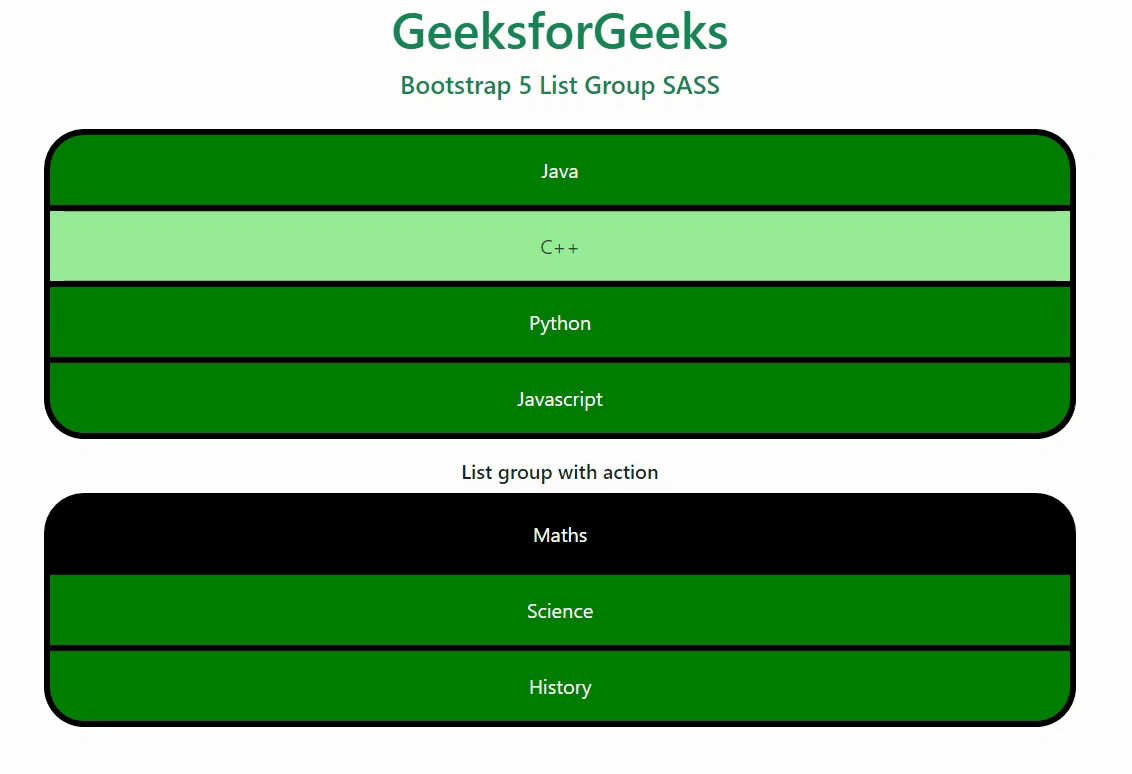
Output
Example 2: In this example, making use of some of the above variables.
custom.scss
SCSS
$list-group-action-color:green;
$list-group-action-active-color:black;
$list-group-action-active-bg:green;
@import "./node_modules/bootstrap/scss/bootstrap"
|
CSS file created after conversion
custom.css
CSS
.list-group {
--bs-list-group-color: #212529;
--bs-list-group-bg: #fff;
--bs-list-group-border-color: rgba(0, 0, 0, 0.125);
--bs-list-group-border-width: 1px;
--bs-list-group-border-radius: 0.375rem;
--bs-list-group-item-padding-x: 1rem;
--bs-list-group-item-padding-y: 0.5rem;
--bs-list-group-action-color: green;
--bs-list-group-action-hover-color: green;
--bs-list-group-action-hover-bg: #f8f9fa;
--bs-list-group-action-active-color: black;
--bs-list-group-action-active-bg: green;
--bs-list-group-disabled-color: #6c757d;
--bs-list-group-disabled-bg: #fff;
--bs-list-group-active-color: #fff;
--bs-list-group-active-bg: #0d6efd;
--bs-list-group-active-border-color: #0d6efd;
display: flex;
flex-direction: column;
padding-left: 0;
margin-bottom: 0;
border-radius: var(--bs-list-group-border-radius);
}
|
index.html
HTML
<!DOCTYPE html>
<html lang="en">
<head>
<meta charset="UTF-8">
<meta name="viewport"
content="width=device-width, initial-scale=1.0">
<title>Bootstrap 5 List Group SASS</title>
<link href=
rel="stylesheet">
<link rel="stylesheet" href="./custom.css">
<script src=
"node_modules/bootstrap/dist/js/bootstrap.js">
</script>
<script src=
</script>
</head>
<body class="text-center">
<div class="container">
<h1 class="text-success">GeeksforGeeks</h1>
<h5 class="text-success">Bootstrap 5 List Group SASS</h5>
<div class="container pt-3" style="width:850px;">
<h6>List group with action</h6>
<div class="list-group">
<a href="#" class="list-group-item
list-group-item-action active">
Maths
</a>
<a href="#" class="list-group-item
list-group-item-action">
Science
</a>
<a href="#" class="list-group-item
list-group-item-action">
History
</a>
<a href="#" class="list-group-item
list-group-item-action">
Geography
</a>
</div>
</div>
</div>
</body>
</html>
|
Output:

Output
Reference: https://getbootstrap.com/docs/5.0/components/list-group/#sass
Share your thoughts in the comments
Please Login to comment...