Blaze UI Avatars
Last Updated :
05 May, 2022
Blaze UI is a free and open-source user interface toolkit that provides a strong foundation to build maintainable and scalable websites. All of its components are developed mobile-first and are fully responsive which works on devices of any screen size.
In this article, we will be seeing Blaze UI Avatars. Avatar component is generally used for chat UIs, profile pictures, or account photos of users in modern web applications. To use Avatars we can use the <blaze-avatar> element provided by Blaze UI or we can use the classes to use the avatar component.
Blaze UI Avatars Classes:
- c-avatar: This class is the wrapper of the avatar component.
- c-avatar__img: This class is used on the avatar image. This should be a direct child of the c-avatar class.
Blaze UI Avatars Attributes:
- data-text: This attribute is used to set the text in the avatar component. It is not applicable when we use the <blaze-avatar> element.
- src: This attribute is used with the <blaze-avatar> element to set the URL for the primary image to display.
- src-2: This attribute is used with the <blaze-avatar> element to set the URL for the secondary image to display.
- alt: This attribute is used with the <blaze-avatar> element to set alternative text to the primary image.
- alt-2: This attribute is used with the <blaze-avatar> element to set alternative text to the secondary image.
- size: This attribute is used with the <blaze-avatar> element to set the size of the avatar.
- text: This attribute is used with the <blaze-avatar> element to set text to display inside the avatar.
Syntax:
With <blaze-avatar> component
<blaze-avatar
    size="small"
    alt="..."
    src="..."
    alt-2="..."
    src-2="...">
</blaze-avatar>
With Pure CSS
<div class="c-avatar u-small">
  <img class="c-avatar__img" src="...">
</div>
Example 1: This example shows the use of the <blaze-avatar> element to make use of the Avatar component.
HTML
<!DOCTYPE html>
<html lang="en">
<head>
<meta charset="UTF-8">
<meta http-equiv="X-UA-Compatible" content="IE=edge">
<meta name="viewport" content=
"width=device-width, initial-scale=1.0">
<title> Blaze UI - Avatar </title>
<link rel="stylesheet" href=
<script type="module" src=
</script>
<style>
body {
font-family: sans-serif;
}
.wrapper {
display: flex;
align-items: center;
justify-content: space-evenly;
}
</style>
</head>
<body>
<div class="u-centered">
<h2 style="color: green;">
GeeksforGeeks
</h2>
<h3> Avatar- Blaze UI </h3>
</div>
<div class="wrapper u-window-box-super">
<blaze-avatar size="super" text="VP"></blaze-avatar>
<blaze-avatar size="xlarge" alt="gfg_profile"
src=
src-2=
alt-2="gfg_profile_secondary">
</blaze-avatar>
<blaze-avatar size="large" alt="gfg_profile"
src=
src-2=
alt-2="gfg_profile_secondary">
</blaze-avatar>
<blaze-avatar size="medium" alt="gfg_profile"
src=
src-2=
alt-2="gfg_profile_secondary">
</blaze-avatar>
<blaze-avatar size="small" alt="gfg_profile"
src=
src-2=
alt-2="gfg_profile_secondary">
</blaze-avatar>
<blaze-avatar size="xsmall" alt="gfg_profile"
src=
src-2=
alt-2="gfg_profile_secondary">
</blaze-avatar>
</div>
</body>
</html>
|
Output:
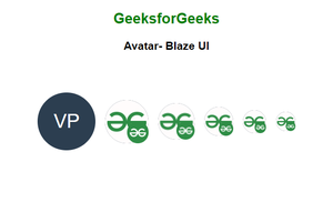
Blaze UI Avatars using <blaze-avatar> element
Example 2: This example shows the use of CSS classes to make use of the Blaze UI Avatar component.
HTML
<!DOCTYPE html>
<html lang="en">
<head>
<meta charset="UTF-8">
<meta http-equiv="X-UA-Compatible" content="IE=edge">
<meta name="viewport" content=
"width=device-width, initial-scale=1.0">
<title> Blaze UI - Avatar </title>
<link rel="stylesheet" href=
<style>
body {
font-family: sans-serif;
}
.wrapper {
display: flex;
align-items: center;
justify-content: space-evenly;
}
</style>
</head>
<body>
<div class="u-centered">
<h2 style="color: green;">
GeeksforGeeks
</h2>
<h3> CSS Only Avatar - Blaze UI </h3>
</div>
<div class="wrapper u-window-box-super">
<div class="c-avatar u-super" data-text="GFG"></div>
<div class="c-avatar u-xlarge">
<img
class="c-avatar__img"
alt="gfg_pfp_primary"
src=
/>
<img
class="c-avatar__img"
alt="gfg_pfp_secondary"
src=
/>
</div>
<div class="c-avatar u-large">
<img
class="c-avatar__img"
alt="gfg_pfp_primary"
src=
/>
<img
class="c-avatar__img"
alt="gfg_pfp_secondary"
src=
/>
</div>
<div class="c-avatar u-medium">
<img
class="c-avatar__img"
alt="gfg_pfp_primary"
src=
/>
<img
class="c-avatar__img"
alt="gfg_pfp_secondary"
src=
/>
</div>
<div class="c-avatar u-small">
<img
class="c-avatar__img"
alt="gfg_pfp_primary"
src=
/>
<img
class="c-avatar__img"
alt="gfg_pfp_secondary"
src=
/>
</div>
</div>
</body>
</html>
|
Output:
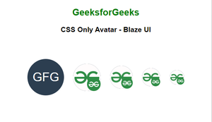
Blaze UI Avatars with Pure CSS
Example 3: This example illustrates how to make Avatar using a single image and two images.
HTML
<!DOCTYPE html>
<html lang="en">
<head>
<meta charset="UTF-8">
<meta http-equiv="X-UA-Compatible" content="IE=edge">
<meta name="viewport" content=
"width=device-width, initial-scale=1.0">
<title>Blaze UI - Avatar</title>
<link rel="stylesheet" href=
<script type="module" src=
</script>
<style>
body {
font-family: sans-serif;
}
.wrapper {
display: flex;
flex-direction: column;
align-items: center;
}
</style>
</head>
<body>
<div class="u-centered">
<h2 style="color: green;">
GeeksforGeeks
</h2>
<h3> Avatar - Blaze UI </h3>
</div>
<div class="wrapper u-window-box-super">
<p><b> Avatars Using Single Image </b></p>
<div>
<blaze-avatar size="xlarge" alt="gfg_profile"
src=
</blaze-avatar>
<blaze-avatar size="large" alt="gfg_profile"
src=
</blaze-avatar>
</div>
<p><b> Avatars Using Two Image </b></p>
<div>
<blaze-avatar size="xlarge" alt="gfg_profile"
src=
src-2=
alt-2="gfg_profile_secondary">
</blaze-avatar>
<blaze-avatar size="large" alt="gfg_profile"
src=
src-2=
alt-2="gfg_profile_secondary">
</blaze-avatar>
</div>
</div>
</body>
</html>
|
Output:
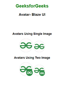
Avatar using a single image and two images
Example 4: This example illustrates the use of the Blaze UI Avatar element with initials.
HTML
<!DOCTYPE html>
<html lang="en">
<head>
<meta charset="UTF-8">
<meta http-equiv="X-UA-Compatible" content="IE=edge">
<meta name="viewport" content=
"width=device-width, initial-scale=1.0">
<title> Blaze UI - Avatar </title>
<link rel="stylesheet" href=
<script type="module" src=
</script>
<style>
body {
font-family: sans-serif;
}
.wrapper {
display: flex;
justify-content: space-evenly;
align-items: center;
}
</style>
</head>
<body>
<div class="u-centered">
<h2 style="color: green;">
GeeksforGeeks
</h2>
<h3>
Avatar - Using Initials - Blaze UI
</h3>
</div>
<div class="wrapper u-window-box-super">
<blaze-avatar size="super"
text="VP">
</blaze-avatar>
<blaze-avatar size="xlarge"
text="AM">
</blaze-avatar>
<blaze-avatar size="large"
text="PM">
</blaze-avatar>
<blaze-avatar size="small"
text="PR">
</blaze-avatar>
<blaze-avatar size="xsmall"
text="BM">
</blaze-avatar>
</div>
</body>
</html>
|
Output:
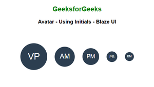
Blaze UI Avatar element with initials
Reference: https://www.blazeui.com/components/avatars
Share your thoughts in the comments
Please Login to comment...